 Video on Patreon
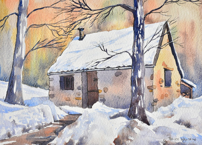
Snowy mountain hut
2 January 2025
Video - Level ◆◆◆
Happy new year everyone! Here's to another year of watercolour joy and painting together :-)
We start the year with this little mountain hut, which is in one of the national parks near my home. I actually took this photo last spring when had a huge amount of snow and I've been holding onto it until now, so that I could paint it with you.
It's a fun painting to do with a minimal of detail so that the painting is all about the contrast of warm against cool colours and soft and hard edges. Plus each part is small and separate so can paint slowly for this one, no need to rush.
Happy painting!
Video run-through...
About This Painting
A sun-drenched mountain hut in a national park, nestled between two large trees with snow all around. What makes this snow scene different from most: it's predominantly warm colours. Sunny snow scenes don't have to be all blues — the background is rich with warm yellowy-browns, reddish-browns, and greens, which contrast beautifully with the blue shadows on the snow. The hut is the focal point, the shadows on the snow shape the entire composition, and the trees bring the scene to life.
A traceable drawing is available in the lesson description.
Composition and Perspective Notes
You're standing slightly below and close to the hut, so the perspective lines above eye level are steep — particularly the roofline. Two large trees cut through the composition vertically. The sun comes from the right, so the left side of the building is in shadow and the right is in warm light.
Mark the main cast shadows (across the roof, and across the foreground snowbank) in the pencil drawing before starting, so you don't have to analyse them while painting.
Colour Palette
Background: Natural sienna, quinacridone sienna, sepia (warm browns), sap green dulled with ultramarine, ultramarine and sepia mixed for a dark granulating grey. Warm and varied — not spring-bright.
Shadow side of building: Ultramarine and sepia (granulating grey-brown), with quinacridone sienna added near the base for reflected light.
Sunlit side of building: Natural sienna and quinacridone sienna, kept light.
Doors and shutters: Quinacridone sienna dulled slightly with ultramarine.
Trees: Blue-brown mix (more blue than brown for the cooler tree; more sepia for the warmer, closer tree). Very dark on the shadow side.
Snow shadows: Ultramarine (clean, vibrant) with a touch of permanent violet in places for variation. Drop warm browns in while still wet for reflected light.
Painting Order
- Background — wet-into-wet, warm colours
- The building — shadow side and sunlit side
- Building details — door, shutters, chimney, roof tiles, stones
- Trees — base colour then shadow side, branches
- Shadows — building, then snow
- Pen work
Step 1: The Background
Wet the entire background generously using a flat brush, cutting carefully around the snow on the building roofline — preserve that white paper. It's fine to go straight over the tree trunks (they'll be very dark). Wet the paper twice if needed to get a good, even sheen.
Drop warm colours into the wet layer gently — don't push paint into the paper, float it into the water layer. Start with the dulled sap green, then work across with natural sienna, quinacridone sienna, and sepia in varying amounts. Go darker in the areas immediately behind the hut so the white snow on the roof contrasts sharply. Use the dark ultramarine-sepia mix in the lower corners. Use a thirsty brush to pull a few soft vertical strokes suggesting tree trunks in the background. The two pigments in the dark mix (both heavy) will granulate beautifully as they dry.
Let dry naturally — don't hairdryer until the paint has finished moving on its own.
Step 2: The Building
Rather than the usual approach of painting warm then overlaying shadow, paint each side in its final colour from the start: shadow side in grey-brown, sunlit side in warm sienna.
Shadow side: Ultramarine and sepia, not too dark — there's a lot of reflected light bouncing off the snow. Vary between more-grey and more-sepia. Drop in a little quinacridone sienna near the base to suggest reflected warmth from the snow.
Sunlit side: Natural sienna and quinacridone sienna, kept light and fresh. Let the shadow-side colour blend softly at the corner.
Work from left to right (or right to left if left-handed) to avoid running a hand over wet paint.
Step 3: Building Details
Doors and shutters: Quinacridone sienna with a touch of ultramarine to take the edge off the brightness. Small brush, blocking in simply.
Pathway: Same colour, with small gaps left for snow patches.
Roof tiles: Where snow has melted away from the tiles, use a very dark ultramarine-sepia or ultramarine-quinacridone sienna mix for the exposed stone edges. Vary the marks — no patterns, no regular spacing.
Chimney: Paint the sunlit face in the warm mix. When it just loses its sheen, drop in the shadow colour on the side to round the form.
Gutter trim: Light grey along the underside.
Stone details: A few selectively chosen rocks on the walls, in varied colours. Resist the urge to add too many — the wash underneath is doing most of the work.
Step 4: The Trees
Both trees are painted the same way: base colour first with vertical strokes (following the direction of the bark), then shadow colour dropped in on the shadow side once the sheen starts to fade. Leave plenty of white gaps — it reads as snow clinging to the bark.
The further tree: More blue-grey, simpler, less detail.
The closer tree: More sepia (warmer, browner), darker on the shadow side. This is near the focal point so give it more attention. Use a calligraphy brush, rigger, or the tip of a dagger brush for branches — hold the brush at the back of the handle for natural, wobbly marks. The closer tree should be noticeably darker overall than the further one.
Both trees will be refined with pen later, so don't labour over the smallest branches now.
Step 5: Shadows
Clean water and a fresh palette mix for this step — shadow colours need to stay vibrant and clean.
Building shadows: Ultramarine and a little sepia, inside the door and window recesses, under the eave, alongside the chimney, and anywhere the building needs a touch more three-dimensionality.
Snow shadows — the key step:
Before applying shadows, lightly flick clean water into random patches of the snow areas. When the shadow wash is applied over these damp patches, some edges will soften while the dry areas stay crisp — a natural mix of hard and soft edges that suggests varying snow forms.
Use two shadow mixes: straight ultramarine (clean blue), and ultramarine with a touch of permanent violet (cooler purple). Apply them alternately across the shadow areas. While still wet, drop in warm brown tones (quinacridone sienna) where snow is close to the building or the pathway — this is reflected light and stops the shadows looking flat.
Follow the form. Where the shadow crosses a snowbank, it must change direction to follow the slope of the bank. A shadow that ignores the underlying form looks pasted on. Soften edges where the snow is rounded; keep edges hard where there's a clear transition.
Cast shadows from the trees should extend far enough across the snow to anchor the trees convincingly. Cast shadows from the building should connect logically to the shadows on the snowbank.
A few small dark accents in the deepest foreground increase the overall contrast and make the snow glow.
Step 6: Pen Work
Three tools: dark brown ink, white gel pen, white Posca marker.
Dark brown ink: Shadow sides only (left-hand sides and underneath). Go gently around the whole painting with a light touch before going back in darker — don't overwork any single area before the rest is established. Extend the smaller branches on the trees with fine flicks. Define the shadow edge of the snowbanks with a few careful marks. Colour in the deepest darks (inside windows) with ink if needed.
White Posca or gouache: Any snow that has been lost and needs recovering — particularly along the roofline. For marks larger than a gel pen can handle.
White gel pen: Snow resting on branches, light catching the sunlit side of surfaces, fine highlights. A line of white on a branch that came out too thick will also reduce its apparent weight.
The pen should make the painting crisper, not busier. If in doubt, put it down.
Resources...
* Reference photo
* Drawing to trace
Join me on Patreon
Join my Adventures in Colour Tier for $16 to access this post and my full library of over 200 others including deep-dive videos and step-by-steps.