 Video on Patreon
My neighbour's daisies (part 2)
15 May 2025
Video - Level ◆◆◆
Let's finish off our daisies :-)
Your painting should be thoroughly dry now. In the 2nd part of this lesson we work on the daisies that are in focus. We first bring them out from the background painting shadows and light behind them. Then we add all the details and some shadowing to give them form.
All of our painting process is now wet on dry, so there's no need to rush. You can take your time and enjoy watching your painting come to life.
Happy painting!
Video run-through...
Part 2: Bringing the Daisies into Focus
This continues from Part 1, which covered the wet-into-wet background stage.
Make sure the painting is completely dry before starting. If it has warped, see the flattening note at the bottom of this page.
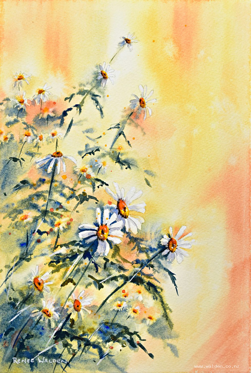
Step 1: Negative Painting — Bringing Flowers into Focus
The first task is to pull the main arc of flowers out from the background using negative painting, working wet-on-dry. There's no rush now — take your time.
Use the same mix as the background: ultramarine blue and quinacridone sienna. On the shadow side of each flower use the blue-green mix; on the sunlit side use the golden colours. After each small passage of negative painting, extend the mark outward with a flat brush so it blends softly rather than leaving a hard edge.
Start light and build up gradually. If you go too dark too early you'll lose the ability to create contrast later. Work in the focal point first — spend the most time and add the most detail here — then become progressively looser and lighter as you move outward towards the edges.
Where the negative painting creates a dark shape, extend it into a leaf form to make it read as part of the plant rather than just a shadow mark. This also helps ground the flowers into the scene.
If you've lost any flower shapes and want to recover some white, try lifting out colour with a clean damp brush — though note that quinacridone colours are staining and may not lift cleanly.
Darken the lower portion of the painting to add weight and ground the composition — this has the added benefit of pushing the lower flowers further into focus.
Step 2: Flower Centers
Paint all the centers in Hansa yellow deep — refer back to your sketch if you've lost track of positions. Vary the shape of each center according to the angle the flower is facing: round for a flower facing directly towards you, more oblong for one turned to the side.
They'll look very bright and attention-grabbing at this stage — don't worry, the shadows will settle them down.
While still wet, drop a touch of pyrrole orange into each center, concentrating it on the shadow side and around the small dimple in the middle.
For the shadow colour on the centers, mix Hansa yellow deep with permanent violet — complementary colours mixed together produce a rich brown. Vary the ratio for interest. Use almost no water so the mark spreads slowly and controllably. If it moves too fast, wait a moment for the paper to dry slightly; if it doesn't spread enough, nudge it with the brush. In the focal point, add a little extra orange to the centers for warmth.
Add stems now, referring to your sketch for direction. A few stems starting off the edge of the page adds to the sense of abundance.
Step 3: Petal Shadows
Dry the painting with a hairdryer, then mix a very pale shadow wash: ultramarine blue, plenty of water, a touch of permanent violet, and a little quinacridone sienna to grey it down slightly — it should be a soft, cool grey-purple, and very dilute.
Apply this wash to the left-hand side of petals (the shadow side, with light coming from the right). A touch towards the center of each petal makes them look as though they're curving. Use it also to separate overlapping petals — a slightly darker petal behind a lighter one immediately creates depth.
Don't lose all the white. The interplay between the shadow wash, the white paper, and the coloured undertones from the wet-into-wet stage is what gives the flowers their freshness and life. The aim is form and depth, not botanical completeness.
Less detail as you move away from the focal point — the outer flowers need only the lightest suggestion of shadow.
Once dry, come back into the focal point with the yellow-and-violet brown mix at full concentration (very little water) to add the final, sharpest details — the deepest part of each center, the most defined petal separations.
Step 4: White Gouache Highlights
Mix white gouache on a completely separate palette — even a tiny amount contaminating the watercolour wells will make future washes look chalky.
Use it fairly thick first to reclaim any lost highlights in the focal point — the brightest edges of petals, the tops of centers. Then dilute it slightly and work outward. A few stem marks in white gouache add sparkle. Don't overdo it — much of the painting has a beautiful golden undertone and it would be a shame to cover it.
Finish with a few optional splatters of yellow and orange across the foreground for texture and energy.
Flattening a Warped Painting
If the painting has buckled, flip it face down, wet the back very gently (much less water than at the start — just enough to relax the paper fibres), then flip it back over and tape all four edges down firmly. Place a clean sheet of watercolour paper or the back of an old painting on top, weigh it down with a couple of books, and leave it for a few days. Keep it taped for a couple more days after removing the books, and it should come out perfectly flat.
Resources...
* Drawing to trace
* Reference photo
Join me on Patreon
Join my Adventures in Colour Tier for $16 to access this post and my full library of over 200 others including deep-dive videos and step-by-steps.