 Video on Patreon
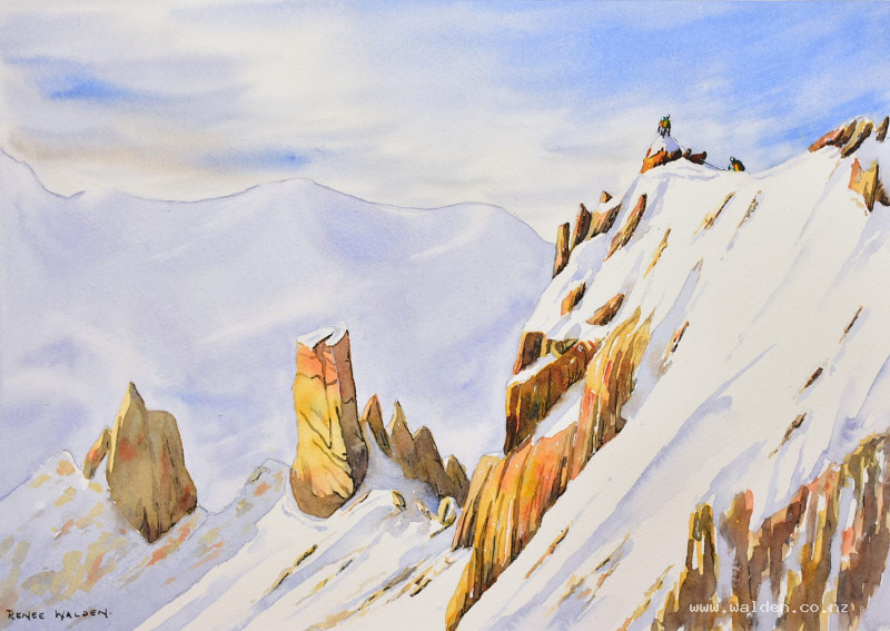
Climbers in the Alps (part 2)
12 June 2025
Video - Level ◆◆◆
We're back for part 2 of this lesson, finishing off by painting all the wonderful foreground.
There are rocks, snow, little people and, of course, the beautiful shadows.
Happy painting!
Video run-through...
About This Painting — Part 2
Continues from Part 1, which covered the planning, drawing, sky, and background mountain.
Painting Order (Part 2)
- Rocks — first colour pass, working back to front
- The mountaineers — bright colours, shadow side
- Shadows on rocks and snow — working back to front
- Pen work
Step 1: The Rocks — First Colour Pass
Before starting, clean the palette thoroughly of all blues and purples — any contamination will dull the warm golden colours instantly. Keep the two colour families completely separate throughout.
Three rock colours: Natural sienna, quinacridone gold, quinacridone sienna. Mix these in separate pools — they'll be changed on the page, not on the palette. Have a small amount of cobalt blue mixed with quinacridone sienna (a warm grey) for variety and weight at the base of some rocks.
The approach — back to front, subtle to saturated:
Start at the back with the natural sienna only — paler and less varied in colour. As you work forward towards the focal point, gradually shift from natural sienna to quinacridone gold, then introduce quinacridone sienna. Saturation and colour variation increase as you approach the two climbers. This shift should be subtle, not sudden — if you go too saturated too early, there's nothing left to intensify as you reach the focal point.
Within each rock section, drop in two or three colours while the wash is still wet, letting them merge on the page. Vary the direction of brushstrokes to follow the angle and slope of each rock face — vertical strokes for vertical cliffs, angled strokes for sloping surfaces. Leave small gaps where snow is clinging to the rock.
Keep an eye on blue contamination: cobalt blue and quinacridone gold will make green. Always clean the brush thoroughly before switching between the warm and cool colours.
Work across the whole foreground gradually rather than finishing one section before moving to the next. As you approach the focal point, slow down and work more carefully — this is where the viewer will look. A smaller brush can be useful for the uppermost rocks around the climbers.
Step 2: The Mountaineers
Before painting the details, briefly revisit the three goals of the painting: light, complementary colours, and the human element. The only detailing the painting needs is around the two climbers — that's where the viewer looks. Everything else is washes and shadows.
Mountaineers wear bright, vivid clothing — this is a good opportunity to introduce colours not used elsewhere. With a tiny brush, give each climber a distinct colour combination: backpack, jacket, trousers, helmet. Let the colours merge slightly into each other — the figures are small and far away, so individual items of clothing needn't be sharply defined, just spots of colour reading as a person.
While still wet, apply a thin wash of Payne's grey on the shadow side (the side away from the sun) to give each figure a little dimension. The rope connecting them can be drawn in pen later.
Step 3: Shadows on Rocks and Snow
Dry the painting thoroughly before beginning. This step transforms everything.
Two shadow colours:
- Rock shadows: Quinacridone sienna and cobalt blue, with a small touch of Payne's grey if needed — a warm neutral that shifts between more-orange and more-blue as you vary the mix.
- Snow shadows: The background mountain mix (cobalt blue, permanent violet, lavender) — matching the background colour ties the snow to the overall cool palette.
Have two brushes ready — one for rock shadows, one for snow shadows. The goal is to apply the rock shadow and then immediately carry it into the snow shadow while both are still wet, so some of the warm rock colour bleeds into the snow, suggesting reflected light.
Work back to front again, with the same principle as the rock colour pass: flatter and less varied in the background, more saturated and more colour variation as you approach the focal point.
For each shadowed rock section, apply the base shadow colour wet and then drop in variations — sometimes more blue, sometimes more brown — while still wet. Join cracks and shadow areas together into unified shapes rather than painting every individual crack. The shadows are where all the rock structure emerges. In the foreground rocks, slow down and work carefully; in the background, keep it simple.
Snow shadows have a different character to rock shadows: while rock edges are hard and angular, snow surfaces are rounded and mounded — soften some snow shadow edges with a clean damp brush where the snow billows. Leave occasional small highlights where sunlight catches a snow ridge. The snow is highly reflective, so warm colour from the rocks bleeds into nearby snow in shadow areas — let this happen naturally where the two wet washes meet.
As you approach the focal point, go darker and more detailed. Small cracks within cracks, directional shadow marks that follow the angle of each surface.
Step 4: Pen Work
Pen work is optional — the washes may already be doing everything they need to.
Dark brown ink: Shadow sides only — the shadowed faces of rocks, cracks that need defining, the figures. Concentrate entirely at and around the focal point. Use the pen upside down for finer marks as you move further from the focal point. Change the direction of marks to match the direction of each rock face. Very little or nothing in the distant background — the washes there are already light, and dark pen marks will stand out jarringly.
Draw the rope connecting the two climbers with the finest possible line from waist to waist.
White gel pen: Highlights on the mountaineers and on rocks where snow or ice is catching direct sunlight. Useful for correcting any pen marks that feel too heavy.
The test: step back and ask whether the pen is visible as pen, or whether it simply reads as part of the painting. If it's noticeable, it's too much.
Resources...
* Reference photo
* Drawing to trace
Join me on Patreon
Join my Adventures in Colour Tier for $16 to access this post and my full library of over 200 others including deep-dive videos and step-by-steps.