 Video on Patreon
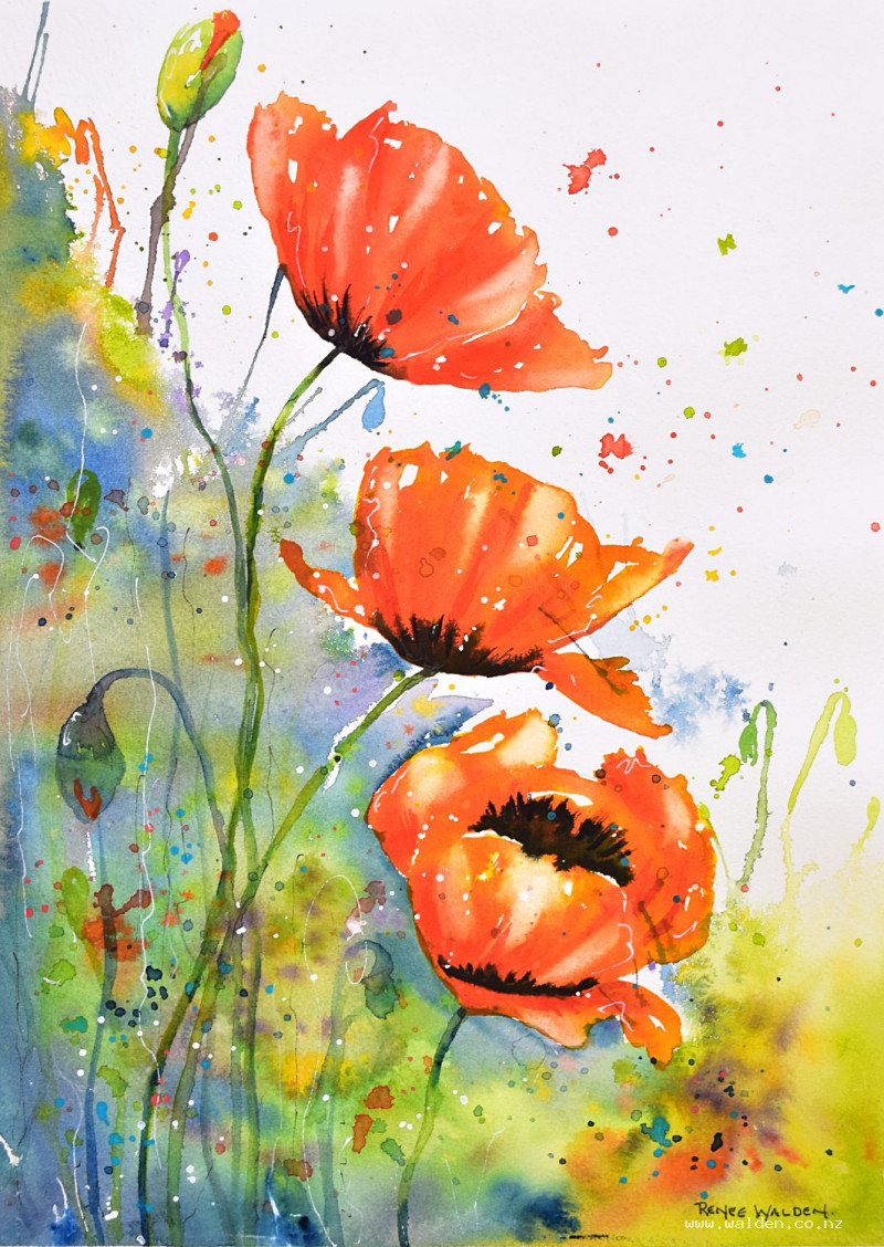
Bold poppies
3 July 2025
Video - Level ◆◆◆
Summer inspiration! We're going to be bold, and free and a little wild with these poppies. So expect to loosen up a bit ;-)
For the background we're going work with lots of different colours (you can choose your favourites), splashing and blowing the paint around. And then I'm going to show you how to mix very vibrant reds for the poppies.
You'll need a straw to blow the paint, or your hairdryer on its strongest fan.
Happy painting!
Video run-through...
About This Painting
Wild, free, and bold — an abstract poppy painting with an expressive wet-into-wet background full of blown paint and splatters, and three feature poppies glowing against it in intense reds and yellows. This is a painting where looseness is a virtue, not a problem. Every painting done this way comes out differently, and the background is done entirely by feel. The only moment requiring care and observation is the poppies themselves.
This painting works at any size — scale your brushes up or down accordingly.
Materials
A large brush (no. 16 or similar) for the background, a mid-size (no. 10) and small (no. 4) for the flowers. A straw for blowing wet paint into firework shapes (or tilt the board and blow with your mouth, or use a hairdryer on maximum fan). A toothbrush for splattering. An apron is strongly advised.
The Key Technique: Glowing Red Poppies
Before painting anything, test this on a scrap piece of paper — it makes a significant difference.
Layering red on red to increase intensity produces a more saturated colour but a lifeless one, because many reds are slightly opaque and stacking opaque layers kills the glow. The solution is a yellow undertone:
- Lay a wash of Hansa yellow deep first.
- While still wet, drop in pyrrole red — not everywhere, leaving some yellow showing.
The yellow underneath acts like a backlight through the red, creating a warm glow that no amount of layered red alone can achieve. The wet-into-wet version produces the most variation and the most beautiful result; if the timing feels risky, let the yellow dry first and apply the red on top — it still works significantly better than red alone.
Do a small swatch test with both methods before starting the flowers.
If you don't have pyrrole red, mix a primary red with a warm pink or orange.
Note: This principle applies beyond reds. Rather than layering more and more of the same colour to increase intensity, consider what undertone would make it glow — a warm yellow under a blue can make it feel luminous in a way a second coat of blue never will.
Painting Order
- Background — wet-into-wet, blown, and splattered
- Feature poppies — yellow undertone then red, with Payne's grey centres
- Buds, seed heads, and stems
- Final splattering and accent colour
- Optional pen work
Step 1: The Background
Load the big brush with your first colour and work freely across the whole background, including over the pencil drawing of the poppies — stray colour over the flowers adds to the abstract feel and is not a problem. Choose whatever colours speak to you: blues, greens, purples, pinks, oranges. The only guidelines are to keep the corners and lower areas darker to give the painting visual weight, and to drop in some Payne's grey in the lower section since the flower centres will need dark colour nearby.
Work very wet and change colours constantly. Drop them onto the paper and let them merge rather than mixing on the palette. Spritz if the paper starts drying too fast.
Blowing: While the paint is very wet, hold a straw close to the surface and blow — the paint shoots outward in organic, unpredictable rays. Spritz the surface wetter first if the paint doesn't move. Soften any areas that feel too busy with a damp brush.
While the background is still damp but mostly stopped moving, tease a few interesting marks into soft poppy buds or seed head forms with a smaller brush — these background elements tie the abstract marks to the subject without being literal.
Let dry naturally until the wettest areas can be touched, then finish with a hairdryer.
Step 2: The Feature Poppies
Work one flower at a time.
Apply a loose, free wash of Hansa yellow deep in the petal area — not filling it solidly, leaving gaps, keeping edges ragged and windblown. Hold the brush further back on the handle.
While still wet, drop in the pyrrole red. Vary the consistency: thinner and more watery at the top (light shines through the outer petals), thicker and denser towards the base. Leave patches of yellow showing. Work with the background shapes, not rigidly against the pencil drawing.
Lift out a few highlights with a clean dry brush while still wet.
Watch the drying carefully. When the red has stopped spreading but the lower area is still slightly damp, apply very thick Payne's grey (almost no water) for the dark centre. Too soon and it will flood the flower; too late and it will sit hard on the surface. Tilting the board so the grey doesn't run upward helps with timing. For front-facing flowers the dark goes in the centre; for side-facing flowers it sits at the petal base.
Step 3: Buds, Seed Heads, and Stems
Use greens already in the background as a colour reference. Keep brushwork loose, hold the brush well back, vary the green colour throughout. Add a small tip of red at the top of any opening buds. Stems are slightly wobbly — make sure they're substantial enough to believably support the flower head. Use Payne's grey where stem meets flower head for shadow. Buds intended to read as background should be painted in background colours (blues, purples) so they don't jump forward.
Step 4: Final Splattering and Accent Colour
Red splatter first — watery paint for larger drops. Red scattered across the composition reinforces movement and ties the flowers to the background. Then add a restrained amount of the other background colours.
White gouache splatter (on a separate palette) adds sparkle, especially effective over denser areas.
Opaque accent colour not used anywhere else — cobalt turquoise or lavender. A few splashes only. Choose something cool if the painting is predominantly warm.
Optional — butterflies: Any loose splatter mark can be gently pulled into a barely-visible butterfly shape with a small brush. Keep them subtle — something to find rather than something obvious.
Step 5: Pen Work (Optional)
If the painting feels complete, sign it and stop. If not:
Red Posca marker: A few dots or dashes to reinforce any lost reds. Shake with the lid on. Avoid pattern — keep it as random as the splatter.
White Posca marker: Highlights and a few energetic squiggles. No outlining.
Dark brown ink: Very light, free marks — stems, movement lines. No outlining of petals or leaves.
Resources...
* Reference photo
Join me on Patreon
Join my Adventures in Colour Tier for $16 to access this post and my full library of over 200 others including deep-dive videos and step-by-steps.