 Video on Patreon
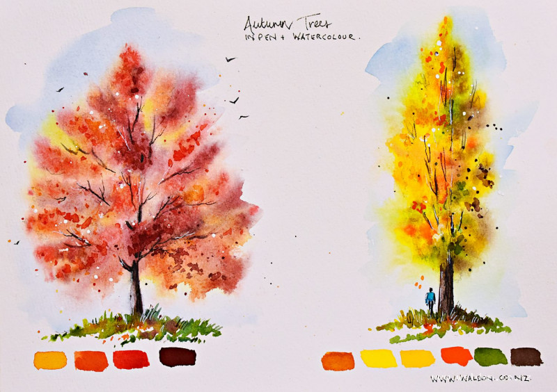
Autumn trees
2 October 2025
Video - Level ◆◆◆
Let's paint vibrant, loose autumn trees. For this lesson we focus on how to paint a feature autumn tree in a landscape. One that is close to the foreground or our focal point and has lots of lovely detail.
We do two different trees - a red maple and a golden poplar. First we look at how to draw the shape of the tree, then we look at all the different colours we can see and create the colour swatches. When we paint the trees I encourage you to work as wet and as loose as possible so that we don't have to paint any individual leaves at all. At the end you should have a tree full of life and movement.
Plus now's the time to get out all your vibrant autumn colours!
This lesson is a compliment to 2 others we have for trees already - one for summer trees and one for distant trees and forests. You can do the lessons in any order.
I've attached a downloadable worksheet at the end of the lesson for you to save and keep.
Happy painting!
Video run-through...
About This Lesson
A skills lesson on painting loose, vibrant autumn trees — working wet-into-wet with bold colour and splattering to create something far more free and energetic than a carefully observed summer tree. Two trees are painted: a maple (red and violet tones) and a poplar (yellows and oranges). The approach is the same for both, so the second becomes good practice for pushing even further with the looseness.
This lesson is part of a series on trees. Earlier lessons in the series cover mixing greens for summer trees, understanding light and shape in tree canopies, and painting distant trees. This one focuses on feature trees — the main tree in a scene — and on freeing up the process.
Before You Start: Study the Tree
Before mixing a single colour, look carefully at the tree in the reference photo. The instinct is to grab whatever the dominant colour seems to be (red for the maple, yellow for the poplar) and call it done. But nature is always more varied than that.
Zoom in and look for all the different colours present — the maple has golds, deep pinkish reds, and what reads almost as violet in the deepest shadows. The poplar has multiple yellows, hints of orange, patches of green, and darker brown in the shadowed interior. These variations are what make a painted tree feel alive rather than flat.
Also study the shape: the overall silhouette, where the trunk sits within it, which side is heavier, how branches escape the general form, where there are gaps of sky visible, and whether the foliage tends to hang downward or reach upward.
The Pencil Drawing
Lightly sketch the general shape of the tree first — a triangle, oval, or irregular mass, depending on the tree — and mark where the trunk sits. Then refine from there, looking at where the actual tree breaks away from that general shape. Most trees are not symmetrical; the heavier side, the direction branches lean, the gaps in the canopy — all of these are what give a tree its individual character.
Avoid patterns. The most common mistake is to create a regular, repeating edge on both sides of the tree. Look at the reference carefully and follow what's actually there.
Mark in a few key branches and trunks visible through the foliage — these determine the underlying structure and growth direction of the tree.
Once happy, lighten the drawing with a kneadable eraser before painting.
Tools and Colours to Prepare
Have everything ready before wetting the paper. You'll need: a flat brush for the sky, a larger round brush for the main tree body, and a dagger or rigger for trunks and branches. Prepare pieces of paper for covering during splattering.
Mix all colours in separate pools before starting — once the paper is wet, you need to move without stopping to mix.
Maple:
- Quinacridone gold (or yellow ochre/natural sienna/raw sienna) — golden highlights
- Quinacridone sienna (or burnt sienna) — main red-orange
- Quinacridone rose or red added to the sienna — for deeper reds
- Perylene violet (or permanent violet mixed into the sienna) — deep shadow colour
Poplar:
- Hansa yellow medium — mid yellow
- Hansa yellow deep — deeper yellow
- Pyrrole orange — just a touch
- Sap green — cool contrast
- Sepia — shadow side
- Quinacridone gold — warm glow
Painting the Trees: The Method (Both Trees)
The process is the same for both trees — work through it with the maple first to get comfortable, then push even further with the looseness on the poplar.
Sky
Wet the entire tree area and sky together — painting over the whole tree canopy shape. Drop in a simple, light wash of cobalt blue for the sky, keeping it pale so it doesn't dull the tree colours that will go on top. Leave some gaps and interesting shapes.
Tree Canopy
While everything is still wet, drop in the tree colours one at a time. Start with the lightest, brightest colour — the gold or the lightest yellow — placing it mainly on the sunlit side. Work inward and add the next colour, then the next, letting them merge on the page rather than being mixed on the brush.
A few key principles:
- Don't follow a pattern. Vary the size, shape, and position of each colour drop.
- Leave gaps — sky holes where birds can fly through; these stop the canopy looking like a solid blob.
- The darkest, most violet or most shadowed colour goes towards the interior and shadow side.
- Let the paint do its thing. Resist the urge to go back in and fuss. The wet-into-wet merging is the effect.
If colours start escaping too far, catch them with a paper towel. If the paint is still too fluid for splattering, half-dry with a hairdryer and come back.
Splattering
Once the canopy is at the right stage of dampness (damp but no longer moving freely), cover the sky area and splatter the tree colours across the foliage to suggest leaves in focus in the foreground. Start with the darker shadow colour first, then add greens, then brighter colours. A little white gouache splatter adds sparkle.
After splattering, use a small brush to pull a few of the splatter marks into recognisable leaf shapes — but only a few. The random marks are already doing most of the work; over-defining them will make everything look tight and stiff.
Splattering clean water into wet areas of the canopy creates organic blooms and additional texture.
Trunk and Branches
Once the canopy is dry, mix a near-black from sepia and cobalt blue (leaning more blue than brown) and use the dagger or rigger for the trunk and main branches. The trunk is narrower as it enters the canopy and wider at the base. Paint some branches escaping the canopy edge. Carry the trunk colour directly down into the grass below — this settles the tree into the ground rather than leaving it floating.
Add a few fallen leaves beneath the tree using small marks of the tree colours.
Pen Work
Dark brown ink: Shadow sides of trunk and branches, following the direction of the bark. A few marks suggesting loose bark add texture and age.
White gel pen: Highlights on the sunlit sides of trunks and branches, and any bright leaf edges that need picking out.
Adding a Figure for Scale (Optional)
For large trees like the poplar, a tiny figure at the base immediately conveys the scale of the tree. Keep the figure very simple: a rectangular body with flat shoulders, two legs (one slightly shorter to suggest walking), short arms, and an oblong head. The head should be small — the gap between the shoulder edge and the chin on each side should be roughly the same as the width of the head. Children's heads are proportionally much larger; an adult figure with an oversized head will read as a child. A cool colour (turquoise top, blue jeans) works well against all the warm autumn tones. Add a small shadow beneath to place the figure firmly on the ground.
Resources...
* Worksheet
Join me on Patreon
Join my Adventures in Colour Tier for $16 to access this post and my full library of over 200 others including deep-dive videos and step-by-steps.