 Video on Patreon
Mixing greens & painting summer trees
30 November 2022
Video - Level ◆◆◆
Let's visit Castelnaud-La-Chapelle in Dordogne, France. We paint the chateau on the hill, the bridge across the Dordogne River and all the reflections in the water.
There are a number of ways to paint reflections, and I thought this lesson would be a lovely way to show you one of them.
Happy painting!
Video run-through...
About This Lesson
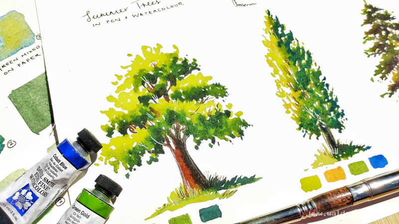
One of the most common questions watercolour painters ask is how to mix natural-looking greens for landscapes. The short answer is that you don't need twenty different tubes of green — you just need a few reliable techniques and an understanding of how to vary and dull your mixes. This lesson is in two parts: first, building a swatch sheet of different green-mixing methods and favourite mixes, then putting it all into practice by painting three different summer trees.
Part One: Four Ways to Make Green
1. Straight from the tube
The simplest approach is to use a ready-mixed green directly from your palette. Sap green and green gold are both good choices for natural landscape greens. Winsor green, by contrast, tends to look unnatural in landscapes and is better suited to painted objects like boats or shutters. A tube green gives a flat, even, consistent colour — which is actually an advantage in areas of your painting that are not the focal point, or when you need to match a colour exactly each time you use it.
2. Mixed on the palette
Mix a blue and a yellow together on the palette to create green. Ultramarine and Hansa yellow medium work well in roughly equal parts, though any blue and yellow from your palette can be experimented with — just test them first on scrap paper, as some combinations read as green while others can shift toward a muddy olive or even a dull gray. The advantage over a tube green is that if you mix loosely and work very wet, the two colours tend to separate as they dry on the page, creating natural texture and variation.
3. Charged on the page
Rather than pre-mixing, lay down the blue first, then drop the yellow directly into the wet wash on the paper. This gives even more variation in colour and texture than mixing on the palette — you can get a range from blue through green through to yellow in a single stroke, depending on where and how much yellow you drop in.
4. Glazing
Lay down a wash of yellow and let it dry completely, then glaze a wash of blue on top. Where they overlap, you get green, with the yellow and blue still visible at the edges. This works best with transparent colours (Hansa yellow medium and ultramarine are both transparent or semi-transparent). Note that the order matters — blue over yellow works better than yellow over blue. Glazing is most useful toward the end of a painting when you want to adjust an area: cool it down, shift its colour, or tone it back without losing the texture underneath.
Part Two: Favourite Green Mixes
Starting with sap green as a base is a useful shortcut — it gives you a natural, workable starting point that you can push in many directions without having to build from scratch each time.
Sap green + indigo — a rich, dark green ideal for shadows and the darkest areas of foliage. Deep and slightly cool.
Sap green + ultramarine — works particularly well wet on wet, as the ultramarine is heavy and will granulate and separate, giving lovely texture in washes.
Sap green + Prussian blue — similar to the ultramarine mix but slightly more turquoise in character.
Sap green + burnt sienna (or burnt umber) — adding a brown to your green dulls it down and makes it more neutral and natural. Earthy and warm, good for dry grass, conifer trees, or any green that needs to feel less vivid.
Any green + yellow (Hansa, quinacridone gold, or green gold) — shifts the green lighter and warmer, good for sunlit highlights on foliage.
Any green + permanent violet — adding violet to a green neutralises it and creates subtle, complex tones that read as very natural. Useful on the shadow side of trees.
The key principle for dulling any colour that looks too bright or artificial is to add its complement, or a neutral brown. Most greens that look unnatural in a landscape are simply too saturated — bringing in a touch of brown or violet will calm them down.
Part Three: Painting Three Summer Trees
The following section covers painting three different tree types, each demonstrating a different approach to colour and form. In every case, the structure is the same: establish a light tone, a mid tone, and a dark tone, and keep them consistent with a single light source. As long as you maintain this tonal structure, you can add as many different colours as you like — the tree will still read as three-dimensional.
Tree One: A Simple Deciduous Tree (three colours)
Start with a light wash of sap green mixed with Hansa yellow, working loosely and thinking about the overall shape as a cluster of overlapping rounded forms rather than a single ball. Hold the brush lightly and touch the paper gently — scrubbing the paint in will prevent the colours from merging later. While still wet, drop in a mid tone of sap green with a touch of ultramarine, concentrating it toward the lower and inner parts of the canopy. Finally, add the dark tone — sap green with indigo — to the underside and shaded areas. Keep the light tone on top and to the light side; keep the darks underneath and to the shadow side.
Tree Two: A Poplar (four colours)
Poplars have a distinctive upright, narrow shape with vertical movement. Use the same light-to-dark principle but introduce a fourth colour — burnt umber or burnt sienna — to warm and vary the mid tones. The trunk and main branches of a poplar are more vertical than those of a rounded deciduous tree, so let your brushwork reflect that with more upward strokes. Leave small gaps in the canopy for sky to show through — these also serve as spaces to add fine branches with a pen later.
Tree Three: A Conifer (five or more colours)
Conifers have a more structured, layered shape with a strong downward direction to the branches. Start with sap green as the light tone, then dull it significantly by charging in burnt umber — this moves the green toward a more neutral, natural conifer colour. Add quinacridone gold or green gold on the sunlit side for warmth, then Payne's gray on the shadow side for the darkest tones. For extra interest, permanent violet can be dropped into the shadow areas — it creates a complex, deep tone that reads as very natural in a forest context.
Don't worry about achieving a perfect conifer silhouette — irregular, layered edges look more convincing than a smooth outline.
Pen Work (Optional)
Once the trees are completely dry, a fountain pen or fine-nib pen with dark brown ink can be used to sharpen up the trunks and add fine branches. Work on the shadow side only — avoid adding pen marks where the light is catching the tree, or use a white gel pen there instead. Turning the pen upside down gives a finer, lighter line useful for very delicate branches. A few pen marks in the grasses at the base help settle the trees into the ground.
This is entirely optional — if your trees already look good, leave them as they are.
Key Takeaways
Variety is what makes landscape greens look natural. Mixing your own greens — and mixing them loosely — introduces the subtle colour variation that the eye reads as real foliage. The tonal structure (light, mid, dark) is what makes trees look three-dimensional. And when in doubt, a touch of brown or violet will calm down any green that looks too artificial.
A downloadable worksheet with swatches and notes is available in the lesson description.
Resources...
* Worksheet
* Worksheet
Join me on Patreon
Join my Adventures in Colour Tier for $16 to access this post and my full library of over 200 others including deep-dive videos and step-by-steps.