 Video on Patreon
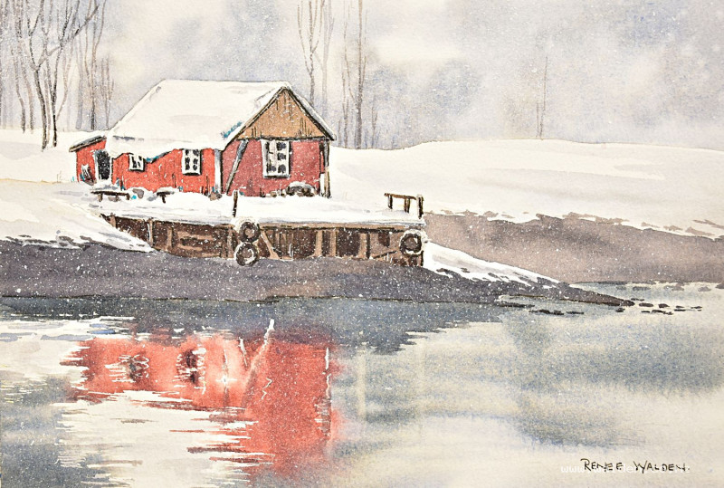
Norwegian winter
1 January 2026
Video - Level ◆◆◆
Happy New Year everyone! Here's to a fantastic and creative 2026. Let's dive right in and paint something.
This looks really chilly, doesn't it?! You'll want to be somewhere cosy when you paint this one ;-)
What a lovely scene to paint - all those different greys, the warmth of the little boathouse and the glassy water and reflection. And the cherry on top - the splatters of snow to really set the feeling of the scene.
It's not a very complicated scene to paint, but it's worth spending a bit of time getting the drawing correct. Remember you can always trace my drawing if you want and just do the painting part - there are no fun police here.
Happy painting!
Video run-through...
About This Painting
A Norwegian boathouse in deep winter — almost monochrome, with soft grey-blues throughout and just a touch of dull red on the painted building. The scene is all about stillness: glassy water, a perfect reflection, snow-laden trees dissolving into the background, and white snow masses catching the pale light. The colour is deliberately restrained, which makes the small accents of warmth and the final pop of an opaque highlight colour all the more effective.
A traceable drawing is available in the lesson description.
The Pencil Drawing
The painting is relatively simple in colour, so the drawing is where accuracy matters most. Spend time getting it right before picking up a brush.
Start with the general outline of the building to confirm it fits on the page at the right size, then add the detail. Use a ruler to drop the reflection lines in — aligning windows with windows, roof edges with roof edges. An offset reflection looks immediately wrong and is worth the extra care to avoid.
Keep the background simple: the only trees with any detail are those near the focal point; everything further away is left vague.
Masking fluid can be used to preserve some of the bright white reflections in the water (where the snow bank reflects). If you'd prefer not to use it, the alternative is explained in the water section below.
Colour Palette
This is almost a monochrome painting. The entire scene is built from a single blue and a single brown mixed in varying ratios:
Main grey mix: Cobalt blue (or ultramarine or Prussian blue) and quinacridone sienna — mix these two rather than reaching for Payne's grey, so you can shift the balance more blue or more brown as needed throughout. Important: check your mix doesn't go green before committing to it.
Building colour: A dull, muted red — not bright, not sunny. Mix it with a little of the grey to knock back the intensity.
Snow colour: Very pale, slightly blue-grey — a tiny amount of the main mix, heavily diluted.
Accent colour (final stage only): An opaque colour not used anywhere else — cobalt turquoise or lavender — for a single focal point accent.
Snowflake splatter: White gouache on a completely separate palette.
Painting Order
- Background — wet-into-wet, soft grey wash with water splatter for snow texture
- Background snow masses and building exterior
- Water — dark reflective surface with soft reflections
- Jetty and foreground details
- Trees
- Masking fluid removal and snow refinement
- Final shadows and accents
- Pen work and snowflake splatter
Step 1: The Background
Wet the entire background area — everything above and behind the building — with clean water using a flat brush. Cut carefully around the roof line and have a paper towel ready to catch any water that lands on the building. Check for dry patches and a dry halo around the building edge.
Mix the main grey from cobalt blue and a small amount of quinacridone sienna — keep it more blue than brown for the background, since the scene is cold and the warm colour is being saved for the building. Drop the colour gently into the wet layer rather than scrubbing it in; the paint should move freely in the water. Keep this wash relatively light — the water in the foreground needs to be darker, and you need tonal range to work with.
Go slightly darker immediately behind the roof line so the light-catching snow on the roof reads clearly against a darker background. Leave some areas completely unpainted for snow-covered trees.
Snow texture in the background: Part-dry the background with a hairdryer until the paper is damp rather than wet — it should have a sheen in places but not look soaking. Then splatter clean water (not paint) across the surface with a rigger or fine brush. This creates blooms that read as falling snow or snow clinging to the trees. Timing is everything — if the paper is still too wet the marks will spread and disappear; if too dry they won't form at all. Test on a scrap piece first. Leave to dry naturally.
Step 2: The Building
The building is the only warm element in the painting. Mix a dull, muted red and paint it simply — no need for complex wet-into-wet here. While still slightly damp, vary the colour slightly in places. Keep the sunlit faces lighter and the shadow faces darker.
The snow on the roof is white paper — reserve it carefully, or lift it out while wet. As the painting develops, add a pale blue-grey shadow wash to give the snow mass form (snow is never flat white in shadow areas).
Step 3: The Water
The water is dark and glassy — much darker than the background. Wet the area and work wet-into-wet, using a richer concentration of the grey mix. The water reflects everything above: the dark shore, the grey sky, and the building.
Reflections: Keep them slightly blurred and softened compared to the objects above. The building's red reflection sits within the dark water. Vertical strokes suggest the mirror-like quality of still, cold water. If you used masking fluid, the bright white snow reflection marks are protected; if not, leave those areas unpainted or lift colour out carefully while still wet.
Horizontal highlight streaks of paler colour in the water suggest the sky's reflection and break up the darkness naturally.
Step 4: Jetty and Foreground
Add the jetty structure and any foreground detail — old tyres, ropes, the underside of the jetty. Use dark marks (near-black from the grey mix at full concentration) for these. Stand back frequently and be selective — add enough to make the focal point feel interesting and inhabited without overdoing it.
Step 5: Trees
Grow the background trees from the ground upward using a small brush or rigger. Keep them lighter than the darkest parts of the building and water — they're in the background and should stay there. Some going off the edge of the composition adds depth. A couple of slightly more defined trees close to the focal point, and progressively vaguer ones further away. If any come out too dark, dab them immediately with a piece of paper towel to lift some colour.
Step 6: Remove Masking Fluid and Refine Snow
Remove the masking fluid and assess the white areas. Very bright, hard-edged whites may need softening — apply a very pale wash of the blue-grey snow colour to reduce them and add form. Use a clean stiff brush to soften any edges that feel too sharp.
Add additional snow modelling throughout: pale shadows where snow masses slump or crack away from eaves, and gentle tonal variation to prevent large white areas reading as blank paper.
Step 7: Final Shadows and Focal Point Accent
Go back through the painting and add any darker shadows needed — these are the marks that separate planes and give the scene its sense of depth and cold weight. Keep them on the shadow side and soften any that feel too hard.
Add the focal point accent colour — a small touch of opaque cobalt turquoise or lavender somewhere in or around the main building. This draws the eye and provides a cool, unexpected note against all the grey. Keep it small and restrained.
Step 8: Pen Work and Snowflake Splatter
Dark brown ink: Shadow sides only — the right-hand sides of structural elements, under eaves, inside any dark openings. Minimal and careful; the washes are doing most of the work. A white Posca marker is useful for cleaning up a wobbly roofline edge.
White gel pen: Sharp details and highlights — anywhere the white is catching the light, fine branches, and any marks that need crisp definition.
Snowflakes (optional): Load a toothbrush with white gouache (on a separate palette) and hold it close to the paper for more control than a regular brush. Flick sparingly — a few snowflakes add magic; too many become distracting. Make a few slightly larger ones and many smaller ones for a natural distribution. Test on a scrap piece of paper first and cover any areas you don't want splattered.
Remove the tape.
Resources...
* Drawing to trace
* Reference photo
Join me on Patreon
Join my Adventures in Colour Tier for $16 to access this post and my full library of over 200 others including deep-dive videos and step-by-steps.