 Video on Patreon
Setting up & warming up
14 January 2026
Video - Level ◆◆◆
Are you starting out? Or are you feeling a little rusty after a break? This lesson is a gentle way to jump back in.
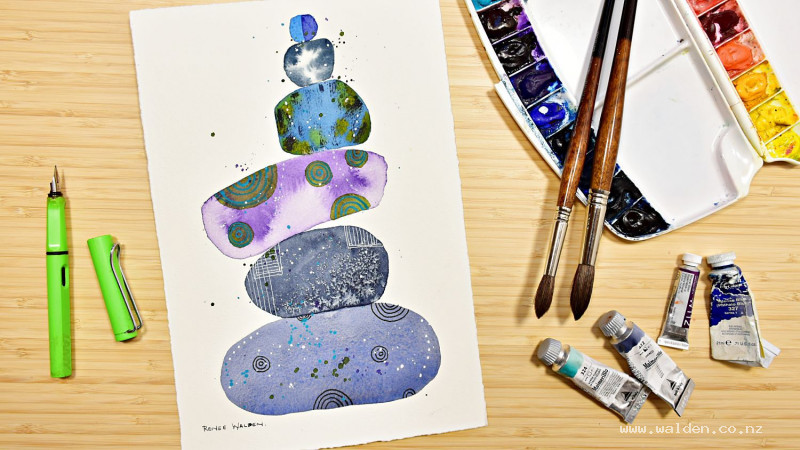
We’ll begin with a quick look at how I set up my workspace — a few simple tips that really help with focus and flow. Then we’ll get the brushes moving and paint something bright and cheerful: a rock cairn, where each stone uses a different, essential watercolour technique.
This is one you can return to whenever you need a refresher or feel creatively stuck — it’s perfect for a reset.
Happy painting!
Video run-through...
About This Lesson
A behind-the-scenes look at the studio setup, followed by a practical techniques worksheet covering some of the most useful tools and effects in watercolour — salt textures, blooms, granulation, dry brushing, and mark making with pens and gouache. This is an ideal warm-up lesson for beginners or a useful refresher for anyone wanting to get more familiar with their materials before diving into a full painting.
Part 1: Studio Setup
Layout
Having a logical, consistent workspace makes painting much more fluid. The general principle: everything you reach for constantly should be within arm's reach, and positioned so you don't have to cross the painting to get to it.
For right-handed painters, keep the palette and water jars on the right. Brushes currently in use go on the left. Less-used tools — palette knife, pens, scratching tools, bulldog clips — go at the top. Paper towels, colour swatches, and reference sketches or thumbnail drawings sit where they can be glanced at quickly without picking them up.
Keep a thumbnail sketch or reference drawing visible at all times during painting — not to slavishly copy, but to check in when you've lost track of what you were thinking.
The Board and Angle
Painting with the board at a slight angle rather than flat helps in several ways: it protects your neck (especially important when standing), the natural flow of water down the page helps prevent blooms, and the paint dries more evenly from top to bottom. A piece of wood underneath one edge of the board is all that's needed.
Board material matters. If you're working on loose sheets without a block, make sure the board is made from something food-safe or inert — bamboo breadboards work well, as do acrylic or perspex sheets. Boards made with unknown glues or resins can leach into wet paper and leave yellow stains, sometimes appearing weeks later.
Paper
The cheapest way to access the highest-quality watercolour paper is to buy full sheets and tear them down to size. Manufacturers put their best paper into their full-sheet offerings. Tear rather than cut for a natural deckled edge.
For sketchbook work, look for 100% cotton paper — thicker is generally better. Tape with standard masking tape from the hardware store for economy, or washi tape for a cleaner, more forgiving edge (it peels off beautifully and leaves a sharp line).
Always use bulldog clips when working in a sketchbook to prevent the pages shifting.
Palette and Paints
A palette with large mixing wells is essential — you need enough room to load a brush fully with paint, which is not possible from small wells. Tube paints squeezed into the wells and allowed to dry are ideal; they reactivate easily with water and are ready to use at any time.
Pan paints work fine but should be mixed into a ceramic or separate mixing palette rather than used straight from the pan.
Keep white gouache on a completely separate palette — even a tiny amount mixed into the watercolour wells will make all subsequent washes look chalky and opaque.
Paper Towels
Always within reach, usually in the non-painting hand. Essential for: testing colour before it goes on the paper, lifting out mistakes, drying the brush between colour changes, controlling the wetness of a brush, and dabbing up unwanted water.
Part 2: Techniques Worksheet
Work through each of the following on a single sheet, creating a reference you can keep. Label each section as you go.
Salt Textures
While a wash is still wet, drop table salt granules onto the surface. The salt draws moisture from the paper and displaces the pigment, creating star-shaped, crystalline marks as it dries. The effect varies with timing — too wet and the marks spread into formless blooms; too dry and nothing happens. Experiment with different levels of dampness and different amounts of salt.
Important: brush the salt off cleanly when dry (use a fingernail to dislodge any stubborn grains) and keep salt well away from the palette — even a few grains in a mixing well will affect future washes.
Blooms (Backruns)
Blooms happen when wet paint is touched by water that is wetter than the surrounding paint — the water pushes outward into the drying wash and creates a characteristic flower-like edge. This is often an accident, but it can be used deliberately for texture and atmosphere.
The size of the bloom depends on the relative wetness: a very wet addition into a very wet wash creates a large, soft bloom; a wet drop into an almost-dry wash creates a small, hard-edged one. Experiment with splattering clean water into washes at different stages of drying to see the full range.
Dry Brushing
Load a flat brush with thick, almost-dry pigment (very little water). Drag it lightly across cold-pressed or rough paper. At the lightest touch, the bristles skip across the raised texture of the paper and leave broken, flickering marks — perfect for suggesting rough surfaces, foliage edges, or sparkling water. A flat brush is far easier to dry-brush with than a round brush.
Granulating Colours
Granulation happens when heavy pigment particles settle into the dimples of the paper surface while finer particles float on top, causing the colours to visually separate as the paint dries. The effect is enhanced by working very wet — the wetter the wash, the more the heavy pigments sink.
You don't need to buy specialist granulating paints to get this effect. Ultramarine blue mixed with a fine-pigment colour (such as quinacridone sienna or a pyrrole colour) produces beautiful granulation — the heavy ultramarine settles while the finer pigment floats. This ultramarine/quinacridone sienna combination is also an excellent shadow colour and appears throughout the lesson series.
Mark Making with Pens and Gouache
Use the finished worksheet as a surface to experiment with:
- White gel pen — works best over dark areas. If it stops flowing, rinse the tip in water and wipe clean; it often clogs with dry pigment around the ball. Note that gel pens run out of ink faster than expected.
- Posca or acrylic markers — always shake with the lid on before opening to avoid paint spray. Makes bolder, more opaque marks than a gel pen.
- Fountain pen with permanent ink — the permanent ink means you can paint over it once dry without smudging. A fine nib held upside down produces an even finer line than normal.
- White gouache splattering — load a rigger or your favourite splatter brush, and flick or drag. Wetter paint produces larger, more spread-out marks; drier paint makes smaller, more defined ones. Keep gouache on its own palette and clean your water thoroughly after using it.
- Opaque colours — cobalt turquoise and similar opaque watercolours can be added on top of existing washes as a final accent. They sit on the surface rather than soaking in and read as bright, distinct marks even over dark areas.
Resources...
* Worksheet
Join me on Patreon
Join my Adventures in Colour Tier for $16 to access this post and my full library of over 200 others including deep-dive videos and step-by-steps.