 Video on Patreon
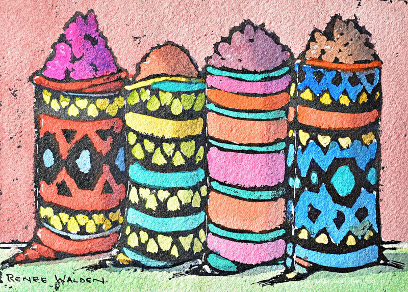
Moroccan spice bags
26 March 2026
Video - Level ◆◆◆
I'm just back from Marrakech — and what a trip it was. Colour, noise, light, and more painting inspiration than we knew what to do with. In this week lesson we're painting something we spotted on day one in the souks: beautiful spice bags, piled high and made out of these brightly coloured rugs.
This one's a bit different, because I promised to show you new techniques occasionally. We're using gouache as a resist with Indian ink, then layering watercolour over the top. The result has a gorgeous rustic quality — almost like a woodblock print.
Not sure what that means? Don't worry, I'll walk you through it. Once you've tried it, I think you'll find yourself wanting to use this approach on lots of different things : flowers, still lifes, landscapes, buildings. I'm looking forward to seeing what you try.
Happy painting!
Video run-through...
About This Painting
Colourful spice bags from the souks of Marrakesh — bags made from woven rugs with spices piled on top, painted in a bold, graphic style inspired by woodblock printing. The technique is completely different from a standard watercolour lesson: gouache is painted as a resist, Indian ink is applied over the top, and then the whole thing is washed in the kitchen sink to reveal the design. Watercolour is added last.
A traceable drawing is available in the lesson description.
Materials — Read Before Starting
This lesson requires a few things beyond the normal watercolour kit:
Indian ink (also called China ink): The resist process only works with Indian ink — not waterproof drawing ink, fountain pen ink, or other types. A small bottle is sufficient.
Gouache: White gouache works fine throughout. Colour gouache can be used but most of the colour washes away during the rinsing step anyway.
Flat brush (medium to large): For applying the Indian ink in as few strokes as possible.
Dish soap or brush soap: Have it ready and nearby. The Indian ink must be washed off the brush immediately — don't let it dry on the bristles.
Apron: Strongly recommended. Indian ink is extremely staining. You will be handling a wet, ink-covered sheet of paper at the sink.
Clean kitchen sink: Free of oils and food residue before use.
The Technique: How It Works
- Gouache is painted over every area you want to keep colour-able — it acts as a resist to the ink
- Indian ink is painted over the entire surface — it soaks into the unpainted paper (your pencil lines and any areas left bare) but sits on top of the gouache
- The paper is washed in the sink — the gouache lifts away, revealing clean paper in those areas while the ink has permanently stained the exposed paper
- Watercolour is painted into the clean areas — the bold ink lines frame everything
The result has the character of a woodblock print: slightly imperfect, grungy, graphic.
The Drawing
Draw with clear, confident pencil lines — they define where the ink will go. The pattern lines should curve gently to suggest the bags are rounded and full, not flat rectangles. Simplify the pattern; the finer the detail, the harder it is to paint around the lines. Any missed details can be added later with black ink or pen.
Painting Order
- Apply gouache resist to all areas except pencil lines
- Apply Indian ink over everything — wash brush immediately
- Rinse the whole painting in the sink to remove gouache
- Add watercolour washes
- Shadows
- Final details with ink and white gel pen
Step 1: Gouache Resist
Squeeze a small amount of gouache onto a separate palette (not your watercolour palette). Add just enough water to make it flow, but keep it fairly thick — thicker gouache resists the ink more completely; thin gouache may let ink bleed through.
Paint the gouache everywhere you want to preserve paper for watercolour later. Leave all pencil lines unpainted — those become the black ink lines. Leave any areas you want to be solid black also unpainted.
Work with a smaller brush to get close to lines and into pattern areas. Don't worry about being slightly untidy — gaps and broken edges in the gouache will let small amounts of ink in, adding a grungy, woodblock character that is part of the appeal.
For the spice tops: the denser the dots and dashes of gouache, the less black will show; leaving an area entirely bare means it stays solid black.
Dry the gouache completely (hairdryer or sunlight) before the ink step.
Step 2: Indian Ink
Pour a small amount of Indian ink into a palette well — it's easier to load the brush from a well than from the bottle. Use the flat brush.
Apply the ink in as few strokes as possible across the entire surface. Don't scrub or overwork — overlapping strokes can show as streaks. Work quickly but calmly.
Clean the brush immediately with soap and water. Don't wait. Indian ink is permanent once dry.
Dry the ink completely with a hairdryer.
Step 3: Washing in the Sink
Take the painting to a clean kitchen sink. Run it under cold water, or soak it. Scrub gently with an old hardware-store brush or a stiff brush to loosen the gouache. The gouache will lift, revealing the clean paper beneath.
Be thorough — remove all the gouache. Once the paper is clean, place it flat or hang it to dry.
The result should be a bold black-and-white design of your pattern with clean white paper in all the areas you painted with gouache.
Step 4: Watercolour Washes
Now paint the clean paper areas in any colours you like. The ink lines will contain and frame each section, making the painting forgiving and satisfying to fill in. Keep the washes clean and relatively simple — the strength of the design is in the ink, not the colour.
Some suggestions used in this lesson: pyrrole red, phthalo green, cobalt turquoise, phthalo blue, Hansa yellow medium and deep, quinacridone rose, quinacridone sienna, pyrrole violet, burnt umber, pyrrole orange.
Some areas may need two or three layers to reach the intensity you want (reds in particular). Dry between layers. Let the reference photo guide you loosely, but don't feel bound to match the colours exactly — the painting should make sense as its own composition.
Step 5: Shadows
The light source comes from one side, with relatively gentle light (the souks are covered and shaded). Apply shadows on the right-hand side of each bag and underneath the spice mounds, using ultramarine blue and quinacridone sienna mixed together. Keep edges soft — apply the shadow wash and then soften the edge with a clean, slightly damp brush before it dries.
Shadows serve two purposes: separating one bag from the next, and showing that each bag is rounded and full rather than flat.
Step 6: Final Details
Black Indian ink or pen: Tighten any lines that went missing, add tassels at the bag bases (too fine for a brush), reinforce any edges that lost definition.
White gel pen: Any highlights you want to add for sparkle or to suggest light catching an edge.
Resist the temptation to over-tighten everything — the slightly imperfect, grungy quality is a feature of the technique, not something to fix.
Resources...
* Reference photo
* Drawing to trace
Join me on Patreon
Join my Adventures in Colour Tier for $16 to access this post and my full library of over 200 others including deep-dive videos and step-by-steps.