 Video on Patreon
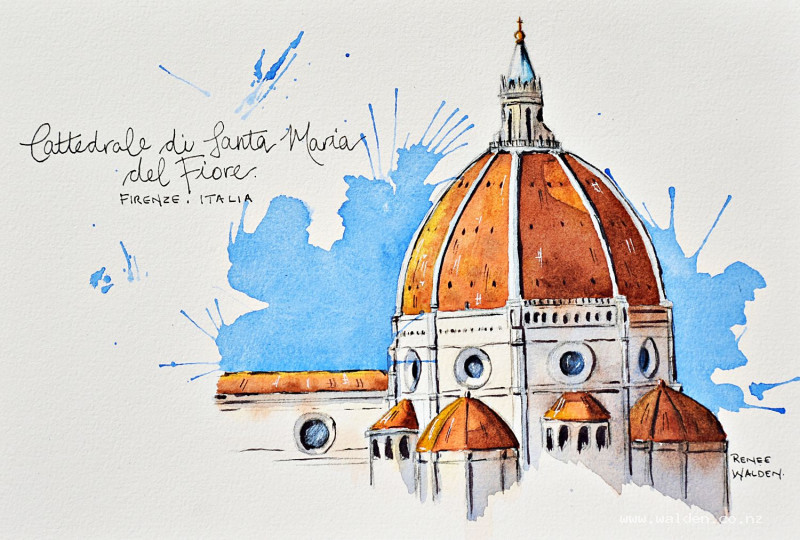
Cathedral in Florence
7 May 2026
Video - Level ◆◆◆
Let's travel together to beautiful Florence and paint the cathedral domes which are such a distinctive feature in any distant view of the city.
We've got lovely light in this scene, so very quickly your dome becomes three dimensional. Plus there's the burnt orange terracotta tiles against the blue sky - complimentary colours :-)
For the drawing, I'll start you off with a tiny bit of theory on 2-point perspective, and explain how domes work with that theory in mind. But remember, if you're not confident in drawing this scene yourself, then just trace the drawing and have fun with the painting part.
If you've never tackled an urban scene like this one, then this is a great lesson to start with.
Happy painting!
Video run-through...
About This Painting
The terracotta domes of Florence — a close-up study in warm, glowing earth tones, with a loose, splashy cobalt blue sky blown with a straw for contrast. The domes are already three-dimensional before a single shadow is applied, because the underwash shifts from warm sienna on the sunlit side through to dark burnt umber on the shadow side. Then shadows do the rest.
A traceable drawing is available in the lesson description.
Perspective Note: Distant Scenes Flatten
This view was taken with a long zoom lens from far away. This means the vanishing points are very far off the page — so far that all the architectural lines appear nearly flat rather than steeply angled. If things look odd in your drawing, this is probably why: the perspective is technically correct even though the angles feel shallow. The closer you are to a building, the steeper and more dramatic the angles; the further away, the flatter they become.
Dome ellipses: A dome above the eye level curves upward (smiley face); a dome below the eye level curves downward (unhappy face). Check your drawing before painting.
Colour Palette
Sunlit stonework: Natural sienna.
Mid-dome: Quinacridone sienna or burnt sienna.
Shadow side of domes: Burnt umber, or quinacridone sienna plus burnt umber.
White/cream sections: Very dilute natural sienna or earth tone — just enough to read as old stone rather than fresh plaster. Keep the sunlit side nearly unpainted.
Metal cupola top: Cerulean, very dilute.
Golden ball and cross: Hansa yellow deep.
Window glass: Cobalt blue (sky reflection), then a very dark cobalt-burnt umber mix to give depth.
Sky: Cobalt blue only — large, very wet pool.
Shadows: Cobalt blue and quinacridone sienna mixed in two mixes — one more brown (for orange stone surfaces), one more blue (for white/cream surfaces). The colour shifts within shadows from warm to cool.
Painting Order
- Domes — underwash, sunlit to shadow side in one pass
- White and cream stonework — light grunge washes
- Metal cupola top
- Details — windows, golden ball
- Sky — splashy wet wash, blown with a straw
- Shadows — light (ribs), then mid, then dark
- Pen work
Step 1: Domes — The Underwash
The entire three-dimensionality of the domes is established here, before any shadow is painted. Work with a relatively large brush, quite wet.
For the main large dome: start with natural sienna on the sunlit left side, shift to quinacridone sienna in the middle, and finish with burnt umber on the shadow right side. Drop in a little of the adjacent colour while still wet so they blend naturally. Aim for a smooth colour transition — the wetter you work, the easier this is. Blooms are fine; they add texture.
For the smaller cupolas: no ribs to use as dividers, so do the same colour shift freehand — natural sienna, quinacridone sienna, burnt umber — working across each one from left to right. This same technique applies to any rounded form: flower pots, lighthouses, columns.
Keep working across all dome shapes in sequence while still thinking about the light direction (from the left throughout).
Dry thoroughly with a hairdryer.
Step 2: White and Cream Stonework
The sunlit left side of white areas stays unpainted — the white paper itself reads as bleached stone in bright sun. For everything else, wet each section and drop in very dilute earth tones (natural sienna, or a touch of grey) to suggest age and texture. No hard edges — soften anything that looks sharp. The areas should still clearly read as white.
Step 3: Metal Cupola Top
Wet the area. Drop in a very dilute cerulean on the shadow side. A touch darker at the base. The blue against the surrounding orange is a beautiful complementary contrast even at this tiny scale.
Step 4: Details
Windows: Cobalt blue (sky reflection) first, then a very dark mix of cobalt blue and burnt umber while still wet. The contrast between the two gives the impression of glass rather than empty holes.
Golden ball and cross: Hansa yellow deep. Enough to read as gilded without competing with the domes.
Any other details (individual stone blocks, ornamental elements) are optional and should be considered carefully — simplicity often serves these paintings better than exhaustive detail.
Step 5: The Sky — Straw Technique
This is the loosest moment of the painting and intentionally so — a splashy, unpredictable sky balances all the tight controlled work on the domes.
Mix a large pool of cobalt blue with plenty of water — enough to keep the whole sky area wet throughout. The mix should be quite pigmented despite the water. Load the brush fully.
Working around the building, lay in a generous wet wash in an interesting cloud shape. Let the dome and steeple push up out of the sky rather than being contained within it. Ensure there is plenty of water along all the edges before using the straw.
Blowing with a straw: Hold the straw close to the paper and blow firmly to push the wet paint into spiky, branching trails. This is intentionally uncontrolled — some paint may cross over the building, which adds to the looseness. Blow separately loaded droplets of colour into the sky for additional marks.
Alternatively, use a hairdryer on full power held close to create the same effect.
Let dry naturally before hairdryer — drying too soon can create unwanted hard edges.
Step 6: Shadows
Three passes: light → mid → dark.
Light pass — rib shadows: Using a fine-pointed brush, apply a very dilute shadow colour (blue-brown mix) along the right-hand edge of each vertical rib. These give the ribs their rounded form without being too assertive.
Mid pass — broad shadows: Two shadow mixes ready: one brown-dominant (for orange stone areas), one blue-dominant (for cream/white areas). Using both brushes — large for blocking in, small for cutting around details — apply the mid-tone shadows. While each area is still wet, bring in the second colour so they blend seamlessly. The brown reflects the orange stonework back into the shadow; the blue reflects the sky. A hard line between the two colours is wrong; a soft blend is right.
Dark pass — final details: The same shadow mixes but much thicker — very little water. Work carefully around arches, window recesses, under overhangs, and along the deep shadow side of each dome. This pass is where all the crisp detail lives. Work slowly; take breaks if tired. Wobbly lines at this stage can be corrected with pen.
Tile detail (optional): A very dilute quinacridone sienna applied lightly over the tiled areas of the dome suggests texture without adding laborious individual tiles. If you do add individual tiles, note that they appear as narrow rectangles when seen from the side and wider rectangles when seen flat-on — and they shift from lighter (sunlit side) to darker (shadow side).
Step 7: Pen Work
Dark brown ink: Shadow sides only — under eaves, right-hand edges, inside arches, railings and architectural lines too fine for a brush. Verticals must stay vertical; check them regularly, especially towards the end when concentration flags.
White gel pen: Left-hand edges catching the light, highlights on metal, window frames on the sunlit side.
Keep pen work minimal — the washes are doing most of the work. As soon as the question "what should I do next?" arises, put the pen down.
If writing a title: Use permanent ink before painting so that watercolour washes over the lettering without smudging, and the pencil guideline can still be erased.
Resources...
* Reference photo
* Drawing to trace
Join me on Patreon
Join my Adventures in Colour Tier for $16 to access this post and my full library of over 200 others including deep-dive videos and step-by-steps.