 Video on Patreon
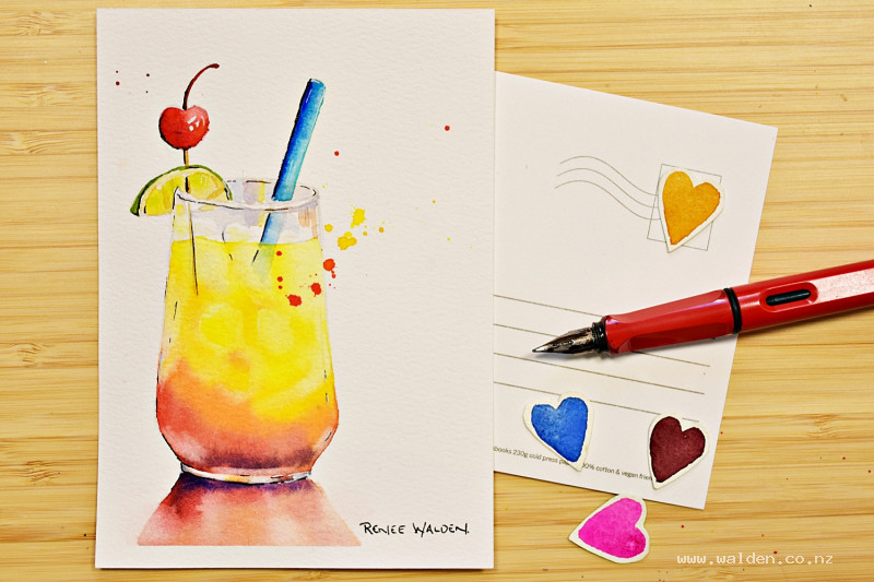
A cocktail
23 July 2026
Video - Level ◆◆◆
Who's painted along with all three summer postcards so far? Let's celebrate by painting a cocktail together. Cheers! Santé! Salud!
I won't pretend this one's simple — there's a glass, colourful liquid, floating ice, a reflection on the table, and a few pieces of fruit all doing their own thing. But here's the good news: we've already covered most of these skills in the earlier postcards, and I'll walk you through every single step. So take a breath, trust the process, and you've got this!
Happy painting!
Video run-through...
About This Painting
The final summer postcard — a celebration cocktail with a cherry, lime, and a brightly coloured straw. There's a lot happening in this one: a warm graduation from yellow through orange to deep red in the liquid, ice cubes lifted out of that wash while wet, reflections in the glass, and a collection of small details that all need careful attention. Work through it slowly and keep looking at the reference photo. The transparent pigments used throughout give the cocktail a convincing glow, as though you can really see through the glass.
A traceable drawing is available in the lesson description.
The Pencil Drawing
Start with a vertical centre line — draw it in and erase it later. Measure outward from this line at key points and place pairs of dots to mark the width of the glass at each level, then join the dots to build a symmetrical shape. The base of the glass has its own distinct curve — get that right before adding anything else. Once the glass shape is correct, add the cherry, lime, straw, and ice cubes.
Lighten the pencil lines with a kneadable eraser before painting, especially along the edges of the glass.
Colours to Prepare
- Hansa yellow medium — the brightest yellow, for the top of the cocktail
- Hansa yellow deep — for the mid section
- Pyrrole orange — for the transition zone
- Pyrrole orange plus quinacridone rose — for the red lower section
- Ultramarine blue plus quinacridone sienna — a rich dark for the very bottom of the glass
- Pyrrole orange plus quinacridone rose — mixed to a primary red for the cherry
- Hansa yellow medium plus a touch of blue — for the lime flesh
- Sap green — for the lime rind
- Phthalo or cobalt turquoise — for the straw
The Cocktail Liquid: Wet-into-Wet
Wet the entire liquid area of the glass — everything except the base section below the liquid. Make sure the water is completely clean so the yellows stay bright, and check for dry patches and pooling before starting.
Working quickly, drop in the colours in sequence from top to bottom: bright yellow at the top with a slight diagonal lean, deeper yellow in the mid section, orange below that, then the red mix, and finally the very dark ultramarine-sienna mix at the very bottom. Keep looking at the reference for the exact shape of each colour band — they're not flat horizontal stripes.
While everything is still wet, lift out the ice cubes using a clean, barely damp brush. The floating ice cubes sit at the top of the liquid; the submerged ones are lower down. Lift shapes carefully, defining edges between cubes where needed. The ice has rounded corners and some inner shadow. Work fast — once the paper loses its sheen, stop.
Leave any further highlights for now and let the whole thing dry. It's easier to judge how much more to lift once the surrounding colours are in place.
The Glass
Mix a slightly purplish version of the dark mix — ultramarine, quinacridone sienna, and a touch of quinacridone rose — to suggest the glass reflecting the cocktail colours. Paint the upper and lower glass sections with this, picking out the varied reflections: hints of yellow, orange, and blue in different places. Keep the rim closest to the viewer unpainted, and the back rim as well — in the reference photo these are clear of colour.
Cherry
Mix pyrrole orange and quinacridone rose to a rich primary red. Start from the shadow side and add water to bring it through to the lighter areas, trying to reserve the small highlights. Add a touch of orange to one side for variety. If highlights disappear, recover them later with a white gel pen.
Lime
Paint the flesh with Hansa yellow medium and a small touch of blue to shift it slightly green. Add sap green for the rind. The green is a welcome note among all the warm reds and oranges — keep it fresh.
Paint the cherry stalk with a fine brush.
Straw
Choose a colour that stands out from the warm palette — turquoise works well. Paint the section outside the glass brighter and more saturated, the section inside the glass paler, and the part submerged in the liquid paler still. Add a slightly cooler or darker tone to the shadow side.
The Table Surface
Wet the area beneath the glass and drop in the cocktail colours in the same sequence — red, orange, yellow — spreading outward from the base in a soft, graduated shape. Add a soft edge along the front. Keep everything diffuse, with some edges lost into the background.
Final Details and Pen Work
Stand back and assess the ice cubes — add a little shadow to any that need more definition. Check whether any highlights need to be lifted or recovered with a white gel pen. Be very sparing with pen work — just enough to bring the glass into focus. A fountain pen held upside down keeps the lines fine and prevents going too heavy. A white gel pen picks out the brightest highlights and can also knock back any pen lines that feel too dark.
A small amount of splatter in yellow, orange, and red finishes it off — keep it minimal.
Resources...
* Reference photo
* Drawing to trace
Join me on Patreon
Join my Adventures in Colour Tier for $16 to access this post and my full library of over 200 others including deep-dive videos and step-by-steps.