 Video on Patreon
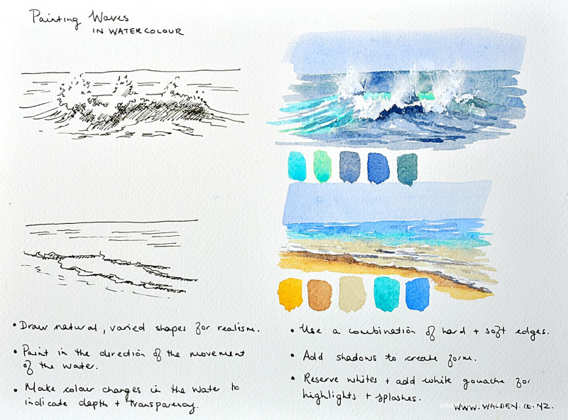
Painting waves
28 December 2022
Video - Level ◆◆◆
So many people have asked for lessons on painting seascapes. To start you off is this skills lesson on how I paint waves - big crashing waves and little ripples onto the beach.
There's so much to learn when painting seascapes - wet-on-wet techniques, charging in with colours, hard and soft edges, how to reserve whites, how to give the feeling of movement and capture light and drama.
Happy painting!
Video run-through...
About This Lesson
This skills lesson covers two distinct approaches to painting waves in watercolour: the big, splashy crashing wave out at sea or breaking against rocks, and the smaller, gentler ripples washing up on a sandy shore. It's a foundation lesson for painting seascapes more broadly — understanding how to observe and capture water movement, plan colour variation with depth, and use shadow to give waves believable form.
A downloadable worksheet with colour notes is available in the lesson description, along with two reference photos, one for each wave type.
How to Observe Waves Before You Draw
Before picking up a pencil, it's worth spending time simply watching the water. The direction of water movement is the most important thing to understand, because your brushstrokes should follow that movement. In a breaking wave, the water sweeps upward on either side of the curl, then becomes increasingly horizontal as it approaches the viewer. In a calm shore scene, the movement is mostly diagonal to horizontal, becoming more horizontal the further away it gets.
Notice also that waves have both hard edges and soft edges. The top of a curling wave is hard where it's folding over and compact; at the edges it dissolves into soft, hazy spray. Shadows are what give waves their sense of mass and weight — the darker you make the shadow beneath the white water, the whiter the foam above it reads.
Part One: The Big Crashing Wave
Drawing the Wave
Draw the wave loosely and organically — this is a random, unpredictable shape and the drawing should reflect that. Sketch the horizon line first, then the base of the wave, then the top: two areas where the water is folding over in hard, curved edges, and areas of soft, feathery spray at the edges. Include a few individual splashes escaping from the main mass. Lightly indicate the direction of water movement with soft pencil marks — these will guide your brushstrokes later.
There's no need to draw in all the shadow at this stage. The drawing is about capturing the shape and planning the direction of movement; the shadows are painted directly.
Colour Planning
The sea is rarely a single colour. For a moody, stormy wave, a useful starting palette includes cobalt teal (for the beautiful transparent turquoise visible through the compressed water in the wave itself), cobalt teal mixed with a little green gold (slightly warmer and greener), and a deep blue-gray mixed from ultramarine and burnt umber or sepia, with a touch of sap green added to shift it slightly toward a natural sea colour.
Avoid painting the whole sea in a single blue — it will look unnatural. Vary the colour deliberately: darker, heavier blues out to sea where the water is deep, shifting to turquoise within the wave where the water is thin and light passes through, and reserving bright white for the foam and spray.
Painting the Wave
Reserve the white of the paper for the foam, spray, and the brightest part of the crest — plan these areas carefully before applying any paint. Work with brushstrokes that follow the direction of water movement: sweeping upward on the sides of the wave, becoming more horizontal in the foreground.
Paint the deep sea behind the wave with the darker blue-gray mix. Work into the wave with the turquoise where the sun passes through the water. Keep the transition between colours loose and wet so they blend naturally. Leave the foam areas white throughout, and use the shapes of your painted areas to define the spray and splash forms.
Once dry, add shadows under the heaviest parts of the wave — beneath the curl, and where the spray meets the body of the wave below. This is the step that transforms a flat shape into a convincing mass of moving water. Use a deeper, darker version of your sea mix for these shadows. The contrast between dark shadow and bright white is what creates the illusion of weight and movement.
Part Two: Shore Ripples
Drawing the Ripples
The pencil drawing follows the same principle: indicate the horizon, sketch the wave shapes organically, and mark the direction of water movement. Shore ripples typically move on a diagonal that flattens out toward the horizon. Waves often overlap each other slightly as they come in — indicate this layering. Add marks to show where shadows will fall beneath the forward edge of each ripple, giving them form.
Colour Planning
A calmer, sunnier shore scene calls for lighter, warmer colours. A useful palette: natural sienna or raw sienna for the dry sandy beach; the same colour darkened with a little burnt umber for the wet sand where it's close to the water; a very light gray-brown (natural sienna, a touch of burnt umber, a little cobalt blue) for the extremely shallow water closest to shore; cobalt teal for the mid-depth water; and cobalt blue for the deeper water toward the horizon.
Note that wet sand can sometimes reflect the sky if it's very wet — in those cases it may pick up a blue tone. The boundary between dry and wet sand is an important transition to paint carefully, as it helps describe the movement and reach of the water.
Painting the Shore Scene
Start at the horizon with the cobalt blue, working in horizontal strokes. Leave small horizontal white gaps to suggest distant breaking waves — keep them modest and horizontal, as perspective compresses everything at that distance. Work forward, transitioning to cobalt teal for the mid-water, then to the pale gray-brown for the very shallow area near the sand. Reserve generous areas of white for the foam at the leading edge of each ripple.
Paint the wet sand with the darker brown mix, using negative painting — working the colour around the foam shapes rather than painting over them — to define the forward edge of each wave. Finish with the dry sandy beach colour. If the sky is dry, add it now.
Once everything is dry, add shadows beneath each wave and ripple to give them form. The shadows are the same blue-gray mix, lighter at the back (far away, and not wanting to compete with the foreground) and progressively darker toward the front. Even small ripples need a little shadow — this is the step most often omitted in beginner paintings, and it makes a significant difference to the result.
Key Principles for Both Wave Types
Direction matters. Paint strokes that follow the direction water is actually moving. Study the reference photo before drawing.
Vary your colours. Deep water is usually darker; shallow water shifts toward turquoise and then warm sandy tones near the shore. A single colour reads as flat and unnatural.
Reserve your whites. Foam, spray, and bright crests are the white of the paper. Plan where these are before applying any paint.
Shadows create form. Without shadow beneath and behind the white water, waves read as flat. The darker the shadow, the whiter the foam above it appears.
Organic shapes. Waves are irregular and random. Resist the urge to tidy or symmetrise them.
Resources...
* Worksheet
* Reference photo
* Reference photo
Join me on Patreon
Join my Adventures in Colour Tier for $16 to access this post and my full library of over 200 others including deep-dive videos and step-by-steps.