 Video on Patreon
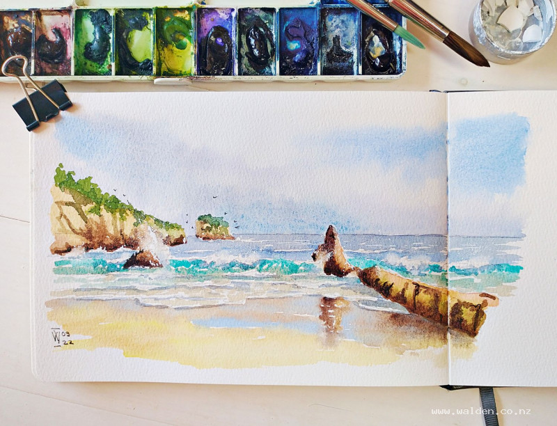
Seascape in Asturias, Spain
4 January 2023
Video - Level ◆◆◆
In this lesson we're going to paint my favourite beach on the north coast of Spain. There's a small island, rocks, crashing waves and little waves lapping the beach. A bit of everything you'd find at a beach :-)
I've sketched this in my sketchbook in just the same way as if I had been sitting on the beach and painting on location.
This lesson puts into practise the skills learnt in the previous "Painting waves" tutorial. You can do this lesson without doing that one, but if you've never painted waves before you might find it easier to start with the skills lesson first.
Video run-through...
About This Painting
This seascape brings together both wave techniques from the previous skills lesson — the big crashing wave and the shallow shore ripples — in a single painting of a favourite beach on the north coast of Spain. The scene features a distinctive offshore island (Castrop), a dramatic blade of rock that splits the beach in two (el Cuchillón, The Knife), a separate rock called Castine, and the moody, cloud-filled sky typical of this Atlantic coastline. It's a scene painted from real observation over many visits, working from two reference photos combined — one for the rock and wave structure, one for a specific wave breaking behind Castine that separates it visually from the headland.
Two reference photos are provided. The rock formations are the same in both; what changes are the waves. Use them together rather than choosing one.
The Pencil Drawing
Start with the horizon line, using a ruler — a wobbly horizon is distracting in a seascape. Then draw the island first, as the key landmark. It has a distinctive profile: one cliff set back, a section coming forward, a ramp descending to the right, and scrubby bushes along the top. Getting the silhouette right matters more than any internal detail at this scale.
Add the left-hand cliff and headland — almost horizontal but not quite — with vertical strokes and diagonal marks indicating the cracks and fissures in the rock face. These pencil marks serve as a reminder when adding shadows later. Draw the blade of rock (el Cuchillón) rising from the beach, and Castine standing separately to the right. For both, add a few marks showing the direction of the rock strata.
Now place the waves. The main breaking wave sits in the mid-ground, with the foam continuing on either side of the blade of rock. A wave breaks behind Castine specifically to separate it from the headland — this is the key compositional reason for the second reference photo. Add smaller waves getting progressively flatter toward the shore, and the wet-sand lapping waves in the foreground. A couple of distant waves near the horizon complete the scene.
If working in a sketchbook spread, consider the composition across both pages: a cliff anchoring one side with the sea opening out on the other works well, and the composition can run across the centrefold.
Painting the Sky
Wet the entire sky area evenly with clean water, shaping carefully around the island. This is a moody, cloudy Atlantic sky — not stormy, but full of movement. A useful palette: cobalt blue for any patches of clear sky (a patch in one or both upper corners works well), cerulean blue for the cooler, hazier tone near the horizon, and a blue-gray with a touch of purple for the cloud masses. Having warm golden tones elsewhere in the painting, a slightly cool purple-gray in the clouds creates a pleasing complement.
Drop colours into the wet sky working from dark at the top toward lighter at the horizon. Leave cloud shapes as lighter, softer areas rather than painting them — the clouds are the unpainted spaces between the darker tones. Soften edges by drying the brush on a paper towel and gently lifting paint where needed. Aim for a mix of hard and soft edges: some cloud edges are sharp, others dissolve into the sky.
Let the sky dry completely before moving on.
Painting the Rocks and Cliffs
Mix a range of warm earth tones for the rocks: natural sienna or raw sienna as the base, burnt sienna for warmer, rustier areas, and a blue-gray (ultramarine and burnt umber) for the cooler shadowed faces. Paint each rock face with the base warm tone first, then drop in variations while still wet — cooler where faces are in shadow, warmer where catching the light.
For the cliff face, use vertical and diagonal brushstrokes that follow the direction of the rock structure. The cracks and fissures indicated in the pencil drawing guide where to place darker marks. The blade of rock (el Cuchillón) has a distinctive upright, knife-like shape — give it strong contrast between its lit face and its shadow side.
The bushes and vegetation on top of the cliffs can be suggested loosely with a varied green mix, keeping them secondary to the rocks and sky.
Painting the Sea and Waves
Work from back to front, letting each section dry enough before moving forward.
For the distant sea behind the island, use a flat, horizontal wash — a steely blue-gray, slightly lighter than the sky to suggest distance. Leave small horizontal white gaps to suggest wind streaks on the water and distant breaking waves. These marks should be very horizontal and understated.
Moving forward, shift gradually toward the turquoise colour visible in the mid-ground water. As you approach the breaking wave, change from horizontal strokes to strokes that follow the direction of water movement — upward and curling as the wave rises, returning to horizontal as the water flattens out. Reserve the white of the paper for foam throughout.
In the foreground, where the water is very shallow, shift to the sandy gray-green of water over wet beach, and leave generous white gaps for foam. Finally, paint the wet sand itself in a warm brown darkened with a touch of blue, using negative painting around the foam shapes to define the leading edge of the waves.
Softening Edges and Adding Movement
Once the water washes are dry, some edges will be harder than the movement of the water warrants. Using a damp, slightly stiff flat brush — a cheap one is ideal, as this process is hard on bristles — gently scrub and lift paint in the spray areas, particularly where waves crash behind rocks or spray breaks at the top of a crest. Clean and dry the brush frequently to avoid moving colour where you don't want it.
The goal is a mix of hard and soft edges. Hard edges read as solid, heavy water; soft edges read as spray and mist. Not everything should be softened — only the areas where the wave is dissolving into air.
Note: some papers and pigments resist lifting. Fabriano paper lifts well; phthalo blue and certain crimsons are known to stain and will not lift. If lifting isn't working, a white Posca or gel pen can add highlights manually instead.
Shadows on the Waves
Use the steely gray-blue mix from the back water, slightly darkened, for shadows. Apply shadows under the heavy, curling parts of each wave — these are the areas where the water mass is at its thickest and the shadow is deepest. Use a small brush and keep the shadow shapes organic and varied. For the foreground ripples, the shadows are flatter and more horizontal.
Add very diluted versions of the same mix as faint dots and dashes within the spray itself — just enough to suggest that the spray has volume rather than being purely flat white. Check for any cast shadows from rocks onto the water and include those too.
Gouache Spray (Optional)
A little white gouache flicked from a flat brush adds the random, scattered quality of sea spray convincingly. Cover any areas you want to protect with a piece of paper or towel first, load the brush well, and flick. This works better than painting spray marks manually, which tend to look too deliberate.
Pen Work and Finishing
Pen work is optional in a seascape — many work without it entirely. Where this painting has enough rock to warrant it, a fountain pen with dark brown ink is used very sparingly: defining a few cracks in the rock faces, adding some highlights and wet-rock sheen with a white gel pen, and — a finishing touch — a handful of seagulls added with the pen turned upside down for a finer line. Small ticks in varying directions and sizes, odd number, some near the island. They add life and a sense of place without demanding attention.
Sign or initial and add the date. Done.
Resources...
* Reference photo
* Reference photo
Join me on Patreon
Join my Adventures in Colour Tier for $16 to access this post and my full library of over 200 others including deep-dive videos and step-by-steps.