 Video on Patreon
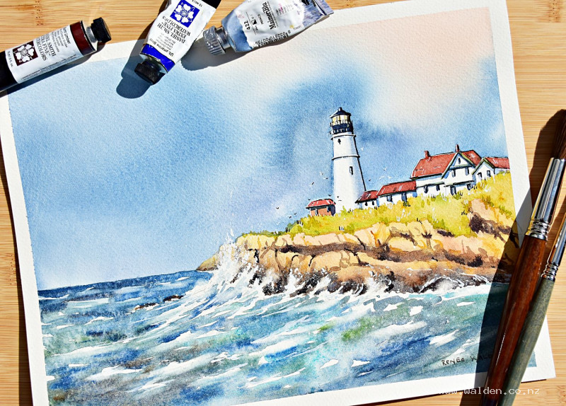
Lighthouse with stormy sea and sky
11 January 2023
Video - Level ◆◆◆
Somehow lighthouses, stormy skies and crashing waves are meant to go together. Especially in watercolour :-)
This lesson puts into practise the skills learnt in the previous "Painting waves" tutorial. You can do this lesson without doing that one, but if you've never painted waves before you might find it easier to start with the skills lesson first.
Thank you to Carl Newton on Unsplash for the reference photo of this lighthouse in Maine, USA.
Video run-through...
About This Painting
Lighthouses, stormy skies, and crashing waves are a natural combination — the lighthouse implies safety and security set against something dramatic and threatening, and that tension is what makes the subject so compelling to paint. This lesson builds on the wave skills from earlier in the seascapes series, adding a dramatic stormy sky, a white lighthouse as the focal point, and crashing waves against rocky cliffs.
A traceable pencil sketch is available to download if you'd prefer to skip the drawing stage.
Composition Notes and a Key Decision
The composition is based closely on the reference photo, with two small changes: the cliff band has been lowered to allow more sky and water, and a rocky reef near the horizon has been removed as it wasn't contributing anything.
The most significant change is a deliberate reversal of the light direction. In the photograph, the light comes from the right. For the painting, it's flipped to come from the left — this means the front faces of both the lighthouse and the smaller building are in the light, allowing them to be set against a very dark sky for maximum contrast. The waves also catch the light from the left, which adds sparkle and drama. Keep this in mind throughout: everything catching light is on the left, shadows fall to the right.
Preparing the Paper
Because so much of this painting depends on bright whites — the lighthouse, the building fronts, the wave foam — it's worth lightening the pencil sketch with a kneadable eraser before starting. Graphite smudged under painted whites will dull them. A kneadable eraser (similar in texture to Blu Tack) also picks up smudge from the paper surface that a regular eraser misses.
Painting the Sky
The sky is the most important wash in this painting and needs to be painted quickly, confidently, and wet on wet. Mix all your colours before wetting the paper.
For the warm, golden glow on the lit side: quinacridone sienna. This has a slight red bias that prevents it turning green when blue is introduced nearby. Raw sienna or natural sienna with a touch of red also works.
For the stormy sky: a large, very wet mix of Payne's gray, ultramarine, and phthalo blue in roughly equal proportions. Mix them loosely rather than to a uniform color — the three pigments will separate on the wet paper and create beautiful, graduated effects. Have permanent violet ready to drop in near the horizon.
Wet the entire sky area thoroughly with clean water, using a flat brush to cut cleanly around the buildings and rocks. Prop the board at around 20–30 degrees so water runs down and helps the washes blend. Check from the side for dry patches. Then work quickly: drop the golden colour in on the lit side, then sweep the dark stormy mix across the rest of the sky, going very dark immediately to the left of the lighthouse so the white building pops against it. Leave streaks and lighter areas for cloud structure — you're aiming for drama, not a uniform gray. Add a little purple near the horizon while still wet.
If the sky starts to dry before you've finished, a small spray bottle can re-wet it. Let the sky dry completely and naturally — don't rush it with a hairdryer.
Painting the Sea and Waves
The sea for a stormy lighthouse scene is darker and more turbulent than a calm seascape. Begin with the distant water using a horizontal wash of a dark blue-green, leaving white gaps for distant wave caps. Move forward, transitioning to the wave area with the water still wet if possible, changing brushstroke direction to follow the wave's movement — upward and curling at the crest, returning to horizontal in the foam zone.
The main crashing wave is the focal point of the water. Reserve generous whites for foam. Use a mid-toned dirty green-gray for the wave body where the water is thick, and let it shift toward a richer turquoise where the water is thin and light passes through.
Deepen the water dramatically around the base of the rocks and cliffs — this contrast between dark water and bright foam is what gives crashing waves their energy.
The Rocks and Cliffs
The rocks are painted in layers. Start with a warm base wash — natural sienna or raw sienna — let it dry, then build up with darker, cooler tones mixed from burnt umber and ultramarine (or sepia and ultramarine). Vary the temperature across the rock face: warmer in the lit areas, cooler in shadow. Suggest the cliff's vertical structure with directional strokes, and indicate the ledges and cave-like formations with darker marks.
Add cracks and fissures in stages: first the broader shadow shapes with a mid-tone, then progressively finer and darker crack lines with a small brush and very little water. Don't cover every surface — leave beautiful wash areas alone. A few grass tufts at the top of the cliffs finish the rocky area.
The Lighthouse and Buildings
The lighthouse and small building are mostly reserved white. Once the background and sea are dry, add the details: the gray section near the lamp housing, the gray top, and any green trim to the rooflines. The small building has brick-coloured walls — a warm red-brown applied carefully. Add windows with a fine brush.
For the building shadows, use a mix of Payne's gray with a little ultramarine. Apply on the right-hand side of each structure and under the eaves, remembering the light source is from the left. While the shadow is still wet on the lighthouse, clean and dry the brush and soften the edge — this gives the cylinder its curved form. A second, slightly darker pass on the shadowed side deepens the form.
If the roofs read as too saturated, a light glaze of diluted burnt umber will calm them down without losing the colour entirely.
Softening Wave Edges
Once the sea washes are dry, some edges will be harder than they should be. Using a damp, stiff flat brush — a cheap one is ideal — gently scrub and lift paint in the spray zones around the main wave and where waves crash against the cliffs. Lift the loosened paint with a clean paper towel. Leave some edges hard (solid, heavy water) and soften others (spray, mist). The contrast between hard and soft edges creates the sense of movement.
Add fine shadow marks within the foam — very diluted blue-gray, applied as light dots and dashes. Foam is heavy and casts subtle shadow beneath itself.
Gouache Spray
Load a small, very clean brush with white gouache and add directional spray strokes around the main crashing wave, painting in the direction the water is moving. Use restraint — gouache sits on top of watercolour and can look out of place if overdone. Test the brush on paper first to check consistency. Cover areas you want to protect before flicking.
Pen Work and Finishing
Stand back from the painting and assess before picking up a pen. Fix any paint smudges or accidents now, while you can still repaint.
For pen work: a fine-nib fountain pen with dark brown ink handles the shadow sides of the buildings, cracks in the cliffs, and any definition needed in the rocks. A white gel pen adds highlights on the left-hand (lit) sides of the buildings and catches the light on wave crests. Since the sky is dark, white seagulls can be added with the gel pen — small ticks of varying sizes and directions, odd number, in the sky around the lighthouse.
If the top edge of the lighthouse needs tidying, a white Molotow or Posca marker gives a clean, crisp line.
Sign in a corner, remove the tape, and step back. The combination of a glowing warm light against a dark, dramatic sky with white foam and a bright lighthouse is one of the most satisfying compositions in watercolour — and this one earns it.
Resources...
* Reference photo
* Drawing to trace
Join me on Patreon
Join my Adventures in Colour Tier for $16 to access this post and my full library of over 200 others including deep-dive videos and step-by-steps.