 Video on Patreon
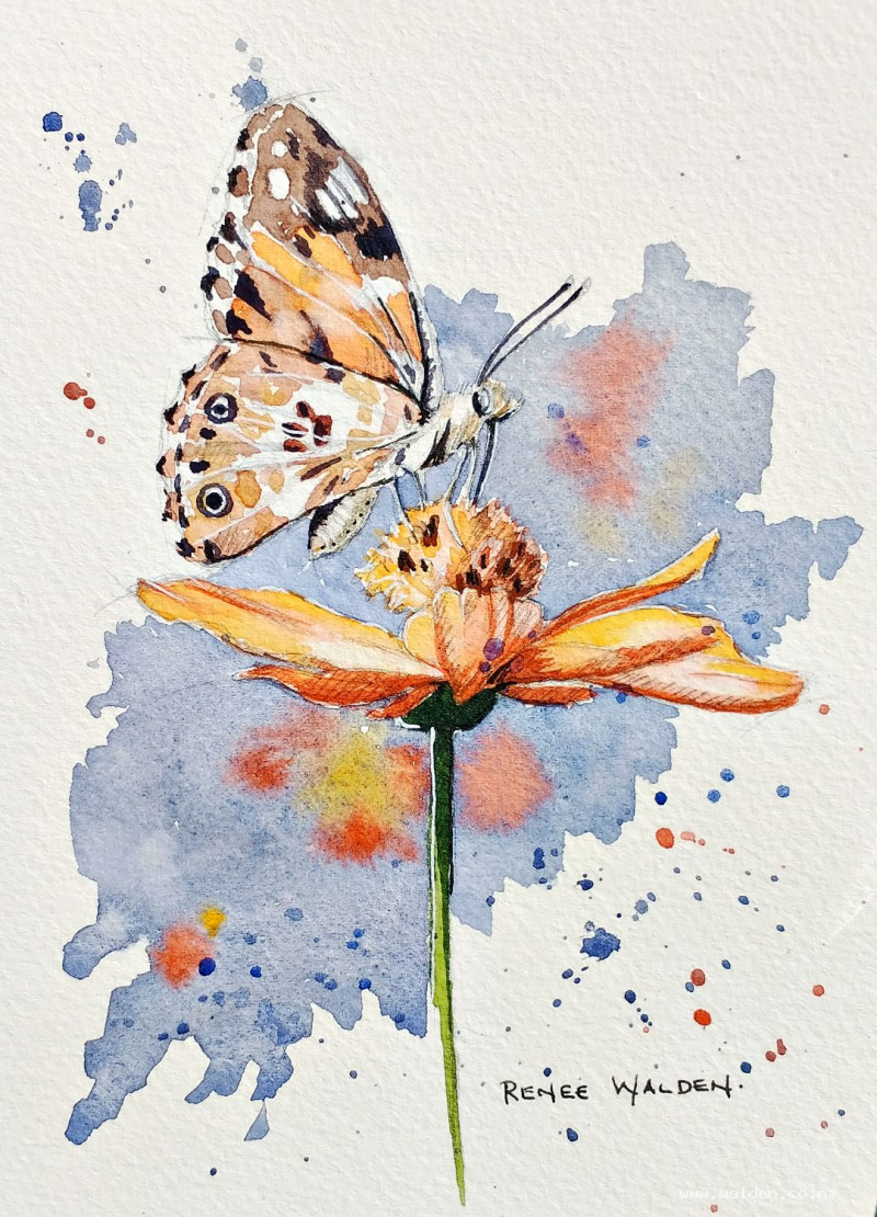
Butterfly on a cosmos flower
29 March 2023
Video - Level ◆◆◆
I must be dreaming of spring! Maybe those of you down south, who are in the height of summer, can spare a thought for us in the northern hemisphere ;-)
Wherever you are, let's paint something summery together.
Thank you to Yuici Kagey on Unsplash for the reference photo.
Video run-through...
This hour-long video covers the following material.
About This Painting
Painted in the depths of a Northern Hemisphere winter as a breath of summer — a butterfly resting on an orange cosmos flower, found while scrolling through reference photos and too good not to paint immediately. The approach is unusual: rather than erasing the construction marks from the pencil drawing, they're kept and even enhanced with hatching, making the pencil an active part of the finished work rather than something hidden beneath the paint. Loose, wet washes of transparent orange over a detailed, confident pencil drawing is the combination that gives this painting its quality.
A traceable drawing is available in the lesson description.
The Pencil Drawing as a Feature
Normally, construction marks are erased before painting begins. For this painting, they're left in — and taken further with deliberate pencil hatching to indicate shadow. The logic is that the pencil handles the tight, precise detail, and the paint stays loose. If you'd prefer no visible pencil, lighten the drawing with a kneadable eraser before starting. But if you want to try something different, work up the shading with hatching now, keeping all the marks going in the same consistent direction. The light source is from the left, so shadows fall to the right and underneath.
Hatch the shadow areas on the petals where they fold and overlap, the underside of the butterfly's body, and the shadowed areas of the central disc. These marks will show through the paint washes and do much of the descriptive work.
Colour Choices: Transparency Matters
Pyrrole orange is the key colour for the cosmos — it's highly transparent, which is what gives the petals that luminous, light-passing-through quality. If substituting cadmium orange, use a very large amount of water to compensate for its opacity. Similarly, Hansa yellow deep is transparent; cadmium yellow is not, so the same caveat applies. Transparency is not optional here — it's what makes the painting glow.
Painting the Cosmos Petals
Use a large brush and work loosely — the pencil drawing is doing the precise work, and the paint's job is to add colour and light, not to add more information. Start with the lightest, most transparent yellow in the areas catching the most light, where the petals almost seem to glow from within. While still wet, bring in the pyrrole orange for the deeper, shadowed areas and let the two blend softly.
Once dry, refine the petals in two ways. First, lift out paint in two or three places where the highlights are brightest — a clean, slightly damp flat brush rubbed gently will lift colour back toward the white of the paper. Second, use a smaller brush with slightly thicker orange to add shadow marks along the folds and overlaps. For soft folds, put the mark down then immediately clean and dry the brush and soften the edge. For hard folds — where the petal crumples abruptly — the edge can stay hard.
Look carefully at the reference photo throughout. An orange flower has many colours within it: brighter yellows, deeper oranges, even areas that lean slightly brown. Noticing and including this variation is what separates a living flower from a flat symbol.
The Central Disc
The central flower disc is a tight, textured sphere. Paint the highlight side (left) with yellow first, then bring orange around to the shadow side, keeping the edge irregular and textured. The disc should read as three-dimensional — a ball of texture, not a flat circle. Add small orange and brown shadow marks to suggest the individual florets, softening some edges so it looks like something is slightly disturbing them (a butterfly landing, perhaps).
The Stem and Calyx
Sap green works well for these, used fairly directly from the tube. Keep these secondary — they're supporting elements, not focal points. Once dry, mix a little indigo into the sap green for shadow on the back of the stem.
Painting the Butterfly
The butterfly has two key requirements: very dark markings and lifted highlights to suggest the slight translucency of the wings.
For the dark markings, mix ultramarine and sepia to make a near-black. Use the finest brush available and focus on the most distinctive marks — the eye shapes, the black border, the zebra-stripe area on one wing, the small tail mark, the proboscis. Don't labour over every dot and vein; the goal is that someone would recognise the butterfly, not that every mark is documented. Use a lighter, more diluted version of the same mix for the veins, which cast a small shadow even though they're light-coloured themselves.
Lift out highlights on the orange wings with a clean damp brush — the wings have a slight translucency and some areas are very light. For the legs, a touch of natural sienna is enough.
The Background
The background serves three purposes: it complements the orange with blue (a complementary colour pairing that makes both colours more vivid), it adds a dynamic diagonal sweep that contrasts with the tightness of the detailed flower, and it implies more butterflies and flowers through loose spots of orange and yellow within the blue.
Mix ultramarine and sepia to a dull, grayish blue. Apply in a confident diagonal sweep using a large brush for the open areas, switching to a small brush to cut in carefully around the flower and butterfly. While still wet, drop in a few spots of orange and yellow to suggest other flowers and wings in the distance. A little splattering of the same blue adds energy and texture to the background without needing more detail.
Cut in carefully along the back of the butterfly's body so the fine hairs stand out against the dark background.
Finishing: Pencil, White, and Ink
Once completely dry, assess what the painting needs. Often the pencil alone, combined with a little white gel pen on the highlight side, is enough. Be cautious with graphite on top of dried paint — it reads as shiny, which some people like and others don't.
The white gel pen is useful for the highlight side of the butterfly's body, extending a few of the fine hairs out from the thorax, and catching a few vein highlights. Note that gel pen white is very white against the warm cream of watercolour paper — use it sparingly in small areas or it will look out of place.
Dark brown ink from a fine pen, used with the nib upside down for an even finer mark, can tighten the butterfly's markings and sharpen a few petal edges on the shadow side. Use it very gently — this is a delicate painting and heavy pen marks will kill the mood. Stop as soon as you find yourself wondering what to do next.
Sign in pencil or in paint — whichever matches what you've already used in the work.
Resources...
* Drawing to trace
* Reference photo
Join me on Patreon
Join my Adventures in Colour Tier for $16 to access this post and my full library of over 200 others including deep-dive videos and step-by-steps.