 Video on Patreon
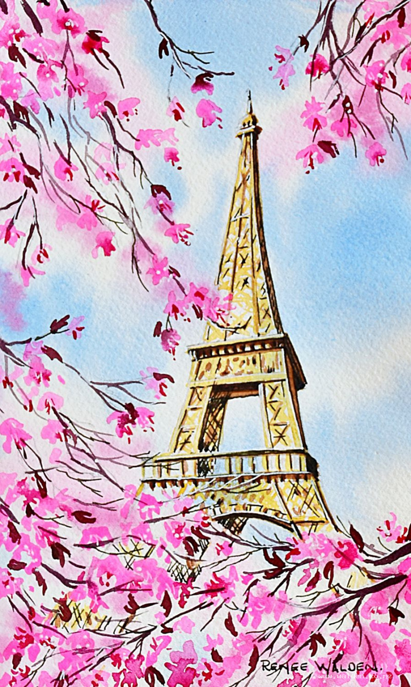
Eiffel Tower in spring
5 April 2023
Video - Level ◆◆◆
Come with me to the city of love. Paris of course! And in spring :-)
Video run-through...
About This Painting
Paris in spring — the Eiffel Tower freshly repainted in its new golden colour for the Olympics, framed by cascading cherry blossoms. This is a painting that layers wet-on-wet sky and blossom washes first, then builds the golden tower over the top, and finishes with detailed blossoms and fine branches. The result relies on leaving soft, hazy areas of pink intact beneath the tower's structure rather than painting over them — planning where not to paint matters as much as where you do.
Two reference photos are provided: one showing the blossoms across the tower, and one showing the top of the tower clearly. Use both together.
The Pencil Drawing
Place the tower slightly off-centre for a more dynamic composition than a symmetrical one. When drawing something tall and vertical, start with a plumb line — a perfectly vertical reference mark — to prevent the tower leaning. Work out where the plumb line falls within the structure, then build the rest of the drawing around it.
Once the tower is established, add the branches to frame it, leaving clearly defined open areas where clusters of blossoms will sit. Keep the distinctive arch near the base visible — it's a recognisable part of the silhouette.
Before wetting the paper, tidy the drawing with a kneadable eraser — roll it across the paper to pick up any smudged graphite from your hand, and lighten any lines that are too heavy. Once the paper is wet, pencil marks become permanent, so all erasing must happen before painting begins.
Colour Palette
For the sky: cobalt blue.
For the blossoms: two pinks at different strengths — opera pink (very diluted) for the soft, hazy background petals, and quinacridone rose or permanent rose for the deeper centres. If you only have one pink, add a touch of purple to create a darker version. For the new purplish-pink leaves emerging with the blossoms: pyroline violet, or a mix of purple and pink.
For the tower: natural sienna with a touch of quinacridone gold. Quinacridone gold is very intense — use it sparingly to warm the sienna toward a golden colour without overpowering it.
For the branches: pyroline violet with a little brown and a touch of cobalt blue, mixed to a warm brown-purple.
The Sky and Blossom Wash (Wet on Wet)
This is the foundation of the whole painting and needs to be done in one confident pass while the paper is wet. Tape the paper firmly on all four sides before wetting — press down the tape edges to prevent wet paint from bleeding underneath.
Wet the entire paper surface thoroughly and check from the side for any dry patches. Then drop in the cobalt blue, leaving white areas where soft clouds will be and where blossom clusters will go. Some blue behind the tower is fine — the structure is made of open ironwork and sky shows through naturally.
While still wet, bring in the very diluted opera pink into the white areas, letting it spread softly into the surrounding blue and white. This hazy pink represents blossoms that are either far away or in motion — soft and unresolved. Then drop in the darker quinacridone rose in tighter areas for a sense of depth within the blossom clusters. Let this all run and blend.
If any area of blue feels too heavy behind the tower, lift some out gently with a paper towel before it dries. Pick up any pools of water along the tape. Then leave it to dry completely — don't rush this stage.
Painting the Tower
Once the background is dry, study what you've got. Look for areas of soft, beautiful blossom colour that you want to preserve — plan your tower structure around these rather than painting straight over them. The tower is built of open girders, so there will be gaps where the background shows through anyway.
Mix natural sienna with a small amount of quinacridone gold for the tower's golden colour. Paint the main structural elements, working carefully around areas of preserved blossom and sky. Vary the tone as you go: slightly lighter on the left (the lit side), slightly darker on the right (the shadow side). Add darks where the ironwork overlaps and where the structural elements cast shadows on each other.
The lower sections of the tower — the broader arch and the platform buttresses — need a slightly heavier hand than the upper sections, which recede into the blossom and sky.
Dry thoroughly with a hairdryer before moving to the blossoms.
Painting the Blossoms
Now that the tower is in place, add defined blossom shapes over the hazy background wash. Use opera pink again, but at a slightly thicker consistency so the marks don't disappear completely into what's underneath.
Each blossom has four or five rounded petals. Paint some facing directly toward the viewer (a star shape), some at an angle, and some turned away — variety in orientation makes the clusters feel natural and three-dimensional. Work across the whole painting rather than finishing one area before moving to the next. Don't overdo it: the goal is enough detail to tell the story, with areas of soft haze still visible behind.
In the foreground, use slightly darker, thicker paint and larger shapes. In the background and distance, keep the blossoms smaller and softer. Let some clusters go off the edges of the paper — this suggests the tree extends beyond the picture frame and the viewer's world continues outside it.
Once the general clusters are placed, switch to a very fine brush (a zero or a rigger) for the stamens — the small, dark filaments that project from the centre of each blossom. Use the darker pink or a slightly purple-toned pink for these. They don't need to appear on every flower, but they are a distinctive feature of the blossom and worth including on the more prominent ones.
Add the purplish-pink new leaves using the pyroline violet mix — scattered among the blossoms in small clusters, using the shapes you've already created to decide where they belong. These add depth of colour and suggest the fresh growth that comes with spring.
The Branches
Paint the main branch structure with a small round brush using the brown-purple mix, using your pencil drawing as a guide but staying flexible — the branches need to connect your blossom clusters in a way that feels natural, not mechanical. Allow some twigs to pass over blossoms rather than always going behind; this layering adds depth.
Switch to a rigger or script liner for the finest twigs. Hold it upright and use a flicking motion, loading the brush well before each set of marks. Work toward the outermost tips of the branches, letting the marks become progressively finer. If you don't have a rigger, the finest pen work at the end will fill this role.
Pen Work
Dark brown ink in a fine pen, applied to the shadow sides (right-hand side and undersides of the girders), tightens the tower structure and helps correct any perspective wobbles from the painted stage. Work tentatively — the paint should remain the dominant element. The pen simply reinforces what's already there.
The white gel pen handles the lit sides: left-hand faces of the girders, tops of branches catching the light, and small dots of sparkle in the blossom clusters. The white Molotow marker can pick out any broader highlights on the tower's structure.
A few branches catching light from above, indicated with the white pen, give the trees additional dimension.
When you find yourself wondering what to add next, stop. Remove the tape, dry flat if needed, and sign.
Resources...
* Drawing to trace
* Reference photo
* Reference photo
Join me on Patreon
Join my Adventures in Colour Tier for $16 to access this post and my full library of over 200 others including deep-dive videos and step-by-steps.