 Video on Patreon
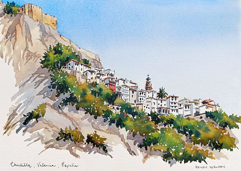
Hilltop town, Spain
10 May 2023
Video - Level ◆◆◆
I'm still in Chulilla, having a wonderful time painting the lovely white houses.
In our last lesson (a step-by-step) we sketched just a few houses, zooming in on all the details.
In this lesson we step right back and paint a much larger portion of the town, including the old moorish castle on the hill and the surrounding cliffs and bushes. We're going to minimise the detail, until we have just enough to make the town recognisable.
Video run-through...
This hour-long video covers the following material.
About This Painting
Chulilla is a beautiful village in Valencia, Spain, perched above a river gorge with dramatic limestone cliffs popular with rock climbers. The scene takes in the whole village from a distance: the old Moorish castle high on the cliff top, the church, a distinctive palm tree breaking the roofline, clusters of white and coloured houses, and the rocky cliffs and vegetation surrounding everything. The challenge here is the opposite of a close-up architectural study — instead of rendering detail, the goal is to suggest it, stepping back far enough that the whole scene reads as a place without any single element being laboured over.
A traceable drawing is available in the lesson description.
Approach: Distance and Selective Detail
Painting a whole village from a distance requires a different mindset from painting individual buildings up close. Rather than documenting every window and stone, look for a handful of distinctive things that tell the story of the place — the castle's silhouette, the church, an unusual palm tree, a pink house, yellow shutters — and include just those. Everything else is suggested rather than described. If the viewer is given enough clues, their imagination fills in the rest.
When planning the drawing, take some time measuring first with small marks on the page to make sure the whole scene fits — if the castle is drawn too large, there won't be room for the town below it. Place the castle high on the page to reinforce the feeling that it genuinely looks down on the village.
Paper and Setup
For a scene with this much wet work, tape the paper to a board or use a watercolour block. Work with the board at around twenty degrees so washes flow naturally. If you want clean edges, tape all four sides; if you prefer the looser look of an untaped page — as in a sketchbook — leave it free.
Painting the Sky (Graded Wash)
The sky for this painting is a simple, deep cobalt blue graded from dark at the top to almost nothing at the horizon. This graded wash is a skill worth practising separately, because getting it right makes a significant difference to the finished painting.
Wet the sky area twice — the first pass of water expands the paper fibres, and the second leaves a layer of water sitting on the surface ready to receive the paint. Cut in carefully around the castle and the upper rooflines, and have a paper towel ready to dab up any water that strays onto the buildings. Check from the side for dry patches before applying colour.
Mix a large, well-loaded pool of cobalt blue. Load the brush fully — paint right up into the ferrule — then sweep a single stroke all the way across the top of the sky. Then without reloading, sweep across immediately below, picking up the bead of paint at the bottom edge of the first stroke. Continue working downward in this way without reloading, so the paint naturally runs out by the time you reach the roofline. The result should be dark at the top, fading to almost nothing where the sky meets the buildings.
If the paper is still wet and the graduation isn't dark enough, you can do a second pass from the top. While the sky is still damp, use a smaller brush to tease the blue carefully into the nooks and corners around the buildings so there's no white halo.
A calm, plain sky is a deliberate compositional choice here — with so much happening in the village and cliffs below, the sky gives the eye somewhere to rest.
The Village Buildings
Work across the buildings from the most distant (the castle and upper cliffs) toward the foreground. The castle and church are painted with a minimal indication of stonework — enough to read as old and substantial, but not so much that they compete with the foreground. White buildings get a very light wash with colour variations dropped in wet to suggest plaster and age. Coloured buildings — the pink house, any with yellow shutters — get slightly more saturated colour that makes them stand out as the distinctive features they are.
For all the buildings at this scale, a small round brush is appropriate for most of the work. The goal is to indicate windows, rooflines, and a sense of material without painting every element individually. Follow your pencil drawing as a guide but don't feel bound by every mark.
The Cliffs and Vegetation
The cliffs are painted in warm stone tones — natural sienna, raw sienna, burnt umber — with variations dropped in wet to suggest the colour range of limestone. While still wet, add some cooler, darker marks to suggest cracks and fissures. The vegetation clinging to the cliff faces and surrounding the village is painted in a range of greens: sap green as a base, with indigo dropped in on the shadow sides for depth and brown in places to keep it from looking too vivid and fresh.
Work wet so the greens merge and create soft, varied edges. The organic, irregular quality of natural vegetation is very different from the straight edges of buildings, and the contrast between the two is part of what makes scenes like this interesting.
The Palm Tree
The palm tree is painted after the surrounding vegetation. Mix indigo with green for a blue-green frond colour and use a small brush, following the direction the fronds grow — upward from the trunk and then curving down. Add thick indigo on the shadow side to give the tree form. The palm tree's silhouette against the sky is one of the distinctive visual elements of this scene, so take a moment with it.
Shadows
Plan all the shadow shapes in pencil before painting, using two shadow mixes: a blue-gray (cobalt blue and burnt umber leaning toward blue) for white-painted buildings, and a warm brown-gray (the same colours leaning toward brown) for stonework. Having both mixes ready before starting means you can switch quickly rather than mixing mid-stroke.
Apply shadows on the left-hand side of all structures and underneath all eaves, starting with the castle and working down through the cliffs to the village buildings. On the cliffs, use the larger brush for the main shadow areas and the smaller brush to tease colour into cracks and fissures while still wet. On the buildings, the shadow wash can be quite light — at this scale and distance, the shadows are more about reinforcing the light source than depicting specific cast shadows in detail.
Do a first pass across the entire painting before going darker anywhere. It's easy to compensate if everything is at a consistent tone; it's harder to fix one area that went too dark while the rest is still light.
Add extra dark marks in the vegetation with thick indigo — a few dots and dashes on the shadow sides that give the otherwise soft greenery some depth and contrast.
Pen Work
At this scale, pen work is light and selective — just enough to tighten up a few key elements without overwhelming the loose, sketchy quality of the painting.
Use dark brown ink in a fine pen on the shadow sides only: a few marks on the castle to make it look old, some definition under eaves and inside windows in the main part of the town, shadow sides of a few key walls. Keep it minimal in the more distant areas and slightly more present in the foreground buildings. Turning the pen upside down gives a finer line for details like the cross on the church spire. A few tree trunks and branches stop the pen work from being entirely concentrated on the buildings.
The white gel pen adds highlights along the right-hand and upper edges of buildings catching the sun — used sparingly so it suggests rather than shouts.
Sign and date, then step back. In a scene with this much to look at, the temptation is to keep adding; resist it.
Resources...
* Reference photo
* Drawing to trace
Join me on Patreon
Join my Adventures in Colour Tier for $16 to access this post and my full library of over 200 others including deep-dive videos and step-by-steps.