 Video on Patreon
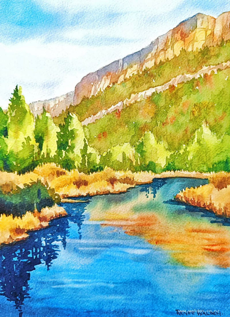
Cañon del Rio Turia, Valencia
31 May 2023
Video - Level ◆◆◆
I couldn't leave Chulilla in Valencia, Spain, without painting a view of the beautiful canyon. One evening, walking out from climbing in the canyon, I took this photo of the lovely evening light catching the cliffs and the reflections of the cliffs and trees in the water. It was a view just begging to be painted.
In this scene we paint cliffs, background forest, trees and, of course, reflections. It's a painting full of rich colour.
Enjoy!
Video run-through...
About This Painting
The Canyon del Turia in Valencia is a dramatic river gorge with golden limestone cliffs, pine trees clinging to the rims, and a river running quietly at the base surrounded by reeds and riverside vegetation. This painting captures a late afternoon in the canyon — the cliffs lit with warm, glowing light, the water reflecting the trees in dark, still passages, and the whole scene bathed in that particular quality of evening light. It brings together a range of skills: wet-on-wet skies, working colour-wet across large cliff faces, reflections, reeds, layered shadows, and the use of darkest darks in the foreground to push the background back.
No pen work is used in this painting — there are no man-made structures, and the cliffs and vegetation don't need sharpening.
A traceable drawing is available in the lesson description.
The Pencil Drawing
Keep the drawing light — this is a scene with a lot of warm golden colour, and heavy pencil marks showing through will muddy it. The cliff faces are the most important thing to get right: the angle of the cracks and features tells the viewer whether the cliff is vertical, overhanging, or slabby. A near-vertical mark reads as a sheer cliff; a more angled mark reads as a slope. Draw enough cracks to explain the geology without detailing every one.
Mark the reflections very lightly in pencil now, directly below the elements they reflect. This is a small investment that pays off considerably later — it's easy to get reflections in the wrong place without this guide.
Painting the Sky
Wet the sky area thoroughly with a flat brush, cutting carefully around the pine trees at the top of the cliffs and along the cliff edges. The sky for this scene is the pale, delicate blue of late afternoon — not dramatic, just warm and quiet.
Wet the sky twice (the first pass expands the fibres, the second leaves water sitting on the surface). Mix cobalt blue — a light pool, not heavily loaded — and a second mix of cobalt blue with a touch of burnt sienna for a warm, light gray for the cirrus streaks. Apply the blue first across the upper sky, then use the flat brush edge to pull a few soft cirrus streaks, picking up the colour with a clean, dried brush in places to soften and thin the marks. Stop as soon as the paint starts to feel sticky — forcing marks into semi-dry paint will leave hard edges in a sky that wants to be seamless.
Let the sky dry flat and naturally rather than with a hairdryer. The paint continues to move and settle while drying and will give a better result if left undisturbed.
Correcting the Skyline
Once the sky is dry, check for any blue that has crept over the cliff edges. The cliffs glow with golden, warm light, and a blue undertone beneath them will undermine that warmth. Use a slightly stiff, damp brush (an old acrylic brush is ideal — don't use a good watercolour brush for this) to gently loosen any strayed colour and lift it with a paper towel. Work in small areas, cleaning the brush thoroughly between each.
Painting the Cliffs
The cliffs are the heart of the painting and the most technically demanding section. A range of warm colours is used — natural sienna, quinacridone gold, burnt sienna, quinacridone sienna — with the cool blue-brown gray reserved for the areas where the cliff folds back toward the top and catches less light.
Paint the foreground cliffs first, then work toward the background, adding progressively more water to the same colours as you go. The background cliffs are the same hues but much lighter and less saturated — this recession in tone and saturation creates the sense of depth. Painting in this order (foreground to background) means the mix naturally weakens as you go.
Use a large brush and work quickly across the cliff face, letting the warm colours blend wet into wet. Brush strokes should follow the direction of the cliff — predominantly vertical for sheer faces. Drop in the different golden colours while still wet, letting them merge and separate naturally. Add the gray along the top of the cliff where the face begins to tilt back. Be careful not to mix the gray into the golden tones too aggressively — the gray is blue-biased and the goldens are yellow-biased, and overmixing will produce unwanted green.
Working with a large brush forces speed, and speed is what allows the colours to merge softly rather than creating hard boundaries between them.
The Pine Trees on the Cliff Top
Once the cliffs are dry, paint the pine trees using a small, pointed brush. These trees are silhouetted against the sky and the top of the cliffs, so their colour should be a dark, warm green — sap green and indigo, shifted slightly toward the cool side. The irregular, spiky profile of pine trees reads well at this scale with quick, varied vertical marks. Keep the trees different heights and slightly different colours to avoid a mechanical look.
Painting the Water and Reflections
The river is largely still, making clear reflections. The general water colour is a cool, light mix — cobalt blue with a little green — with the reflections of the cliffs and trees appearing directly below their sources as darker, slightly rippled versions.
For the cliff reflections, use the same colour mixes as the cliffs themselves, but slightly more muted and applied with horizontal strokes rather than vertical ones. Reflections in water are always horizontal, regardless of the angle of the subject. Add light horizontal marks across the reflection to suggest gentle movement on the water's surface.
For the tree reflections, use a dark indigo mix, keeping the marks vertical but feathered at the ends to suggest ripple. Check against your pencil marks to ensure each reflection sits directly below the thing it's reflecting.
The Reeds and Riverside Vegetation
The reeds and vegetation at the water's edge are built up in layers — each clump of reeds slightly in front of the one behind it, with negative painting along the bottom of each group to separate them and create a sense of depth.
Start with the lightest, most distant vegetation in muted greens and yellow-browns. For the foreground reeds and bushes, work with richer, warmer greens: sap green with a touch of quinacridone gold or natural sienna, shifting toward indigo on the shadow sides. Use the two-brush technique for the reed edges — paint a stroke, then clean and dry the brush and soften the lower edge immediately — so the reeds have soft, organic bases rather than hard lines where they meet the water.
Negative painting along the base of each reed clump (a dark mix of natural sienna and sepia, pushed toward indigo where the reeds touch the water) defines the clumps and makes them read as standing in front of each other.
Building the Shadows
Shadows are applied in multiple passes, working from a lighter general wash toward increasingly targeted dark accents in the foreground only.
The light source is from the right, so shadows fall to the left and underneath all elements throughout. Begin with a transparent shadow wash across the main shadow sides of the cliffs — an interesting mix of ultramarine and quinacridone sienna, well diluted, with large blocky shapes rather than fussy detail. The transparency of the wash allows the cliff colour and texture to show through.
Add forming to the bushes and trees with a darker version of the green mix (more indigo), softening some edges to keep the shadows from looking pasted on. Deepen the shadows under the reed clumps where they touch the water, using a very dark indigo-sepia mix.
The Darkest Darks
The final step is placing the very darkest marks — indigo mixed with sepia for a near-black — in the foreground only. The principle here is that the darker the foreground, the further back the background appears. These deepest marks go along the bottom edges of the foreground bushes and reed clumps, at the base of the foreground tree reflections, and in a few carefully chosen places where depth is most needed.
Work from the foreground toward the mid-ground, with progressively less dark paint as you go back. Nothing goes in the background — those cliffs need to stay light and receding. Vary the size and shape of these dark marks; uniform darks look mechanical.
A useful test at this stage: photograph the painting and convert to black and white. Do the same with the reference photo. Comparing the two in greyscale strips away the colour confusion and shows clearly where the tonal values are balanced and where more depth is needed.
Sign in paint — no pen has been used, so pen for the signature would be inconsistent. Remove the tape and step back.
Resources...
* Reference photo
* Drawing to trace
Join me on Patreon
Join my Adventures in Colour Tier for $16 to access this post and my full library of over 200 others including deep-dive videos and step-by-steps.