 Video on Patreon
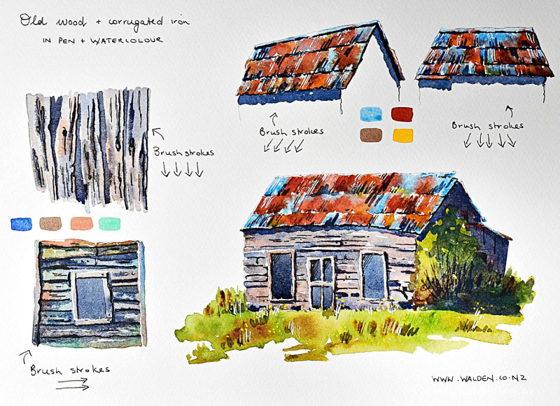
Old wood and corrugated iron
28 June 2023
Video - Level ◆◆◆
Let's paint worn, old wood and rusty iron. We'll start with a few short exercises and then put it together in a painting of a cute, little barn.
I'll show you how to create the feeling of something having lots of character, giving you examples of some colour choices. We'll be working quickly and with free strokes and charging in with colours to make everything look organic and natural. As always, we'll be concentrating on the direction of light and the direction of our brush strokes.
This lesson is a compliment to the lesson where we painted stonework and brickwork, and you can do the lessons in any order.
There's a downloadable worksheet below for you to print out and keep.
Video run-through...
About This Lesson
A companion to the stonework and brickwork lesson, this skills lesson covers two of the most commonly encountered textures in rural and agricultural painting: old weathered wood and corrugated iron. Both are approached with the same layered method — overall colour first, texture and detail second, shadows last — and the two are then combined in a small barn scene. A downloadable worksheet is available in the lesson description.
The Core Principle: Paint in the Direction of the Material
The single most important habit for painting wood or corrugated iron convincingly is to orient every brush stroke in the direction the material runs. Vertical weatherboards get vertical strokes. Horizontal cladding gets horizontal strokes. Corrugation ridges get strokes that follow the corrugations. This directional consistency, even without much detail, immediately reads as the right texture.
Old Weathered Wood
Colours
Weathered wood has lost most of its colour and sits in the gray-brown range. Mix three colours: a warm gray from ultramarine and burnt umber, straight burnt umber for the warmer areas, and burnt sienna for a slightly redder warmth in places. Where the wood was originally painted and has been sheltered (under an eave or inside a doorway), the original colour may still show; for exposed faces, the gray-brown weathered tone dominates. Working with these three mixes and varying between them gives the natural, uneven quality of aged timber far more convincingly than any single colour could.
First Wash
Paint in the direction of the planks, working wet and loose with a large brush. Start with the gray, then switch to the warm brown, then drop in the reddish-brown — letting the colours merge wet into wet. The wetter you work, the softer the colour transitions and the more the pigments will separate and create natural variation. Don't follow a pattern; vary which colour each plank is and let adjacent planks blur slightly into each other.
Wood Grain and Knots
While the first wash is still slightly damp (not wet, not dry), switch to a smaller brush with a thicker mix of the gray. Add a few grain lines running in the direction of the wood, and one or two knots — circular or oval marks where the grain swirls. These marks will soften slightly into the damp paint, giving them the right soft-edged quality of real wood grain. If the wood area is small, don't bother with this level of detail. Once the paint begins to dry, any marks you make will have harder edges and look more mechanical.
Gaps and Shadow Between Planks
Once completely dry, use a small brush with thick, dark gray-brown paint to fill the gaps between planks and to indicate where one plank overlaps and casts a shadow on the one below it. These shadow marks can have an interesting, slightly irregular edge on the shadow side — suggesting a broken or worn edge on the plank above. These darks are what give the planks their depth and make the wall read as three-dimensional.
Multi-Directional Wood
On a more complex structure — a building with both horizontal and vertical boards, or a window surround — paint each section in its own direction, keeping the strokes consistent within each section. The principle is the same; only the orientation changes.
Corrugated Iron
Colours
Old corrugated iron has a distinct warm rusty-gray quality. Ultramarine and burnt sienna (or quinacridone sienna) in varying proportions give an interesting mix that separates on the page into blue and warm tones — far more convincing than a flat gray. For older, rustier iron, lean the mix toward the sienna. For newer, shinier iron, lean toward the blue.
Painting the Corrugations
Paint in the direction of the corrugations. Corrugated iron panels are typically oriented so the corrugations run vertically on a wall and down the slope on a roof. Use a large brush and work quickly across the whole surface in one pass, varying the colour mix as you go. Leave occasional fine white gaps between strokes — these catch the light on the ridges and give the surface its characteristic metallic quality without any additional effort. The more gaps, the more sparkle; the fewer gaps, the flatter the surface.
While still wet, drop in variations: a little more blue in some areas, a touch of rust-orange in others, a slightly darker mix where the iron is in shadow or where one sheet overlaps another. Corrugated iron is never one uniform colour.
Overlapping Sheets
Where one sheet of corrugated iron overlaps the next, there is a cast shadow underneath the upper sheet. Once the base wash is dry, add a fine dark mark along the overlap line with a small brush. This detail immediately makes the roof or wall read as being made of individual sheets rather than one continuous surface.
The Barn Scene: Putting It Together
The barn combines corrugated iron roofing with old wooden weatherboards, surrounded by rough vegetation. The order of working is important: paint the building surfaces first, then add vegetation around them. Painting greenery first and trying to shape the wood around it restricts the brush strokes; painting the wood first and growing the vegetation over and around it is far more natural.
Walls
The barn's weatherboards run horizontally on the main face and vertically on the gable end — paint each in the appropriate direction using the same warm gray-brown mixes. The wood may have traces of original paint colour (a rusty red in this case) surviving in sheltered spots; drop in a little of that colour in places while still wet.
Keep the brush strokes loose and the paint wet. The pen work at the end will tighten everything up, so there's no need to be fussy with the brush. Working loosely and fast produces better soft-edge effects than careful, slow brush work.
Roof
Corrugated iron roof, painted with ultramarine and burnt sienna, leaning toward the ultramarine. Work wet, vary the colour, and leave a few fine white gaps along the corrugation ridges. Add shadow under the eave line once dry — this tells the viewer how far (or how little) the roof overhangs the wall.
Vegetation
A muted sap green with a touch of brown keeps the surrounding plants from looking too fresh or vivid, in keeping with the weathered, old-world quality of the barn. Paint roughly and quickly with a large brush, growing the vegetation around the base and sides of the building. The scrubby quality of rural weeds and brambles suits loose, varied marks better than careful detailing.
Where the ruler end or a sharp tool can scratch grass marks into still-wet paint, do so — these immediate, fluid marks look more natural than painted grass lines.
Shadows
The shadow wash (ultramarine and burnt umber) goes on last, across the side wall that's in shade, under the eave, and as a cast shadow on the ground. Apply as a single, slightly diluted glaze so the wood texture and detail underneath show through. While still wet, drop in a slightly thicker version of the same mix in the darkest areas — the cast shadow immediately below the eave, and deep inside any windows or doorways. Add a few dark marks to indicate the shadow within the corrugations and any gaps where boards have warped or fallen away.
Pen Work
Four tools are useful at finishing: dark brown ink in a fine pen, a white gel pen, a white acrylic Molotow marker, and a yellow Posca marker for daisies.
The brown ink tightens the shadow sides of individual boards, emphasises cracks and gaps, adds a few corrugation lines on the roof, and puts in any dark detail inside windows. Use it sparingly and only where the paint hasn't already told the story clearly enough. This is the step most likely to be overdone — those beautiful wet brush strokes deserve to remain the dominant quality of the painting.
The white gel pen or acrylic marker adds highlights along the corrugation ridges, the apex of the roof, and any edge catching direct light. The yellow marker places a few small daisies at the base of the barn.
Step back frequently and stop before it feels finished.
Key Takeaways
Paint in the direction of the material — wood grain, corrugation, plank run — in every stroke.
Work wet and vary the colour — three related browns and grays, merged together, look infinitely more convincing than one flat tone.
Build in layers — wash first, grain and texture second, shadows last.
Loose brush work, tight pen work — paint freely and let the pen sharpen things at the end rather than trying to be precise with the brush.
Resources...
* Reference photo
* Worksheet
Join me on Patreon
Join my Adventures in Colour Tier for $16 to access this post and my full library of over 200 others including deep-dive videos and step-by-steps.