 Video on Patreon
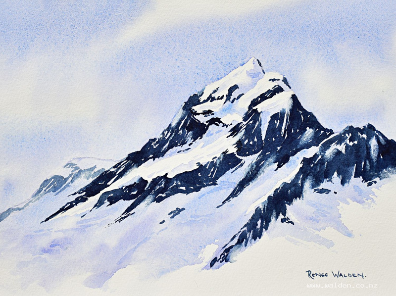
Big snowy mountain
19 July 2023
Video - Level ◆◆◆
This month is all about painting mountains. The big snowy kind! For our first lesson we take a trip to near my home in New Zealand, and paint our highest peak - Aoraki / Mt Cook. In this scene we zoom in right close up on the mountain and paint it's summit peaks.
We start with a little bit of theory where I explain how to use a very simple tonal value scale and directional strokes to create the illusion of 3-dimensional form. Then we use just 3 colours to paint the scene.
I use masking fluid in this lesson, but you don't have to. I explain in the video what to do if you don't want to use it.
Happy painting!
Video run-through...
About This Painting
Aoraki Mount Cook — New Zealand's highest mountain — painted by zooming right in to the summit peak and simplifying it drastically. Just three colours, three tonal values, and directional brush strokes. The result looks like a real mountain and has real drama, not despite the simplification, but because of it. There's a short theory section at the start covering tonal values and directional strokes that is worth working through before painting — it's the framework everything else hangs on.
Masking fluid is used to preserve the bright snow areas. If you'd rather skip masking fluid, an alternative approach is explained in the painting section below.
A traceable drawing is available in the lesson description.
Theory: Tonal Values and Directional Strokes
Tonal Values
Tonal value describes how light or dark something is, regardless of its colour. A red rock and a gray rock might be exactly the same tonal value even though their colours are completely different. In this painting, only three values are used:
- Light — the white of the paper (the bright, sunlit snow)
- Mid-tone — a diluted, cool blue-gray (snow in shadow, the sky, the glacier)
- Dark — a deep, rich dark (the rock bands)
This high-contrast approach — light, mid, dark, with little in between — is what gives the mountain its drama. With only three values and the right directional strokes, a flat shape on paper reads immediately as a three-dimensional mountain.
Directional Strokes
Once the tonal values are established, directional strokes add the second layer of form. Instead of painting in one consistent direction across the whole mountain, each area of rock is painted in the direction that geological feature actually runs. Some rock bands are near-horizontal and slabby; others are more steeply angled; others are almost vertical. Changing the direction of the brush strokes to follow each rock band gives the mountain far more form than any amount of additional detail would.
Before painting, sketch this out: roughly block in the rock bands and mark small arrows indicating the direction each section runs. This reference sketch is worth having beside you while painting.
Colours
Three colours only: ultramarine blue, permanent violet, and Payne's gray. The mid-tone is mixed from ultramarine and permanent violet. The dark is Payne's gray with a little ultramarine or violet. The light is the white of the paper.
Mixed colours rather than single pigments from the tube are preferable here — when two colours are worked wet together, they separate and granulate on the paper, creating the natural variation and texture of rock and ice. Rough watercolour paper enhances this further. Daniel Smith's Moonglow is a good alternative to Payne's gray if you want even more colour variation in the darks.
Drawing and Masking
Keep the pencil drawing simple — mark the main rock band masses and the snow areas. Small crosses on the snow areas help distinguish them from rock in the drawing.
Apply masking fluid to all the bright sunlit snow patches. Set the painting aside and work through the theory exercises above while it dries. Never dry masking fluid with a hairdryer.
Without masking fluid: Simply leave the snow areas unpainted throughout each wash stage, working around them with the brush. The resulting soft edges can look more natural than masked hard edges.
Painting the Sky
Mix ultramarine and permanent violet into a cool blue-gray. Wet the sky area and drop in the mix, working darker at the top and lighter toward the mountain summit. Keep the sky pale and calm — the drama belongs to the mountain.
Painting the Background Mountain
The secondary peak behind the main summit is painted in the same mid-tone but lighter still (more water). Using only mid-tone here, with no dark marks or detail, is what pushes it back in space. Any dark marks added to the background peak would bring it forward and compete with the foreground.
Painting the Main Peak
Work across the peak section by section, orienting each brush stroke in the direction that rock band runs. The darks (Payne's gray and ultramarine, mixed wet) go in first, stroke direction varying with each geological feature. The mid-tone (more diluted ultramarine and violet) fills the shadow sides of snow areas and any snow not in direct sunlight.
Keep the brush large enough that precision is impossible. Bold, confident marks suit the scale of the subject.
Removing Masking Fluid and Refining
Once completely dry, remove the masking fluid with a clean eraser. The hard edges masking fluid leaves may need softening in places — a clean, damp brush gently worked along the edge will do this. Assess the painting as a whole: reshape any snow areas with an odd silhouette by adding a few dark marks, adjust any transitions that feel too abrupt.
With the mid-tone mix, add a little shadow and form to the larger snow patches — overhanging ice cliffs, crevasse lines, shadowed hollows. Apply some marks with hard edges and soften others immediately with a clean dry brush. The combination of both is what makes snow feel solid.
Lifting paint along selected edges with a clean damp flat brush creates the impression of blowing snow at the summit. Clean the brush thoroughly between each lift.
Optional: White Gouache
A small amount of white gouache or acrylic ink can add fine snow detail along sunlit ridge lines. Use it only where it makes tonal sense — white marks in the dark rock areas look wrong because those areas are in shadow. The paper itself is a warm cream tone, so gouache will appear noticeably brighter than the reserved white; use it very sparingly.
Sign in pencil or with a tiny brush. Remove the tape.
Key Takeaways
Three values are enough. Light, mid, dark — a high-contrast painting can be entirely built from just these.
Directional strokes create form. Each brush stroke should follow the direction of the geological feature it represents.
Mixed colours granulate. Two colours worked wet on paper give natural texture that suits mountains perfectly.
Simplification is a strength. Leaving out detail forces the viewer to engage with the essential shape and drama of the subject.
Resources...
* Drawing to trace
* Reference photo
Join me on Patreon
Join my Adventures in Colour Tier for $16 to access this post and my full library of over 200 others including deep-dive videos and step-by-steps.