 Video on Patreon
Colour mixing with primaries
7 September 2023
Video - Level ◆◆◆
In this skills lesson we're going to have fun doing some colour mixing with primary colours. We'll paint 4 postcards, all of the same scene. For each postcard we use just a red, a yellow and a blue - different ones for each postcard.
Working in this way is going to show you just how many possible colour combinations your palette can create. It will also show you how to mix some really lovely neutral colours. Plus, when you limit your palette in this way, your paintings will have a wonderful colour harmony.
At the end of this lesson you'll have 4 little postcard paintings and a number of colour swatches to use for other paintings.
Happy painting!
Video run-through...
About This Lesson
A colour mixing lesson structured around a simple challenge: paint four small postcard landscapes, each using only three colours — one red, one yellow, one blue. Every time you change the specific red, yellow, or blue, you get a completely different palette and a completely different range of possible colours. The lesson explores what happens when you mix primaries, how to predict and use secondary colours and darks, and what to do when your palette can't make the darks you need.
At the end, you have four little postcards. Seal them with acrylic varnish and they're ready to post.
The Core Method: Swatching First
Before painting each postcard, make a small swatch sheet with the three chosen colours. Mix each pair — red and yellow, yellow and blue, red and blue — and then mix all three together. This gives you six swatches: the three primaries and three secondaries (orange, green, purple), plus the dark brown you get from all three combined.
This swatch does two things: it shows you exactly what colours are available for this palette before you commit any of them to the postcard, and it gives you a record to keep. Note the colour names and the date on the swatch. If you later decide to scale up a postcard into a larger painting, the swatch tells you exactly what you mixed.
Critical note on darks: The dark you can make from any three primaries depends entirely on which three you choose. Some combinations make a rich, near-black brown; others can only produce a warm, light brown. Knowing this in advance — from the swatch — tells you whether your chosen scene can have deep shadows or needs to be kept light and airy.
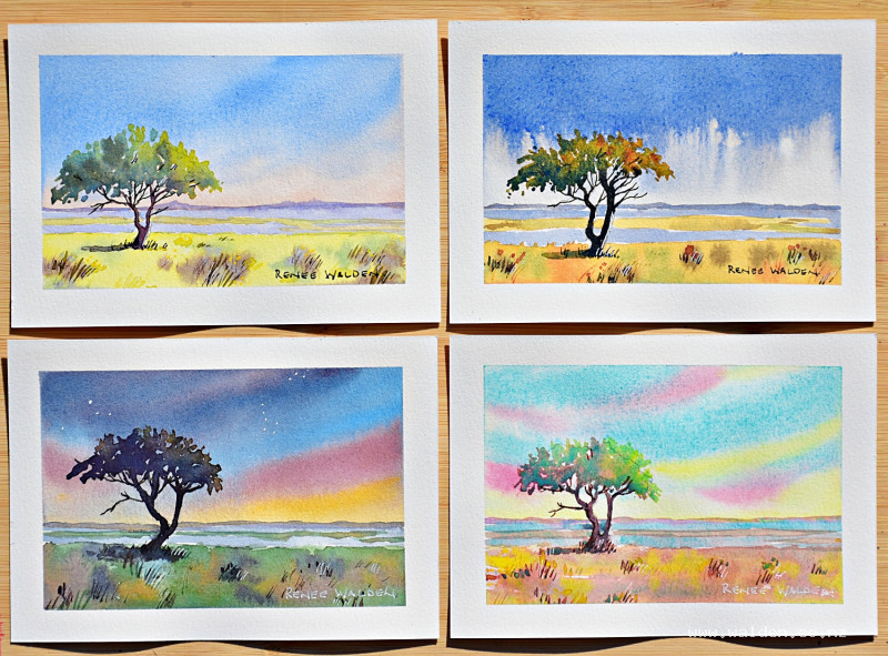
Postcard One: Summer Savanna
Colours: cobalt blue, quinacridone rose, Hansa yellow medium
Swatches: rose + blue = cool purple; rose + yellow = warm orange; blue + yellow = green; all three = rich neutral brown
This is a warm, summery palette. The scene is a savanna or bushveld landscape: a hot, hazy sky, dry golden grasses, a single umbrella-shaped tree (an African acacia), distant hills, and a hint of water.
Sky: Wet and drop in cobalt blue across the upper half, then transition to the orange mix (rose + yellow) along the horizon — the orange at the horizon suggests heat and haze, and critically, because it contains red, it prevents any blue-yellow green forming at the boundary between the blue sky and the warm horizon.
Foreground: Yellow on its own for the dry grass, with a touch of green (blue + yellow) for any living grass, and some brown (all three) in places. Scratch in grass marks with the back of a ruler while still wet.
Distant hills: Diluted purple (rose + blue, leaning blue) for cool, receding hills; same mix, even more diluted, for any water.
Tree: Blue and yellow mix, leaning yellow, for the sunlit canopy. While still wet, add more yellow on the lit side and more blue on the shadow side, then deepen with all three colours for the darkest underside. The trunk goes in while the canopy is still slightly damp so it blends at the join. The cast shadow falls on the ground below.
Keep notes on colour names beside the swatch.
Postcard Two: Rainy Day
Colours: ultramarine blue, quinacridone sienna (or similar warm orange-brown), Hansa yellow medium
This palette shifts toward a cooler, more muted range. The rainy day scene uses the same compositional elements — sky, hills, grass, tree, water — but the mood is entirely different.
The dark that all three colours make together is a deep, rich gray-brown that suits overcast light and wet conditions. The purple mix (blue + sienna) makes a warm gray perfect for storm clouds and reflective water. The orange mix (sienna + yellow) gives warm accents in the wet grass.
Use the three-colour mix wet into wet across both sky and ground so that it separates on the paper, creating natural texture that suggests rain-dampened surfaces.
Postcard Three: Near-Night or Dusk
Colours: a warm dark blue (such as indigo or Prussian blue), a warm red, a muted yellow
This palette is capable of producing genuine deep darks — the three-colour mix approaches black. The scene shifts toward a dramatic, almost-night mood: dark sky, silhouetted tree, last light at the horizon.
The sky goes very dark at the top with minimal water. A few small dots placed with a fine brush or gel pen after drying suggest stars. The tree silhouette is painted with the near-black three-colour mix. A lighter version of the same dark mix serves for the ground and water.
This palette demonstrates one end of the spectrum: maximum contrast is achievable, but the range of light, bright colours is limited.
Postcard Four: Sunrise
Colours: cobalt teal, cadmium yellow light, quinacridone rose
Note on opacity and lightfastness: Cobalt teal and cadmium yellow light are both opaque and heavy — they will push other colours aside when dropped into a wet wash, creating interesting textural effects. Avoid opera pink for anything intended as a keepsake or gift, as it is not lightfast and will fade over time. Quinacridone rose is a stable, lightfast alternative.
The critical limitation: These three colours together cannot produce a dark. The three-colour mix makes a pleasant warm brown but no deep shadow is possible. This is not a failure — it's useful information. A sunrise scene suits a light, luminous palette where everything is bright and the shadows are soft.
The sky gets cobalt teal and cadmium yellow dropped in separately rather than pre-mixed (pre-mixing would make a very strong, flat green). A touch of the rose creates a pink-orange sunrise glow. The foreground uses the three-colour brown, which is particularly lively because the cadmium yellow is heavy and pushes the other pigments aside as it dries.
For the tree, the light side gets the bright teal-yellow green; the shadow side gets the warmest brown the three colours can make. The result is more vivid and unusual than a conventional tree, and considerably more honest about the palette's character.
Pen Work (All Four Postcards)
All four postcards get a small amount of pen work at the end. Dark brown ink (extra-fine nib) on the shadow sides of trunks and branches; a lighter brown ink for sunlit branches and fine details. The near-night postcard can also work well with black ink for maximum contrast.
The white gel pen adds highlights, white grass marks, and for some postcards a few stars in the sky. A yellow Posca marker can add small flowers or light accents in the warm-palette postcards.
Remove the tape, sign each card, and seal with acrylic varnish before posting.
Key Takeaways
Swatch before you paint. The swatch predicts exactly what you can and can't do with any set of three colours before you commit to the scene.
Check whether your palette can make darks. Some combinations can; some can't. The scene you choose should match what your palette is capable of.
Mixed colours separate on wet paper. The three-colour brown is always more interesting than brown from a tube, because the three components separate and granulate.
Explore what's already on your palette. Before buying new colours, try combining what you have. The results are often surprising.
Resources...
* Reference photo
Join me on Patreon
Join my Adventures in Colour Tier for $16 to access this post and my full library of over 200 others including deep-dive videos and step-by-steps.