 Video on Patreon
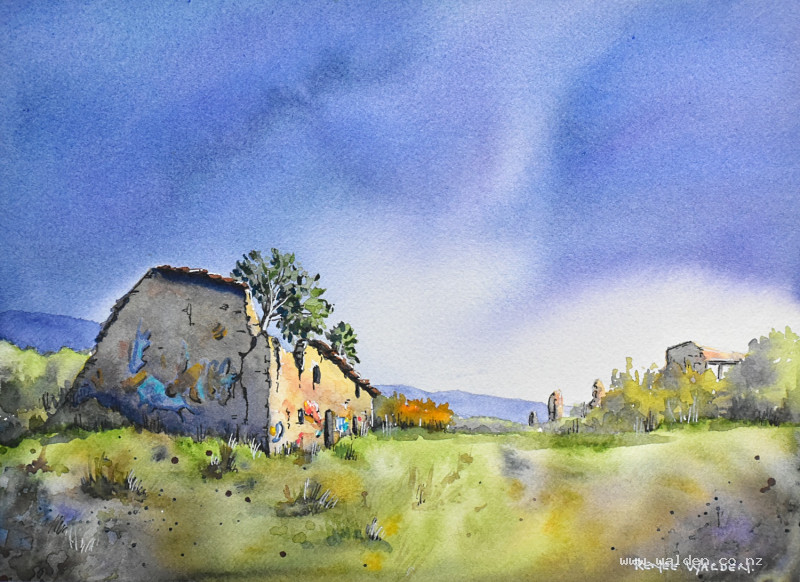
Sunlit ruin with stormy sky
2 November 2023
Video - Level ◆◆◆
A couple of weeks ago I discovered a new abandoned town - Tiermas. This one is an old Roman town and had some beautiful medieval buildings, including a very large church. In the 1950s most of the town, the old Roman baths and all the orchards and arable land was flooded to make way for a reservoir. Everyone, except 2 of the inhabitants, moved on, with the remaining 2 staying until they died. It's a sad story for sure.
The part of the town that was on a hill still remains, and is quite extensive. But it certainly is very ruined! On the day I was there it was rainy and I had a number of false starts before sketching, plus a few trips back to the van to wait out showers then setting up again and continuing. It was rather funny, and also totally worthwhile, because the lighting was beautiful with the sunlight catching the stonework on the buildings and the dark stormy sky.
After I finished sketching, I took a million photos, and we're going to be working from one of those for this lesson.
Happy painting!
Video run-through...
About This Painting
An old Roman town in Spain — most of it submerged beneath a reservoir, but the hilltop ruins still standing (or rather, beautifully crumbling). Painted on a stormy day with dramatic light catching the front face of the main ruin while heavy clouds rolled in behind. The key compositional tension is between the sunlit stone face and the dark, saturated sky — each makes the other more powerful.
This scene was found on location and photographed for a studio painting. The building has been scaled down slightly from the reference to give the sky more space, and a couple of extra ruined walls are included to suggest the extent of the abandoned town rather than isolating the single building.
A traceable drawing is available in the lesson description.
The Pencil Drawing
Concentrate on the perspective angles of the building. Ruins are irregular, but the underlying architecture still obeys perspective, and angles that are wrong will make the building look unstable in the wrong way — unconvincing rather than romantically dilapidated. Check every wall angle against the reference before committing.
Painting the Sky
The sky is the dominant element of this painting and sets everything else up. The colour choice is deliberate: the sunlit front of the building has a warm, almost golden quality, so the sky uses its complementary colours — a deep, saturated blue-purple — to maximise the contrast and drama.
Mix a large pool before wetting the paper: ultramarine and phthalo blue combined for a very intense, deep blue, darkened with a touch of Payne's gray, and warmed very slightly with a small amount of permanent violet. Mix more than seems necessary — running out of colour mid-sky is a serious problem.
Wet the sky area twice (settle the paper fibres with the first pass, create a working layer of water with the second). Use a flat brush for the sky so it can cut cleanly around the building roofline. Board at a slight angle so colour flows naturally downward.
Drop the colour into the wet surface rather than scrubbing it in — let the water carry it. Work dark in the upper corners and progressively lighter toward the horizon. Leave some white gaps and lighter streaks for drama and the sense of a moving sky. The colour can be pushed and guided by tilting the board or by adding directional strokes. Pick up any beads that accumulate at the edges before they dry into hard lines.
As the sky begins to dry slightly, any additional paint dropped in must be thicker than what's already on the paper — wet paint into damp paint creates cauliflowers, but thick paint into damp paint settles in and darkens without blooming.
Let dry completely and naturally.
The Building
The front face of the ruin catches full sunlight and is painted in warm golden tones: natural or raw sienna with some quinacridone gold, varied with a touch of burnt sienna in places. Work wet into wet across the whole face so the colour varies naturally. This side is the focal point — give it the richest, most saturated colour.
The shadowed side of the ruin (left-hand wall, interior spaces seen through window and door openings) receives almost no direct treatment at this stage — that's handled in the shadow washes later. Any glimpse through a ruined window or doorway that shows the sky beyond should be left as sky colour.
The ruined walls visible at the sides and background are painted in similar tones to the main building but lighter and slightly cooler — they recede in space and shouldn't compete with the focal point.
Vegetation and Ruins
The scrubby bushes and grasses that grow in and around abandoned buildings are painted loosely. Mix a range of muted greens and warm browns — sap green with natural sienna, sap green with a touch of indigo for the darker areas, pure indigo for the deepest vegetation shadows. Work quickly with a large brush and let the marks be free and irregular. This vegetation frames and grounds the building rather than being a subject in itself.
Once dry, scratch grass marks through any still-damp areas using the back of a ruler for a few fine lines in the foreground. A light splatter of green and earth tones adds organic texture.
Shadows
The shadow washes are where the drama is created. The contrast between the dark shadow side and the lit front face is what makes the building glow.
Mix the shadow colour using the same recipe as the sky (ultramarine, phthalo blue, Payne's gray, permanent violet), but add a little sepia or burnt umber to ground it and prevent it reading as simply sky-coloured. Mix it generously — a large, continuous shadow wash needs a full brush without reloading.
Load the brush fully and work across the entire shadowed area in a single connected pass, from top to bottom. Don't scrub — lay the paint in and let it settle. The mixed colour will separate on the paper just as it did in the sky, creating visual interest in what could otherwise be a flat gray mass. Where the shadow falls over the graffiti on the building, apply it lightly so the graffiti is visible beneath the shadow, subdued rather than erased.
Reserve a small, irregularly shaped highlight on the part of the shadowed wall nearest the sun — this reflected light prevents the shadow from looking completely dead.
Switch to a smaller brush for the shadow inside windows, doorways, and under eaves. These interior shadows are very dark — near black. Apply a shadow line under each eave and immediately soften its lower edge with a clean dry brush, creating the slightly soft quality of a shadow cast by a roof overhang. Windows and doors receive the darkest marks in the whole painting.
Add a touch of green to the shadow mix for the base of the vegetation, painting a shadow along the ground line where each bush meets the earth. Vary the edge between hard and soft — not all of it needs to be crisp.
Second shadow pass (darkest darks): once the first shadow wash is completely dry, deepen the very darkest areas — immediately under eaves, along the base of walls, deep inside openings. This second layer creates the tonal depth that makes the scene feel truly three-dimensional.
Checking Tonal Values
At this stage, photograph the painting and convert to black and white. The front of the building and the light areas of sky should be in the lightest value range; the shadow side of the building and the dark sky corners in the darkest range; everything else in the mid-range. If the contrast isn't there, the shadow washes need to go darker.
Pen Work
Dark brown ink in a fine pen (extra-fine nib) on shadow sides only: cracks in the stonework, broken edges along ruined walls, under eaves, inside window and door openings. The pen reinforces and sharpens what the paint has created rather than adding new outlines. Work slowly and with intent — there is no time pressure with pen work, unlike the wet watercolour stages, and rushing at this point is what leads to the look of a coloured-in line drawing rather than a painting with light pen accents.
Any graffiti on the building can be lightly defined with the pen. The cross-shaped window openings that characterise old church ruins can be suggested with a few marks — enough to read as a feature without being over-drawn.
Branches and a few marks in the vegetation extend the pen work beyond the building so it doesn't look isolated to the focal point.
White gel pen for highlights: the lit edges of stonework catching the sun, any bright details on the lit face of the building. A few marks with yellow or red for the graffiti colour if it needs brightening after the shadow wash subdued it.
Sign and remove the tape.
Resources...
* Reference photo
* Drawing to trace
Join me on Patreon
Join my Adventures in Colour Tier for $16 to access this post and my full library of over 200 others including deep-dive videos and step-by-steps.