 Video on Patreon
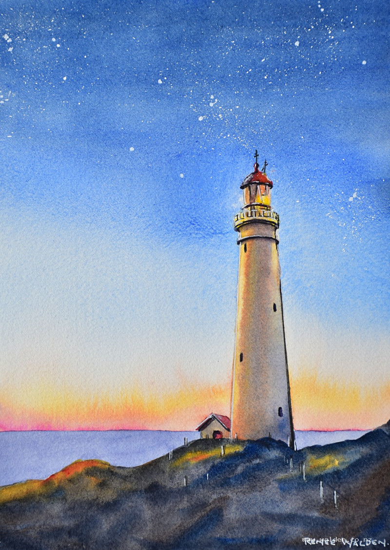
Lighthouse at night
14 December 2023
Video - Level ◆◆◆
Lighthouses seem so romantic to me - places to protect you from storms and rocky dangers. I always enjoy painting them, but this one seems extra special with the starry sky and the last light of a pretty sunset lighting up buildings.
This isn't actually a very difficult painting, even though it looks quite complex. I've got a trick to show you how to paint that beautiful sky! And then when the sky is done, the rest is just little details you can take your time over.
Happy painting!
Video run-through...
About This Painting
A lighthouse at dusk — a rich, dark starry sky in the upper portion of the painting, graduating down through a cooler blue into a warm sunset band of yellow, orange, and pink along the horizon. The lighthouse itself glows with reflected sunset gold on one side and cool purple shadow on the other. Despite the layered complexity of the scene, the technique is simpler than it looks: the sky is painted wet-in-wet in one pass (upside down, to keep the warm and cool colours from mixing), and the lighthouse is built up with just a few controlled washes.
The beam of light from the reference photo is intentionally left out — when painted, it looks like the lighthouse is on fire rather than lit.
You'll need white gouache and an old toothbrush for the stars, and a ruler for the final pen work.
A traceable drawing is available in the lesson description.
The Pencil Drawing
For a tall, symmetrical subject like a lighthouse, start by drawing a faint vertical centre line — measure from both edges of the paper to make sure it is truly vertical. Mark a few key horizontal measurements (base width, midpoint, top) on either side of this line before drawing the curves and tapers, so both sides remain even. A lighthouse that leans even slightly looks wrong. Offset the lighthouse slightly from the centre of the composition. Indicate the horizon line and the rocky base.
The Sky: Colour Plan
The sky is divided roughly into thirds from top to bottom: a very dark, rich ultramarine blue for the upper third (the night sky); a paler, cooler cobalt blue for the middle third; then a buffer zone of almost no colour, followed by a yellow streak, an orange-sienna streak, and a pink streak along the horizon.
The challenge is preventing the yellow and blue from mixing into green where they meet. Two things solve this: the unpainted buffer zone between them, and painting the sky upside down so the warm sunset colours are applied first and gravity carries them away from the blue rather than into it.
Colours: ultramarine blue (warm, dark) for the night sky; cobalt blue (neutral) for the transition zone; Hansa yellow medium for the yellow band; quinacridone sienna for the orange streak; quinacridone rose for the pink. Have Payne's gray in reserve in case the very top of the sky needs deepening.
Painting the Sky (Upside Down)
Turn the board upside down so the horizon is at the top. Wet the entire sky area — including behind the lighthouse — with clean water, cutting in carefully along the lighthouse edges and the horizon line. Use a flat brush for precision at the edges. Allow the water to settle briefly into the paper fibres.
With the board still upside down and tilted at a slight angle, drop in the sunset colours first: a thin streak of quinacridone rose along what is currently the top (the horizon), then quinacridone sienna below it, then a narrow streak of yellow. Gravity will carry these colours upward (toward the horizon in the final orientation). Leave a gap of unpainted paper as the buffer zone.
Then immediately lay in the cobalt blue below the buffer, and the darker ultramarine below that. Let the blues bleed softly into each other. If the very top needs to be darker, deepen it with a touch of Payne's gray or extra ultramarine. Allow the wet colours to move naturally — don't overwork with the brush. Turn the board back to the correct orientation and lay it flat. Let dry naturally until almost dry, then finish with a hairdryer.
The Stars
Once the sky is fully dry, add stars using white gouache and an old toothbrush. Load the toothbrush directly from the top of the gouache, then test on a scrap first — too much moisture produces large blobs rather than fine dots. Standing up and holding the toothbrush close to the paper gives more control. Flick paint by running a finger or thumb across the bristles. Stars cluster in groups, not evenly scattered — concentrate the splattering in a few areas to reflect this. Keep it restrained; it's very easy to overdo. Once the fine splatter is done, pick out a few individual larger stars with a white Posca marker or a fine brush loaded with slightly thicker gouache.
The Lighthouse: First Washes
Paint the lighthouse in two stages: a broad directional wash first to establish the light and shadow, then small detail shadows once that is dry.
Wet the entire lighthouse (not the small keeper's hut) with clean water, being gentle so as not to lift any colour from the sky wash underneath. Mix a warm golden yellow (quinacridone gold or similar) for the sunlit side and a purple-gray (ultramarine, quinacridone rose, and a touch of burnt umber) for the shadow side.
Tilt the board and drop the purple into the centre-shadow area, letting gravity carry it toward the shadow side. The warm golden glow should remain on the lit side — if the purple encroaches too far, lift it gently with a clean dry brush and drop in a little quinacridone gold to restore the warmth. Darken the base of the lighthouse slightly to give it weight and anchor it to the ground. Allow to dry.
The Lighthouse: Detail Shadows
Add the small architectural shadows once the main wash is dry: underneath the gallery (the railing platform), beneath any protruding bands or mouldings, inside the lantern room facets, and in the small windows. Use the same purple-gray mix, slightly thicker. Use a small brush and work slowly — these marks define the structure. The keeper's hut at the base should be slightly set back in tone so the eye travels up to the lantern at the top rather than stopping at the hut.
Pen and Ink Work
Use a ruler for the pen work on this painting — the lighthouse has long, clean lines and freehand marks will look wobbly against the precise geometry of the structure.
Use dark brown ink with a fine nib for the shadow sides: down the shadow edge of the tower, underneath the gallery, inside the windows, and along the bottom of any horizontal bands. Add aerials or a weather vane at the top if present in your reference. A few lead-in lines at the base suggest steps or railings without being fully rendered.
Use a white gel pen for the highlights: the lit edge of the tower, the brightest facets of the lantern glass, and any railing details on the gallery. A small dot or stroke of white on the lantern itself adds the final brightness. Keep the white pen restrained — used sparingly, it reads as genuine light.
Remove the tape and sign.
Resources...
* Reference photo
* Drawing to trace
Join me on Patreon
Join my Adventures in Colour Tier for $16 to access this post and my full library of over 200 others including deep-dive videos and step-by-steps.