 Video on Patreon
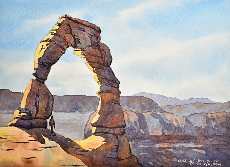
Delicate Arch
1 February 2024
Video - Level ◆◆◆
In 2011 we visited Utah and Colorado on a climbing holiday. The wonderful red rock formations, towers, arches and canyons, all set in the desert, were some of the best scenery I had ever seen.
Long winter evenings right now mean that I've got time to revisit some old memories and paint scenes from photos or from my outdoor sketches. A few weeks ago I painted a little postcard of Delicate Arch - one of the incredible arches in Arches National Park. Someone who saw it online asked if I would do it again as a full tutorial. Of course! An excuse to get out a larger piece of paper and paint the scene properly. Happiness is :-)
In this lesson we paint the arch with lovely back lighting. It's all too easy to always look for a scene with sun coming from the front. But light from behind creates so much interesting drama - a little halo of light and big shadows to have fun with.
I hope you enjoy painting this as much as I did.
Happy painting!
Video run-through...
About This Painting
A famous rock arch at Arches National Park, Utah — painted as a backlit scene where the light source comes from behind the subject rather than the front. Backlighting produces dramatic, large-scale shadows across the foreground rocks and a glowing sky behind, and this lesson is as much about understanding that lighting approach as it is about painting rock texture and desert landscape. A small human figure is included at the base of the arch to convey its enormous scale.
The colour palette is warm throughout — oranges, siennas, and ochres for the sunlit rock faces, with complementary blue-purples for the shadows. The sky is painted as smooth and clean as possible to contrast with the busy, textured rock surfaces.
A traceable drawing is available in the lesson description.
The Pencil Drawing
The arch is drawn carefully from the reference photo — it's a well-known landmark and getting the proportions right matters. Mark a centre line and horizon line with a ruler first as a guide. A small figure is added at the base; check the scale so the figure reads as genuinely dwarfed by the arch. The key compositional change from the reference is the lighting: light is brought in not just from behind the arch but also underneath it, creating a secondary pool of warmth beneath the span. The photograph is wider than the painting — a more panoramic format is also possible if you want to include more of the background landscape.
The Sky
Use phthalo blue as the main sky colour rather than cobalt — phthalo is a very fine pigment that sits smoothly on the paper without granulating, and a smooth sky provides a calm contrast to the busy rock surfaces that follow. Mix a small amount of cobalt blue in to moderate the intensity. For the hazy horizon and back hills, mix a separate wash of permanent violet and a little burnt sienna with plenty of water — a pale, purplish-gray.
Wet the entire sky area with clean water, working carefully around the lit edges of the arch. It's fine to paint over the shadow side of the rocks and the distant hills, but protect the areas where light will be catching — no blue undertone there.
Paint the sky with a large brush, laying in loose, diagonal streaks of the phthalo blue and leaving plenty of white paper to suggest a high, cirrus sky. Work in close to the arch edges with a smaller brush to avoid halos. Shift to the pale purplish-gray wash toward the horizon and over the back hills. While still wet, lift out the white streaks by scrubbing a clean, dry brush along them — vary the pressure to give the cloud edges an irregular, natural shape. The sky should feel bright and high; don't overwork it.
Background Hills
Once the sky is dry, paint the distant hills in very pale, cool tones — the sky's blue undertone has already set them back, so only light washes are needed. Keep edges soft and shapes simple. No detail here; the arch and foreground are where all the complexity lives.
The Sunlit Rock Faces
The rocks that catch the backlighting glow with warm oranges, siennas, and ochres. Work wet-in-wet, dropping in a range of warm colours and allowing them to blend — raw sienna, quinacridone sienna, burnt sienna, yellow ochre, and a little Naples yellow for the palest, most intensely lit areas. Vary the colour constantly across each rock face: no two adjacent areas should be exactly the same tone. Reserve the very lightest paper for the brightest lit edges.
Vary texture by letting some areas merge softly and leaving others to form harder edges as they dry — rock surfaces have both smooth faces and rougher, more broken areas. The lower rocks tend to be smoother; the upper sections more fractured and complex.
The Shadows
The shadows are the dominant feature of a backlit scene and need to be handled with care and variety. Mix the main shadow colour from cobalt blue and quinacridone sienna — these two granulate against each other on the paper, which produces beautiful, mottled texture that reads as rock. Add a touch of permanent violet to deepen and cool the darkest areas.
Work the shadow across the whole arch in a single continuous pass if possible, using a large brush for the broad areas and a smaller one to tease paint into cracks, crevices, and overhangs. Drop in colour variations while wet — more blue in some areas, more sienna in others, a little violet in the deepest pockets. There may be reflected light on the shadowed face closest to a sunlit surface; drop in a little sienna there to lighten it slightly.
Work quickly enough to keep the paint wet across the whole shadow area, but stay aware of edges that are beginning to dry — joining wet paint to nearly-dry paint will cause cauliflowers. The shadow at the base, where the arch meets the ground, can go very dark and run off the edge of the page. Let dry naturally, then finish with a hairdryer.
Rock Detail and Cracks
Once the shadow is dry, add a second, darker pass for the deepest cracks and where boulders sit against each other. Use a number 4 brush — not a tiny one — and work at a pace that keeps you from overworking any single area. Use the pencil drawing as a guide for crack placement and refer constantly to the reference photo. Vary the thickness and darkness of the marks: some cracks are sharp and dark, others barely visible. The rock gets smoother toward the base and more fractured and pocketed toward the top. Add any background rock detail now as well — a few horizontal and vertical marks to suggest crags and buttresses without bringing it too far forward.
Pen and Ink Work
The painting may not need pen at all — assess it once the brushwork is complete. If it does, use a fountain pen with dark brown ink to define the very darkest crack lines and shadow edges, and to tighten any areas that became too soft or blobby. Work across the whole painting rather than getting drawn into one area; add marks sparingly and stand back regularly to check.
Use a white gel pen with restraint — against the warm yellow-orange of the rock, white will read as cool and slightly stark. Where highlights are needed, apply the gel pen and immediately rub it partially into the paper with a finger to reduce its intensity and warm it slightly. Less is more.
Remove the tape and sign.
Resources...
* Reference photo
* Drawing to trace
Join me on Patreon
Join my Adventures in Colour Tier for $16 to access this post and my full library of over 200 others including deep-dive videos and step-by-steps.