 Video on Patreon
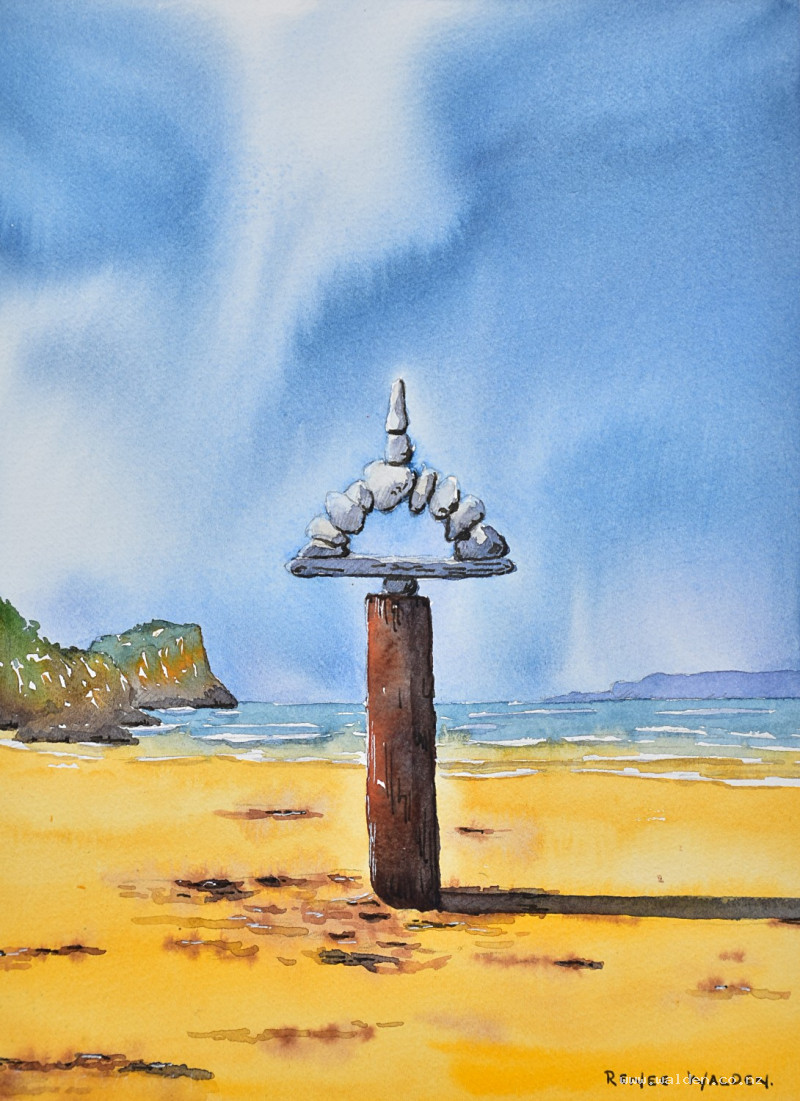
Beach rock sculpture
7 March 2024
Video - Level ◆◆◆
Join me on my favourite beach on the north coast of Spain. We visit every September and part of the tradition is that David builds these huge rock sculptures and I sketch them. Now you can paint one with me too!
Besides the sculpture itself, we have a lovely rainy sky, a sunny beach and a few lapping waves. So a few different elements for you to explore.
Also! Make sure you watch right to the very end, as we have a little surprise for you after my sign off :-)
Happy painting!
Video run-through...
About This Painting
A rock sculpture on a beach on the north coast of Spain — a tall stack of balanced stones on a weathered wooden pole, placed dead centre in the composition against a moody, rain-streaked sky. The light source comes from one side, putting half the sculpture in warm golden sunlight and the other in cool shadow, and the beach itself glows with sandy yellows and oranges that play against the purple-gray of the sky. The complementary contrast between warm beach tones and cool sky is the colour key of the whole painting. The centred composition is a deliberate choice — there's something meditative and almost iconic about the scene that suits a symmetrical arrangement.
A traceable drawing is available in the lesson description.
The Pencil Drawing
Mark the horizon line and a centre vertical line with a ruler first — getting the proportions of the rock sculpture right depends on having these as reference. Draw the sculpture itself first, then add the islands and headlands. Optional hatching on the shadow side of the rocks helps guide the painting stage. The light comes from the right, so shadows fall to the left.
Painting Order
Sky first, then tidy any overrun before painting background elements. Islands and headlands next, then the sea and waves, then the beach, then the rock sculpture working from light to dark. The wooden pole goes in late — it's the focal point and benefits from being painted against an already-established background. Shadows across the whole painting come near the end, followed by pen and ink finishing.
The Sky
Mix two washes: a gray-blue for the upper sky (cobalt blue, a little phthalo blue, and Payne's gray) and a softer lavender for near the horizon (the same mix with permanent violet added and more water). Mix generously — a large sky uses more paint than expected.
Wet the entire sky area with clean water, shaping carefully around the rock sculpture, the headlands, and the horizon line. Paint right over the headlands — they'll be painted on top later and the blue undertone sets them back into the distance. Use a large brush for broad diagonal sweeps and a smaller pointed brush to cut in around the sculpture without leaving a halo.
Apply the gray-blue from the top in diagonal strokes, then shift to the lavender toward the horizon. The diagonal direction gives the sky movement and draws the eye toward the sculpture. Lift a few lighter streaks while still wet to suggest rain out at sea. Drop the board flat and allow the sky to dry naturally — forced drying too early stops the movement and kills the soft edges.
Once dry, neaten the horizon line and any sky wash that crept onto the rocks with a damp brush.
Islands and Headlands
Paint the distant headlands with very pale, cool washes — the sky blue-gray well diluted. No detail; soft edges and restrained tone keep them firmly in the background. A light wash anchors the islands into the water.
The Sea and Waves
Horizontal strokes, varying slightly between cooler and warmer blues. Leave white gaps and curved shapes for the wave crests. Keep it simple — the beach and sculpture are where the painting's interest lives.
The Beach
The beach glows with warm sandy tones — yellows, ochres, and a touch of orange — in direct contrast to the cool purple sky. Work wet-in-wet and vary the colour across the surface, leaving the lightest values near the waterline where wet sand reflects the sky. Add soft marks for pebbles and footprints sparingly; they suggest texture without demanding attention.
The Rock Sculpture
Paint the rocks starting with the lightest values — the sunlit faces are close to white paper, so reserve them and work inward. The shadow side uses the same purple-gray mix from the sky, slightly more concentrated. The large supporting rock and the ones at the base sit more heavily in shadow.
Work across the shadow side in one connected pass, joining the shadows of individual rocks into a coherent shape, then soften some edges with a clean damp brush. Some rocks should look angular with hard edges; others more rounded. Two passes of shadow — a light first pass across the whole sculpture, then darker accents where rocks actually touch — gives depth without overworking.
The Wooden Pole
The pole is the focal point's anchor and deserves saturated, warm colour that stands apart from everything else in the painting. Use quinacridone sienna (or burnt sienna) for the warm reddish-brown on the sunlit side and burnt umber for the darker shadow side. Drop in a little of the sky's purple-gray wet-in-wet for colour interest. Darken the base where it meets the sand — this grounds the pole and maximises contrast against the pale rocks above. The richer and darker the pole, the more the white rocks glow by comparison.
Shadows Across the Whole Painting
Once everything is dry, add shadows in a single session so they feel consistent. Work from lightest to darkest:
Fine shadow lines beneath the wave crests using a very dilute purple-gray — barely any pigment. Anchor the islands into the water with a slightly warmer version of the same mix. For waves breaking onto the beach, add a touch of brown to warm the shadow.
The cast shadow from the sculpture falls across the sand — warm purple, following the direction of the light source. Soften the edges on the beach side. The shadow of the pole itself should be a warmer colour than the rock shadows.
Pen and Ink Work
Use dark brown ink with a fine nib for the shadow side: mostly where rocks touch each other (the darkest point of contact), broken lines along shadow edges, and a few cracks and details on the pole. Don't outline everything — sparse, considered marks are better than a complete outline. Nothing in the background; ink there would bring it forward.
Use a white gel pen for the sunlit side of the rocks, the highlight edge of the pole, and any lost foam in the waves. The contrast between bright gel pen highlights and the stormy sky is what makes the sculpture feel sunlit. Use it lightly elsewhere — it's brighter than the paper and can look harsh if overdone; smudge with a finger to reduce intensity if needed.
Remove the tape and sign.
Resources...
* Reference photo
* Drawing to trace
Join me on Patreon
Join my Adventures in Colour Tier for $16 to access this post and my full library of over 200 others including deep-dive videos and step-by-steps.