 Video on Patreon
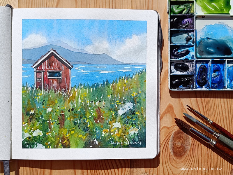
Little red hut
14 March 2024
Video - Level ◆◆◆
Too cute! I've had this photo in mind for a lesson for a very long time. It was really fun to paint. The scene was all rainy and gloomy in the photograph, so I changed to it to a sunny, summer's day.
Not jealous of you folks in the southern hemisphere at all, with your summer weather! But maybe those of us in the northern hemisphere can chase away the winter blues a little.
Happy painting!
Video run-through...
About This Painting
A sunny summer scene transformed from a grey, rainy reference photo — a small red-roofed hut sitting off-centre in a wide landscape, with layered mountains receding into the distance, a flat expanse of sea, and a foreground filled with wildflowers. The key changes from the reference are a much larger foreground to make the flowers the main subject, the hut shifted off-centre for a more pleasing composition, and the weather entirely reinvented as a bright, cloud-filled day. The painting uses salt in the foreground to create organic flower and texture marks, followed by splattering and gouache work to build up a lively sense of abundance.
You'll need white gouache, an old brush for splattering, a white gel pen, brown ink with a fine nib, and salt. Keep the gouache on a separate small palette to avoid contaminating your watercolour wells.
No traceable drawing is provided for this one — the composition is simple enough to draw freehand.
The Pencil Drawing
The main compositional decisions: a generous foreground takes up the lower half of the painting, pushing the mountains and sky into the upper portion. The hut is placed off-centre rather than centred as in the photograph. A gently curving path or ground line echoes the original photo's compositional curve. Two or three layers of hills recede behind the hut. Keep the drawing relatively minimal in the background areas — all the detail interest lives in the foreground.
The Sky
Wet the entire sky area, extending the water down over the mountain shapes so they'll receive a cool blue undertone. Mix cobalt blue and phthalo blue — cobalt is the warmer, more neutral blue; phthalo is cooler and moves more on the paper. Keep the mixture well-saturated for a sunny day feel, and lay it in darker at the top, lightening toward the horizon.
While the wash is still wet, scrunch a paper towel and lift paint to shape puffy clouds, using the white areas that are already forming as a guide. Don't overdo it — a mix of hard and soft edges is better than a uniformly textured cloud. Add a shadow tone to the undersides of the clouds by mixing a little burnt umber into the blue to make a warm gray, dropping it in wet-in-wet along the lower cloud edges and softening immediately with a clean damp brush.
Let the sky dry naturally at first, watching for unwanted hard edges and softening them while the paper is still workable. Finish drying with a hairdryer before painting the mountains.
The Mountains
Paint three layers of mountains, each one slightly darker and warmer than the one behind it, to create a sense of depth and aerial perspective.
For the furthest mountain: cobalt blue and phthalo blue with a large amount of water and a tiny touch of permanent violet. Keep it very pale and cool. Dry thoroughly.
For the middle mountain: the same blue mix with slightly more pigment and a small addition of brown to warm it fractionally. Take care framing around the white-edged hut. Dry thoroughly.
For the nearest hill: the same mix again, a little more saturated and a little warmer with additional brown. Still no detail — all the complexity belongs in the foreground.
The Sea
Using the same blue mix, paint the flat water with horizontal brushstrokes, leaving occasional white gaps for ripples and light. Keep the tone similar to the sky to reflect the sunny day. The sea sits between the hills and the foreground, and because the foreground will be very busy, keep this area as simple and restful as possible.
The Foreground: First Washes
The foreground is the most complex part of the painting and is built up in multiple passes. Begin with a varied wet-in-wet wash using a range of greens, yellows, and earth tones. Drop in colour loosely and let it blend — the foreground doesn't need to be controlled at this stage. While the paint is still wet, drop salt across the foreground area. The salt will draw the paint toward it as it dries, leaving organic marks that will become the basis of flower shapes and texture.
Allow to dry completely before removing the salt — brushing it away too early will smear the marks. Once dry, gently rub any remaining salt crystals off with a finger.
The Hut
Paint the hut in sections, working around the white-edged eaves and window frames. The walls are a warm, slightly pinkish neutral with variation — drop in blues and browns wet-in-wet to suggest weathering. The door and window areas use horizontal brushstrokes to follow the direction of the boards. The roof tiles are a warm red-brown, with a very dark value inside the window opening. The vertical boards on the walls are painted with vertical strokes; the door's horizontal slats go across.
Once dry, add shadow tones: using the sky blue mix with a little burnt umber, run a shadow line under the eaves, and add shadows wherever one element overlaps another to give the hut three dimensions. Keep the shadows fairly dark — this is a sunny day, so the contrast should be stronger than in the rainy reference.
Finishing the Foreground
Once all the salt is removed, stand back and assess what the marks suggest. The goal is to respond to what's already there rather than impose a predetermined pattern.
Use white gouache on a separate palette to exaggerate existing salt marks into simple flower shapes — a few petals radiating from a centre point. Aim for an odd number, distributed across the foreground with larger ones toward the front and smaller ones further back. Don't cover up any marks that are already working well.
Splatter yellow in two tones — a cool yellow (cadmium yellow light or similar) and a warm orangey yellow (Hansa yellow) — with larger drops toward the foreground and finer ones toward the back. Splatter dark indigo marks last for depth and contrast. If you don't have a bright yellow that reads clearly, Posca markers work as an alternative — but keep the marks random rather than evenly spaced.
Pen and Ink Work
Dry thoroughly before finishing with pen. Use brown ink with a fine nib for shadow-side details on the hut — underneath the eaves, along the right-hand edges of boards, around the window frame, and a few marks indicating the direction of the timber. Keep lines broken rather than solid outlines. Use a white gel pen for highlight edges on the left-hand side, and to neaten any wobbly lines around the white-edged trim.
A few pen marks in the foreground are optional — small stalks connecting to flower heads if needed — but err on the side of restraint. The foreground is already busy and the pen work should tighten, not clutter.
Remove the tape for a clean edge, sign, and done.
Resources...
* Reference photo
Join me on Patreon
Join my Adventures in Colour Tier for $16 to access this post and my full library of over 200 others including deep-dive videos and step-by-steps.