 Video on Patreon
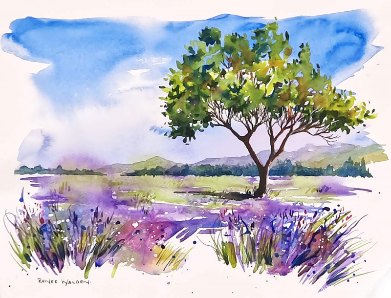
Lavender Meadow
2 May 2024
Video - Level ◆◆◆
In just over a month I'll be heading to France to guide a 10 day retreat and one of the things we hope to paint will be fields of lavender :-) There's something so evocative about painting lavender in France. It feels like a must do for any painter visiting the southern regions in summer.
I didn't want you to miss out, so in this lesson we can paint a meadow of lavender together. And in a lovely loose style. We start with a very wet-in-wet background for the whole scene - painting the sky through to the foreground in one go. It's an exciting way to paint! Then, when this is dry, we add a few details on top.
It's good to be organised for this one, so get everything ready and reach before you start.
Happy painting!
Video run-through...
About This Painting
A lavender field in Provence with a large summer tree in the foreground — painted in a deliberately loose, joyful style that is quite different from the more controlled approach used in most lessons. The background is laid down in a single fast, wet pass with sweeping colour and intentional splashing; the tree and foreground details are tightened up on top once everything is dry. The whole lesson is a study in knowing when to let go and when to pull back.
No tape around the edges — the rough, unmasked edge is part of the loose aesthetic.
The Approach: Two Stages
This painting works in two clearly distinct stages and the mindset for each is different. The first stage is fast, bold, and improvisational — colours dropped and swept across a partially wet surface, splashing encouraged, edges deliberately varied between soft and hard. The goal is not accuracy but atmosphere. The second stage is slower and more deliberate — small brushes, careful marks, building up the tree and the foreground details on top of the dried background.
The temptation to tighten up during the first stage should be resisted entirely. Once it's working, stop and let it dry.
Colours
Mix several pools before starting, because the first stage moves quickly and there's little time to mix mid-process. For this scene:
- Cobalt blue — sky
- Ultramarine violet — background lavender (less intense, for distant rows)
- Permanent violet — foreground lavender (stronger, saturated)
- Ultramarine blue — background trees and sky accents
- Sap green and green gold — tree canopy and grass
- Natural sienna and quinacridone sienna — earth tones, tree branches
- A touch of pink can be added for warmth in the lavender
Keep all pools well loaded with water so they're ready for fast dipping.
Stage One: The Loose Background
Do not tape the edges. Work without taping a border — the soft, ragged edge that results is part of the style.
Rather than wetting the whole paper evenly as usual, use a combination of brush and spritz bottle to wet selected areas, leaving some patches dry. This deliberate unevenness means the colour will behave differently across the page — blooming and running where the surface is wet, sitting hard-edged where it is dry. Both effects are wanted here.
Sky: Sweep cobalt blue in from the top with a large brush, darker at the top and lightening toward the horizon. Add a touch of permanent violet into the blue for a suggestion of warmth. Work quickly and leave some dry-paper areas that create hard streaks and edges — this is fine and even desirable. Soften some edges with a clean damp brush; leave others hard. This unconventional sky has character.
Lavender rows: While the sky is still wet or just after it dries slightly, drop in the lavender. Ultramarine violet for the rows furthest back (pale and cool), permanent violet for the rows coming forward (richer and darker). Leave gaps between the rows for green to fill in later. Add splashes of colour in places — small irregular marks read as individual flowers. Introduce some ultramarine blue and some pink into the lavender area to add colour variety; lavender in nature is never a single flat violet.
Greens: Horizontal strokes in the background for distant hedges and fields; more vertical strokes in the foreground grasses between the lavender rows. Use sap green and green gold, varying between them. Let the purple and green sit adjacent to each other without overmixing — as long as they're not scrubbed together, they'll remain clean rather than making mud.
Let everything dry completely and naturally. Do not use a hairdryer. The colours will continue to separate and settle, and the final result will be richer than what was visible immediately after painting.
Assessing the Background
Once dry, stand back. The background will look loose and textured — exactly right. Every painting's background will be slightly different at this stage, and the second stage needs to respond to what's actually there rather than following a fixed plan. Identify where the focal point is, where the colours are working, and where additional detail is needed.
Stage Two: Background Hills and Trees
With a medium brush, add the rolling hills in muted greens and earth tones. Work from back to front, letting adjacent hills merge slightly while still wet so they don't have hard separating lines. A line of dark pine trees sits at the base of the hills — painted while the hills are still slightly damp so the bases soften into the lavender below. Keep the marks loose and the shapes interesting at the edge; these background elements are not the focal point and should not be fussed over.
The Tree Canopy
The summer tree is the compositional centrepiece. It has a wide, asymmetric canopy — the light source is from the right, so the right side and upper areas are green gold (bright, warm, sunlit) and the left side and underside are sap green plus indigo (cool, shadowed).
Hold the brush toward the back for most of the canopy work — this makes the marks looser and more organic. Use the side of the brush as well as the tip. Leave gaps through the canopy where sky shows through (birds need somewhere to fly). The overall shape of the tree should feel natural and slightly asymmetric rather than perfectly round.
Once the basic canopy shape is in place, while it is still slightly damp, tease in the main branches using a small round brush and a brown mix (quinacridone sienna lightened with water for the lit side, sienna deepened with Payne's gray for the shadow side). Painting branches into damp leaves causes the branch colour to bleed slightly into the surrounding foliage, which makes the tree feel integrated rather than drawn onto a flat surface.
Foreground Details
With a rigger zero and a small round brush, add the foreground lavender stalks — long, sweeping vertical strokes in permanent violet and dark greens, largest and most detailed in the immediate foreground, diminishing rapidly toward the back. A few splashes of cobalt blue in the foreground add sparkle. White gouache splattered or dotted over the lavender suggests sunlight catching the flower heads.
The tree needs a cast shadow on the ground to its left, otherwise it will look like it's floating. Use a diluted version of the shadow mix and let it extend naturally into the surrounding ground.
Pen Work
Dark brown ink in a fine pen on the shadow side of the tree: tighten the main trunk, add the finest branches at the canopy edges, suggest a few knots and joints. Work slowly — there's no time pressure here unlike in the wet stages. A few fine ink strokes in the lavender foreground stop the pen marks being concentrated only on the tree.
White gel pen on the sunlit side of the trunk and main branches. White gouache or a white Posca marker for small daisy-like dots around the base of the tree where wildflowers grow. Any colour Posca markers available can add extra flower dots in the foreground.
The Balance
The joy of this lesson is in the contrast between abandon and control — the first stage asks you to trust the process and not interfere; the second stage asks you to be precise and deliberate. Keeping those two stages separate, and not letting the second stage undo the freshness of the first, is what makes the painting work.
Resources...
* Reference photo
Join me on Patreon
Join my Adventures in Colour Tier for $16 to access this post and my full library of over 200 others including deep-dive videos and step-by-steps.