 Video on Patreon
Warm vs cool colours
9 May 2024
Video - Level ◆◆◆
Often in a lesson, particularly when we are painting a landscape, I might ask you to mix up a cool blue, or a warm blue; a cool yellow or a warm yellow. I realised that I haven't spent much time explaining in detail what I mean by this and why it is important.
Knowing more about cool vs warm colours will give you a tool to help you create the right mood in a painting - soothing, sunny, calming, energetic, or somber. It will also help you create the illusion of depth in your landscape paintings.
I'm also often asked by students why their painting doesn't seem as vibrant as mine. While the answer to this is quite detailed and is another lesson all of it's own, part of the answer lies in knowing more about what colours you're mixing together and whether they're warm or cool.
This a rather different lesson today - a sort of combo of skills, theory and Q&A. I've given you the worksheet I've created to download and keep, but I recommend you paint along with your own palette and make a worksheet of your own too.
Happy painting!
Video run-through...
About This Lesson
This is a theory lesson on colour temperature — what it means when you hear "mix a warm blue" or "cool yellow" in a painting tutorial. Understanding warm versus cool colours is essential for creating mood, building a sense of depth, and mixing cleaner, more vibrant colours. This lesson works best if you follow along and make a little worksheet as you go rather than just watching.
What Is Colour Temperature?
A colour wheel makes this easy to visualise. Split it down the middle and you've got two camps: the blues on one side are cool, and the yellows on the other side are warm. The colours in between — greens and reds — can go either way depending on what's in them. If a green leans blue, it's cool. If it leans yellow, it's warm.
The first reason this matters is mood. A painting made mostly of cool colours — blues, blue-grays, muted violets — tends to feel calm and soothing, even if the subject is dramatic. A painting made mostly of warm colours — yellows, oranges, ochres — feels happy, sunny, and vibrant. When you sit down to paint something, it's worth deciding early on which side of the colour wheel you want to live in.
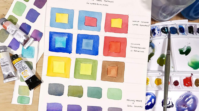
Cool Colours Recede, Warm Colours Come Forward
This is one of the most useful concepts in all of painting. Do this exercise: paint three small boxes with overlapping colours — cobalt blue with a warm yellow in the middle, cobalt blue with a red in the middle, then red with yellow. In each case, the warmer colour jumps forward. The yellow will always appear closer than the blue. Surprisingly, yellow also comes forward against red — yellow is the warmest of all the primaries.
This is the foundation of aerial perspective. Things that you want to look distant should be painted in cool, blue-leaning tones. Things in the foreground should be painted in warm, yellow-leaning tones. Look at almost any landscape painting that has a convincing sense of depth, and you'll find cool blues and blue-greens in the background, with the warm yellows, ochres, and oranges moving closer to the viewer. It works for still life too — background lemons can be painted with a blue undertone while the same fruit in the foreground reads as a pure, forward-pushing yellow.
Warm and Cool Within a Single Colour
Within each colour family, there's also a temperature shift. Two blues can look similar sitting next to each other on the palette, but put them in those same overlapping boxes and the difference becomes clear. Ultramarine has a touch of red in it — it's a warm blue. Ultramarine turquoise has a touch of yellow — it's a cool blue. The turquoise will appear to come forward compared to the ultramarine. The same logic applies to reds, yellows, and greens.
To find out where your colours sit, check the back of the tube. It will usually list the pigment or the colour mix. If your blue has red in it, it's warm. If your yellow has red in it, it's warm. If both lean towards yellow, they're cool.
How Colour Temperature Affects Mixing
This is where knowing your palette really pays off — especially when you're trying to avoid muddy colours.
Mixing Greens
When you mix a blue with a yellow, you're combining two colours. But if your blue has red in it (like ultramarine) and your yellow is warm (like hansa yellow deep), you're actually mixing three primaries — blue, red, and yellow — and three primaries together make mud, or at least a muted neutral. This is perfect for olive greens, distant trees, or any scene where you want something quiet and understated.
Swap in a more neutral blue like cobalt blue with the same warm yellow, and you'll get a more vibrant, sap-green-like result. Go even cooler with phthalo blue and you get a brighter green still. Add a cool lemon yellow to that phthalo blue, and you'll get the most vivid green possible — two cool colours producing a very bright, sharp result.
So if your greens keep coming out dull, try mixing a cooler blue with your yellow, and check whether your yellow has any red in it.
Mixing Purples
The same principle applies. Ultramarine (warm blue) with quinacridone rose (a warm, clean red) gives you a beautiful, vibrant purple — two colours that share warmth without introducing a third primary. Switch to phthalo blue with the same quinacridone rose, and the purple is noticeably duller, which can be surprising given how bright phthalo colours usually are.
Add a red that leans orange — like pyrrole red, which has yellow in it — and now you've introduced all three primaries again. The result is a very dull, muted purple. Mix cobalt blue with pyrrole red, and it moves so far from purple it becomes a warm gray. None of these mixes are wrong — a neutral gray mixed this way is often far more interesting than a flat Payne's gray straight from the tube. But knowing what you'll get before you mix it puts you in control.
Making a Colour Temperature Worksheet
This lesson is most useful if you make a worksheet alongside it. Paint your own small overlapping boxes and test:
- A warm blue vs. a cool blue (try ultramarine and phthalo or turquoise)
- A warm yellow vs. a cool yellow (try hansa yellow deep and lemon yellow)
- Green mixes: warm blue + warm yellow, cooler blue + warm yellow, cool blue + cool yellow
- Purple mixes: warm blue + warm red, cool blue + warm red, warm blue + orange-red
The combinations you can make depend entirely on what's on your own palette, which is exactly the point. Getting to know your own colours — what's in them, how warm or cool they are, what they do when mixed — gives you far more creative range than anything you can mix from a tube.
Why This Matters for Vibrant Painting
Vibrancy in a watercolour painting isn't only about using bright, saturated colours. It's about clarity — colours that stay clean and let the paper shine through. Muddy mixes come from unknowingly introducing a third primary, and knowing your colour temperatures is the single best way to avoid that. When you want a vibrant green or a luminous purple, choose two colours that share the same temperature lean, or sit close together on the colour wheel. When you want something muted and neutral, cross the temperature boundary deliberately.
The goal is always to break the rules with intention rather than by accident.
Resources...
* Worksheet
Join me on Patreon
Join my Adventures in Colour Tier for $16 to access this post and my full library of over 200 others including deep-dive videos and step-by-steps.