 Video on Patreon
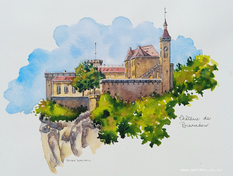
Chateau de Rocamadour
27 June 2024
Video - Level ◆◆◆
Visiting the amazing medieval town of Rocamadour is always a highlight day of my retreats in France in June. There's a castle, a huge cathedral and a very charming village along the bottom. A lifetime's inspiration.
Because there is so much to explore, most of my students very rarely paint here. But this last visit, I did stop near the top of the village to sketch the chateau with one of them. Looking back at the sketch in my sketchbook, I knew I'd like to do the scene again, this time in the comfort of my studio and a painting, not a sketch.
So here it is - a wonderful castle for you to paint along with me.
Happy painting!
Video run-through...
About This Painting
Rocamadour — a medieval château and cathedral perched on a cliff in the Dordogne region of France, surrounded by lush greenery and bathed in summer light. An ambitious scene, but the approach is methodical: buildings first, cliff and roofs together, greenery in broad sweeps, shadows last, then the sky cut in around everything. The pencil drawing is the hard part. The painting moves fairly quickly.
A traceable drawing is available in the lesson description.
Composition Notes
Use the church tower as the key measurement — size everything else proportionally from it. Simplify detail heavily away from the focal point (the church steeple). A hillside in the background was deliberately left out to give the castle a fairy-tale feeling of floating in the sky.
The cliff base was modified from the reference photo to create a slight overhang rather than a straight vertical edge — if you want the same effect, adjust your pencil line accordingly.
Hatching in the drawing is optional but recommended — it guides shadow placement and shows through the washes, adding a pleasing texture.
Edge options: This lesson works as an open sketch (loose edges top and bottom) or with tape all around for clean edges. Decide before you start, as tape needs extra margin.
Colour Palette
Buildings and cliff (base wash): Natural sienna (or raw sienna/yellow ochre) as the main colour, with burnt sienna, burnt umber for variation, and a small amount of ultramarine-quinacridone sienna grey for older or cooler stonework.
Roofs: Burnt umber with quinacridone rose — a reddish-brown. Vary from more red to more brown across different buildings.
Greenery: Green gold or sap green with a touch of yellow (sunlit areas), sap green (mid), indigo (deep shadow). A touch of warm brown or sienna dropped in for naturalness.
Shadows on buildings: Two mixes — ultramarine and quinacridone sienna leaning blue (cool shadows, under eaves), and the same mix leaning brown (warm shadows, lower walls). Natural sienna for a warm golden glow within shadows. Shadows shift from cool (top) to warm (middle) to cool (bottom) for interest.
Sky: Cobalt blue only — clean and simple. No variation needed given how much is happening elsewhere.
Figures (optional): White gouache tinted with watercolour drops for bright clothing; a tiny dot of dark for heads.
Painting Order
- Buildings — base wash (all stonework)
- Cliff — same colours as buildings, done at the same time
- Roofs — reddish-brown, once walls are dry
- Greenery — sweeping wet-into-wet passes
- Shadows on buildings — warm and cool, varied
- Sky — cut in around buildings last
- Pen work and figures
Step 1: Buildings — Base Wash
Work with a large brush, left to right, painting all visible stonework in one continuous session so colours can bleed naturally between walls. Apply natural sienna as the base and drop in burnt sienna, burnt umber, and grey variations while still wet. Let adjacent buildings blend together slightly — the character this creates is a feature, not a mistake. Go straight over all windows and dark areas (they'll be covered by shadows later). Keep roofs unpainted for now.
Step 2: Cliff — Same Session
Do the cliff base wash at the same time as the buildings, using the same colours. The golden/ochre colour appears on the overhanging undersides; the grey goes on the weathered tops. Drop in brown and grey variations while wet. The shared palette means cliff and buildings read as the same stone.
Step 3: Roofs
Once walls are dry, switch to a smaller brush. Mix burnt umber and quinacridone rose for a warm reddish-brown. Vary each roof slightly — newer roofs more saturated, older ones more muted. The church steeple roof (focal point) can be slightly brighter and redder.
Step 4: Greenery
Two or three separate sweeping passes from left to right, each staying wet long enough to drop in shadow colours. Hold the brush well back throughout to keep the edges loose and natural.
Lower bushes and ivy: Start with green gold (sunlit), drop in sap green and then indigo on the shadow side (right), and finally a touch of warm brown. Shadow goes underneath and on the right side throughout — sun is coming from the left.
Tall background trees: Sap green as the base (not green gold — these are a slightly different character), then ultramarine for the shadows (rather than indigo, to distinguish from the lower greenery), then natural sienna dropped in for warmth and naturalism.
Large canopy: Break into thirds if needed; work each third while still wet before moving to the next. The darker the shadow contrast, the more convincingly sunny the scene reads.
Step 5: Shadows on Buildings
Two shadow mixes: one blue-leaning (cool), one brown-leaning (warm). Natural sienna ready to drop in as well.
For each shadow area: apply the cool blue at the top (under eaves, where least light reaches), shift to warm brown in the middle, and cool again at the base if possible. This colour shift prevents the shadows from reading as flat grey. Drop a touch of natural sienna for a warm reflected glow within the shadow.
Older buildings (battlements, ancient stonework) get cooler, bluer shadows. Newer plasterwork buildings get warmer ones. The church steeple and its surrounds — the focal point — get the most careful treatment with the most variation.
Vary how saturated you go. Brave, dark shadows make it look like a proper summer's day. Timid grey shadows kill the painting.
Let dry thoroughly with a hairdryer before the sky step.
Step 6: The Sky
Wet the sky area first with clean water in an interesting, irregular cloud shape. Let the church steeple protrude up out of the sky rather than being contained within it — this gives the scene its fairy-tale quality.
Use cobalt blue only, applied with a large brush from the outside edges working towards the buildings. Use a smaller brush to cut in around the architecture. Leave some irregular white gaps for clouds and birds. If the sky looks blotchy — that's fine, even desirable. Let dry naturally; hairdryer too soon creates unwanted blooms.
Step 7: Pen Work and Figures
White gel pen: Everything on the sunlit left-hand side — window frames, gutters, wall edges catching the light. Use a ruler if needed for the flagpoles and cross. White gel pen ink can be lifted while wet if you make an error.
Dark brown ink: Shadow sides — right-hand sides and underneath. Tree trunks. Architectural details at the focal point. Windows (dark interiors). Keep detail concentrated at the church; minimal or absent further away.
Figures (optional): White gouache tinted with drops of watercolour — one tiny dash of colour for the body, one tiny dot of dark for the head. Keep them all roughly the same size and positioned so only the upper half is visible (they're standing). Groups of two or three read more naturally than solo figures.
Resources...
* Reference photo
* Drawing to trace
Join me on Patreon
Join my Adventures in Colour Tier for $16 to access this post and my full library of over 200 others including deep-dive videos and step-by-steps.