 Video on Patreon
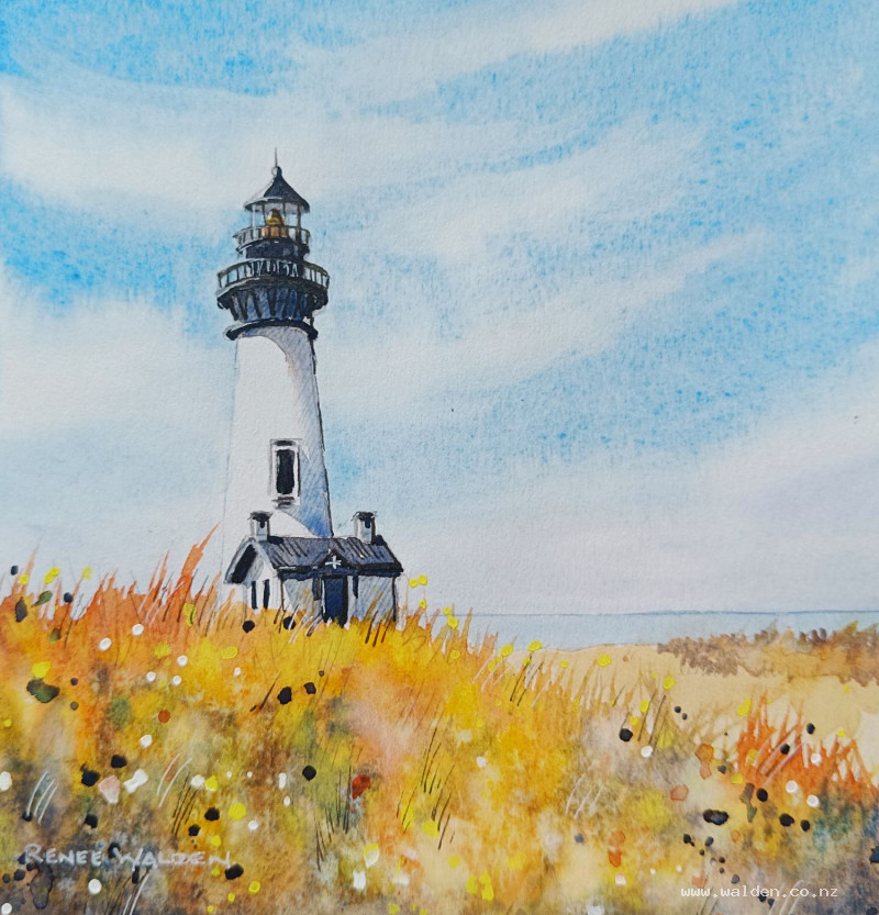
Summer lighthouse
1 July 2024
Video - Level ◆◆◆
It's the second birthday of my Patreon and nearly the first birthday of Renee's Studio! So I thought it would be nice to start this month with a bonus lesson and you know how much I love to paint lighthouses.
This painting has a lovely contrast of warm vs cool colours and very loose foreground contrasted with the tightness of the pretty lighthouse. Both ideas are fun to play with.
Thank you for your support! Here's to another year of painting together.
Happy painting!
Video run-through...
About This Painting
A lighthouse with a small keeper's cottage, painted with a hazy seaside sky, cool blue tones throughout, and a rich warm foreground of dry grasses and wildflowers. Salt texture, gouache splattering, and scratched grass marks all come together in the foreground to contrast with the precise, detailed lighthouse. The painting order is reversed from the usual approach — lighthouse before foreground — so that grasses and flowers can be teased over the building's base.
You'll need table salt, white gouache (and optionally yellow), and a scratching tool (the back of a brush, a credit card edge, or a ruler edge).
A traceable drawing is available in the lesson description.
Drawing the Lighthouse
Lighthouses are tricky to draw because they lean over very easily. Before drawing the outline, mark a vertical centre line from top to bottom. Then measure equal distances on both sides of that line at each horizontal level so the building is symmetrical. The curved profiles of the tower need to get slightly more curved as they move away from the sea-level horizon line — flatter curves near the waterline, steeper curves toward the top and base.
Painting the Sky
Wet the sky carefully with a flat brush, carving neatly around the lighthouse and cottage silhouettes. Have paper towel handy for any water that strays onto the buildings. Let the first pass of water settle into the paper fibres, then check for dry patches from the side before beginning to paint.
Mix cobalt blue for the upper sky (a slightly cerulean cobalt suits the hazy coastal atmosphere) and a diluted lavender mix (cobalt blue with a touch of permanent violet) for the horizon. Seaside horizons often have a purple-lavender haze that gives them a distinctive quality distinct from inland landscapes.
Drop the cobalt blue into the wet sky with broad streaks, working in both directions and leaving gaps. Add the lavender mix at the horizon, blending gently upward. While still very wet, clean and dry the brush on a paper towel until just damp, then use the tip to lift out soft cirrus streaks — twist and drag the damp brush through the wet paint. Work quickly; if the paint has dried enough to leave a visible brushstroke without bleeding, stop. Any water on the brush at this stage will cause cauliflowers.
Let dry naturally — don't use a hairdryer. The streaks need time to continue settling.
Painting the Lighthouse and Cottage
Before laying in the main white of the lighthouse, add all the small dark structural details first: the railings, lantern housing, window frames, the distinctive horizontal bands, and any metal fittings. Use a fine brush and a near-black mix. This approach means the dark details sit cleanly without the risk of going over already-laid colour, and the white of the lighthouse is then applied around them.
The lighthouse and cottage walls are not pure white — they carry the colour of the light source and sky. The sunlit faces (left side, facing the light) are very pale warm cream; the shadow faces are a cool, diluted blue-gray consistent with the sky colour. Apply each tone separately and let them transition softly where they meet.
The keeper's cottage has its own small shadow and window details. Keep the architectural detail accurate but not laboured.
The Sea
A calm sea uses horizontal strokes with a flat brush or large round. The sea colour sits between the sky blue and the horizon lavender — a cool blue-green, lighter toward the horizon. Any reflections of the lighthouse in the water are vertical, directly below the building, and broken with small horizontal strokes to suggest gentle movement.
The Foreground (All at Once, While Wet)
The foreground is painted quickly as a single wet session so that the salt texture, scratched marks, and gouache splatters can all be applied before things dry. Have everything ready before beginning: a range of warm browns and yellows mixed (quinacridone sienna, natural sienna, sepia, yellow — four or five options), white and yellow gouache on a separate palette, a scratching tool, and the salt.
Wet the entire foreground area. Then drop in colour freely, varying between warm browns, yellows, and earthy tones. Leave white gaps here and there. Add darker tones in the corners and edges to give the painting weight. Work fast.
While still wet:
- Scratch out grasses with the back of a brush handle, a credit card edge, or a ruler edge. The wet paint is pushed aside and the paper shows through as fine light lines. This only works if the paint is genuinely wet.
- Sprinkle salt generously. The salt draws the wet pigment toward each grain, creating small starburst patterns as it dries. Don't disturb it — let it sit.
- Splatter gouache with a loaded brush. White and yellow gouache are heavy and opaque; they create distinct light dots over the darker foreground, suggesting wildflowers and seed heads. Gouache over dry paint sits on top cleanly; over wet paint it blooms slightly.
Let everything dry naturally — using a hairdryer will blow the salt across the painting. Once completely dry, brush off the salt crystals to reveal the texture they've left behind.
Final Splattering
Once dry, a second round of splattering refines the foreground: dark near-black splatter for shadow and depth, more white and yellow gouache for additional flower and sparkle marks. Some dark splatter in the far corners and edges reinforces the vignette. This second pass can be dried with a hairdryer once the splatters have settled (hold it at a distance to avoid moving them).
Pen Work
Dark brown ink in a fine pen (extra-fine nib) on shadow sides: under the eaves, the shadow face of the tower, below the railings, window surrounds, and structural joints. The goal is that a viewer shouldn't be able to tell pen was used — it merely sharpens what the paint has already done. Start gently, as the ink is permanent. A few marks in the foreground grasses prevent the pen detail from sitting only on the lighthouse.
White gel pen on the sunlit side: bright edges of the tower, the lantern housing, any metal fittings catching the light. The white gel pen is not permanent and minor errors can be lifted with a damp brush.
Sign and remove the tape.
Key Techniques
Salt texture only works in genuinely wet paint — if the surface is drying, re-wet before sprinkling.
Gouache splatter should be kept on a separate palette to prevent it contaminating the watercolour wells and making them chalky.
Scratching tools of various widths make marks of different character — experiment on scrap paper to find what each one produces.
Resources...
* Reference photo
* Drawing to trace
Join me on Patreon
Join my Adventures in Colour Tier for $16 to access this post and my full library of over 200 others including deep-dive videos and step-by-steps.