 Video on Patreon
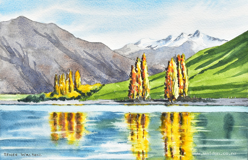
Autumn in Dublin Bay
12 September 2024
Video - Level ◆◆◆
We're continuing with the still water theme and reflections this week and painting a very pretty autumn scene from a bay on Lake Wānaka which is near my home in New Zealand. This is one of my favourite places to go painting, especially in autumn and so I'm very happy to be 'visiting' it again with you.
Happy painting!
Video run-through...
About This Painting
Autumn poplars on the shore of Lake Wanaka, New Zealand, reflected in still water. The scene is all about the relationship between the trees and their reflections — golden yellows, warm browns, and bright oranges echoed in soft, blurry mirror images below. The water does most of the talking, and getting the reflections right is the main challenge and the main pleasure.
A traceable drawing is available in the lesson description.
Composition Notes
Keep the shoreline off-centre — roughly a third of the way up the page works well. A centred horizon gives equal weight to land and water and reads as static.
Odd numbers of tree clumps create a more dynamic composition; even numbers feel more traditional and calm. Three clumps are used here.
Vary the height and width of each tree clump — uniform clumps look like wallpaper.
Mark the reflections in the pencil drawing before starting to paint — it prevents having to align them mentally during painting.
Blurry or sharp? Plan ahead. All the water reflections in this scene are soft and blurry, which immediately tells you they need to be painted wet-into-wet. Sharp reflections are painted wet-on-dry.
Colour Palette
Sky: Cobalt blue (keep simple, no need for more).
Mountains: Cobalt blue with a touch of ultramarine violet (back mountain, snow shadows), ultramarine and burnt umber (front mountain). Both kept pale and blue-leaning to stay in the background.
Green hill: Sap green (base), sap green with indigo (darker gullies and shadows).
Tree reflections and trees: Lemon yellow (lightest highlights), Hansa yellow medium, Hansa yellow deep, burnt umber (shadow side), a little sap green, optional orange (quinacridone sienna or similar) as an accent in the focal point.
Water: Cobalt blue (sky V-reflection), Prussian blue dulled with indigo (darker water areas), sap green with indigo (green hill reflection).
Wind streak: Cobalt blue.
Painting Order
- Sky — wet-into-wet, simple cobalt blue with cirrus
- Back mountain — form shadows, then rock details
- Front mountain — wet-into-wet base wash
- Green hill — sap green base
- Water reflections — wet-into-wet, all at once
- Wind streak
- Trees — main focal clumps first
- Tree trunks, scrub, beach
- Shadows — hills, trees, and ripple marks
- Optional pen work
Step 1: The Sky
Wet the sky, let it settle, then apply cobalt blue in soft horizontal streaks. Vary the spacing — no zebra stripes. Let the brush run slightly drier near the horizon so the blue is lighter there. Lift out a few cloud edges by twisting a nearly-dry brush into the wet paint. Keep it simple — the focal point is in the foreground.
Let dry naturally, then hairdryer.
Step 2: Back Mountain
With the sky dry, apply a light wash of cobalt blue plus ultramarine violet (cooler and paler than the foreground mountains) for the snow shadow areas. Follow the photo for shadow placement — all on one side. While still wet, drop in a few slightly darker marks for rock crags using ultramarine and burnt umber (test on scrap first — some blue-brown combinations go green). Soften some rock marks with a clean brush. Don't overwork — this mountain stays soft.
Step 3: Front Mountain
Same colour approach as the back mountain but slightly warmer (more burnt umber) and a touch darker. Wet-into-wet base wash with ultramarine and burnt umber, varying the proportion as you go. This mountain needs a little more texture than the back one to feel closer, but still pale and blue-leaning to stay behind the trees.
Step 4: Green Hill
Sap green base — a big simple wash. The yellow in sap green naturally pushes this element forward, which is correct. Drop in darker sap green while wet for gullies. Keep the distant field strip paler.
Step 5: Water Reflections
This is the centrepiece of the painting — take time with it.
Wet the entire water area (everything except the wind streak) with clean water. The reflections are very blurry, so the paint needs to be thicker than usual — watery paint will flood and spread too far. Keep the mixes concentrated.
Work light to dark:
First: Drop in a small pale cobalt blue V-shape for the sky reflection (this sits between the tree reflections and should be positioned under the trees, not centred).
Tree reflections: Drop in the highlight side first (Hansa yellow medium/deep), then the darker yellow, then a little green, then burnt umber with Payne's grey for the shadow side. Let each colour blur into the next. Reflections are slightly shorter than the trees above, slightly darker overall, and blurrier. The focal clumps get more colour variation; the distant clumps less.
Water colour: Fill the remaining water areas with Prussian blue (dulled with indigo) for the open water, and sap green with indigo for the hillside reflection.
Edges: While still damp, use the tip of a nearly-dry flat brush to drag horizontal strokes across the edges of the reflections, pulling tree colour into the water or water colour into the reflection to create the characteristic jagged, rippled edge. Direction matters — dragging from yellow into blue pulls yellow outward; dragging the other way pulls blue in. Clean the brush between each stroke.
If an area dries too soon, re-wet it carefully before continuing.
Once the main water is done, paint the small background water strip in a similar way — blue on one side, green on the other, merging to join the foreground reflections.
Dry thoroughly with a hairdryer.
Step 6: Wind Streak
A single horizontal stripe of cobalt blue with a small flat brush — slightly deeper than the palest sky colour. This simple mark separates the near and far water and adds a sense of movement.
Step 7: The Trees
Start with the main focal clumps while energy and concentration are freshest.
Use relatively thick paint so the colours don't spread too far (these are small areas). Apply lemon yellow to the sunlit side first, then Hansa yellow deep, a little green, and optional orange as an accent colour unique to the focal point. The shadow side gets burnt umber deepened with Payne's grey — this is the darkest area in the painting, providing maximum contrast at the focal point.
Hold the brush well back on the handle for loose, natural marks. Pull out a few individual branch or leaf details with a smaller brush once the main colours are in.
For the secondary tree clumps (further back): same colours but less saturation, no orange, and less dark on the shadow side. They're further away.
Scrubby bushes underneath get brown-green tones. Willows in the background get yellowy tops with green underneath.
Tree trunks: a grey-brown mix, painted vertically. Settle them into the ground with a slightly darker mark at the base.
Step 8: Beach and Scrub
The beach is a light grey (the mountain colour, diluted). Keep it pale and simple — no colour or texture to distract.
Step 9: Shadows
Work back to front.
Mountain gullies: Ultramarine and burnt umber, used lightly to suggest depth in the front mountain. Barely there.
Green hill shadows: Sap green and indigo — paint in the direction of the slope. Soften some edges while wet. This shadow is a strong directional element pointing towards the focal trees.
Tree shadows: The darkest mark in the painting — under and around the tree bases where they meet the ground. Settling the trees into the ground is what prevents them from looking like they're floating.
Water ripple marks: A few horizontal streaks of the water colour across the foreground, if the water looks too static. Easy to overdo — add tentatively and step back.
Step 10: Pen Work (Optional)
For a painting with no architecture, pen work is entirely optional.
Dark brown ink: A few fine marks suggesting smaller branches or bare twigs within the focal trees. A hint of fence posts along the shoreline. Very little or nothing in the background trees.
White gel pen: Small highlights and sparkle, particularly in the tree canopy.
The rule applies: if the pen is visible as pen, it's too much. If stepping back and wondering what to add next, put the pen down — the painting is done.
Resources...
* Reference photo
* Drawing to trace
Join me on Patreon
Join my Adventures in Colour Tier for $16 to access this post and my full library of over 200 others including deep-dive videos and step-by-steps.