 Video on Patreon
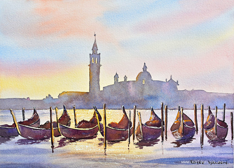
Venice at sunset
7 November 2024
Video - Level ◆◆◆
A very famous scene in this lesson - Venice at sunset. I was lucky enough to go on a solo sketching trip to Venice a few years ago and I did sketch the Grand Canal at sunset one evening. It was magical and the scene for this lesson brings back lovely memories.
Lots of wonderful light in this one and big shapes to play with various neutral colours. For this lesson we use just 3 primaries and you can choose your favourite red, blue and yellow combination.
There's also still water ... so a follow up to the lessons we've already been doing with that. In this one I show you how to use a normal wax candle to create the sparkles on the water.
Happy painting!
Video run-through...
About This Painting
Venice at sunset — boats and buildings in silhouette against a glowing sky, with shimmering light reflected across the water. The scene is all about the play of light: warm, rich colours in the boats and water contrasting with the cooler haze of the background skyline. The sparkle on the water is created using a wax candle resist, and the whole painting is built from just three primary colours.
A traceable drawing is available in the lesson description.
The Pencil Drawing
The scene has been simplified considerably — the skyline is treated as a single solid silhouette shape, and the windows are made slightly larger than in the reference to make it easier to paint around the glow of light shining through them. The boats are also simplified into a play of light and shadow.
Seven boats are included, but if that feels like too much, reduce to three or five — just adjust the skyline and composition to suit. An odd number of boats tends to work better compositionally. Move things around until you're happy with the arrangement.
Colour Palette: Three Primaries
The whole painting uses just three primary colours — a blue, a red, and a yellow. For this scene, cobalt blue, quinacridone rose, and hansa yellow deep were chosen: all on the warmer side, which suits the sunset mood.
Before you start painting, mix your chosen three together in different combinations and make a small swatch sheet. Two colours together give you oranges, purples, and greens; all three mixed together produce beautiful neutrals. Adjusting the ratio — more blue, more pink, more yellow — gives you a whole range of neutrals from cool to warm. These mixed neutrals will be used extensively for the buildings, background, and boats.
Mix up generous pools of each colour before you start, since you'll be returning to them throughout.
The Wax Candle Resist
Before doing any painting, apply the wax candle resist to the water area. This is what creates the sparkle of light on the surface. Use a normal white candle — experiment with both the tip and the flat side, pressing lightly for finer marks and harder for broader ones. Do a test on a scrap of paper first to find the right pressure.
Apply the wax along the main band of light in the centre of the water, the foreground, and along the left-hand sides of the boats where the light catches them. The wax is invisible once applied, so you have to trust the process — the magic reveals itself when the paint goes on over it.
This step is permanent and cannot be undone, so test first and take your time.
Painting Order
- Sky (wet-into-wet, painted over the whole background including the silhouette)
- Background silhouette (buildings and skyline)
- Water (underwash, then ripples)
- Boats — tops first, then hulls and reflections
- Poles and metal details
- Pen and ink finishing
The Sky
Wet the entire sky area thoroughly — including straight over the buildings and boat shapes — with clean water. Tilting your board at an angle helps the paint flow. Check from the side to make sure there are no dry patches.
Drop in a warm yellow glow in the area where the light source is (this will later reflect in the water below). Fill in the rest of the sky with sunset colours — purples, oranges, pinks — keeping it atmospheric rather than overly tropical. Let the colours blend wet-into-wet and don't overwork them. Painting over the buildings at this stage is intentional: it creates the warm glow that shows through the windows and gives the whole silhouette a luminous quality.
The Background Silhouette
Once the sky is dry, paint the entire background skyline — buildings, domes, towers — as a single flat wash using a cool neutral (all three primaries mixed, leaning towards blue). This is the hazier, cooler counterpart to the warmer foreground. Keep it simple and don't add detail; the shapes do the work.
The Water
Underwash: Wet the water area and lay in the base wash, reflecting the colours of the sky above — yellow in the centre where the light source is, cooler colours to the sides. Let the wax resist do its work as the paint flows across the surface.
Ripples: Once the underwash is nearly dry (the sheen is almost gone), add ripple marks using a neutral mixed from all three primaries. Work loosely — three-dimensional and expressive in the foreground, becoming flatter and more horizontal as they recede towards the background. In the yellow glow area, shift the ripple colour to a warmer brown. Keep marks minimal; too many ripples tips a painting from dynamic to static.
The Boats
Paint the boats in two stages so you can leave a fine unpainted line along the top of each hull — this sliver of underpainting catches the light and separates the hull from the top of the boat.
Tops first: Mix warm neutrals — reddish-brown and yellowish-brown, all three primaries leaning towards the warm side. Drop in touches of yellow along the edges catching the light, and a little blue in the deep shadows. Change colour as you move across each boat to keep things interesting. Even though these are silhouettes, there's plenty of room to vary the colour within the dark shapes.
Hulls and reflections: Mix the same colours but slightly bluer and darker than the tops. Paint each hull carefully, leaving the fine highlight line at the top, and when you reach the waterline paint straight into the reflection without lifting the brush. This connects the boat to the water and makes it feel grounded rather than floating independently. The wax resist will show up beautifully here, creating sparkle along the hull edges.
Keep the light source consistent — left-hand sides of boats should carry the warm yellow glow.
Poles and Metal Details
For the distinctive metal ornaments on the front of the gondolas, apply a very pale wash of yellow to suggest a shiny, light-catching surface.
For the poles, think about the direction of the light — some poles will have the light on the right, others on the left, depending on their position relative to the light source. Paint each pole with the light side left pale and the dark side in a very dark neutral (all three primaries, heavily loaded), then carry the colour straight down into the reflection below.
Pen and Ink Details
The painting has a lot of beautiful wet washes, so use the pen sparingly — just enough to sharpen things up without losing the softness.
Use dark brown ink on the shadow sides of the boats only, tightening any edges that need it. Use a white gel pen very carefully for the light-catching sides — but keep it so subtle that a viewer wouldn't notice it at first glance. Aside from the wax sparkle on the water, there's no stark white anywhere else in this painting; everything glows warm yellow rather than pure white. Keep that in mind when reaching for the white pen.
Nothing in the background needs pen work — leave the silhouette soft.
Remove the tape to reveal the clean edge, and the painting is done.
Resources...
* Drawing to trace
Join me on Patreon
Join my Adventures in Colour Tier for $16 to access this post and my full library of over 200 others including deep-dive videos and step-by-steps.