 Video on Patreon
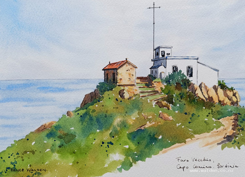
Sardinia Lighthouse
5 December 2024
Video - Level ◆◆◆
This old lighthouse - Faro Vecchio, Capo Camino - is on the eastern most point of Sardinia. The views from up here are spectacular as you can see a long way both north and south along the coast. It's one of my favourite places to go sketching.
So come and join me on my winter break.
Happy painting!
Video run-through...
About This Painting
An old disused lighthouse on a hillside on the easternmost point of Sardinia — white-walled buildings against a coastal sky, Mediterranean shrubs and warm-toned rocks, and a calm blue sea in the distance. The scene is full of colour contrast: pale sky and sea set against saturated olive greens and warm ochre rocks, with the white lighthouse standing out as the focal point.
A traceable drawing is available in the lesson description.
Perspective Note: Moving the Horizon Line
The reference photo was taken from slightly above the lighthouse, placing the horizon line high and cutting awkwardly through the building. For the painting, the horizon line was lowered so the lighthouse soars rather than being looked down upon.
Important: Moving the horizon line changes all the perspective angles. Lines above the horizon point downward to it; the further a line is above the horizon, the steeper its angle, and the nearer it gets to the horizon, the shallower. Lines below the horizon point upward. If you adjust the horizon position, every angled line in the drawing needs to be reconsidered accordingly.
Colour Palette
Sky: Cobalt blue (blue streak), cobalt blue with permanent violet and quinacridone sienna (cloud shadows) — three colours mixed so they separate on the paper and create texture in the clouds.
Sea: Ultramarine with a touch of quinacridone sienna — slightly grayed, not tropical.
Rocks and stone buildings: Natural sienna base, with quinacridone sienna, burnt umber varied throughout.
Greenery: Three greens — sap green alone (bright grass), sap green with ultramarine (blue-green), sap green or natural sienna with brown (olive green). Mediterranean vegetation is olivey and muted, not vivid.
Accent building roof: Pyrrole orange dulled with burnt umber — a brownish red, kept low-key so it doesn't compete with the focal point.
Blue building trim: Ultramarine, with a little Payne's grey.
Warm shadows (rocks, stone building): Ultramarine and quinacridone sienna — more sienna for warm surfaces.
Cool shadows (white lighthouse): The same mix shifted more towards ultramarine.
Painting Order
- Sky — wet-into-wet, blue streak and cloud shadows
- Sea — wet-into-wet, calm horizontal wash
- Rocks — warm base colours, joined masses
- Greenery — over and into the damp rocks
- Building details — red roof, blue trim, small features
- Splatter and road texture
- Shadows — warm (rocks) then cool (white building)
- Pen work
Step 1: The Sky
Wet the sky entirely with clean water, using a flat brush to cut around the white building carefully. A flat brush is excellent for seascapes — its edge creates a clean horizon line. Have a paper towel ready for any water that strays onto the building.
Mix three colours together for the cloud shadows (cobalt blue, permanent violet, quinacridone sienna) — the three-colour mix separates on the paper and creates natural cloud texture. A straight purple from the tube won't do this.
Apply a streak of cobalt blue in a diagonal arrow shape pointing towards the focal point (lighthouse), then use loose U-shaped strokes for the cloud shadows. Work light — it's very hard to lift colour from a sky without creating streaks. Larger, more varied shapes near the top; smaller and more horizontal near the horizon. Leave generous white gaps. Go slightly darker immediately around the lighthouse roofline so the white building contrasts sharply against the sky.
Let dry naturally.
Step 2: The Sea
Wet the sea area with clean water (flat brush for the horizon line). Mix ultramarine with just a touch of quinacridone sienna — enough to take the tropical edge off without going grey.
Apply with horizontal strokes only — the sea is flat and any curved strokes will read as waves. The paper being wet allows white gaps to remain as sparkle and ripples. While still wet, add a few slightly darker horizontal streaks with a drier brush for subtle variation. Lift out a few streaks as well.
The sea should be a restful, quiet area — save the colour energy for the foreground. Don't overwork it.
Dry thoroughly with a hairdryer before painting the foreground.
Step 3: Rocks
Find the large connected masses of rock and paint them in one or two goes rather than rock by rock. Start with a base of natural sienna across each mass, then drop in quinacridone sienna and burnt umber while still wet for colour variation. Dark accents under overhanging rocks or at the base of walls settle them into the ground.
The small stone buildings are part of the same colour family — treat them as part of the rock mass at this stage, adding shadows later.
Step 4: Greenery
While the rocks are still slightly damp, come in with the three greens. The paint will bleed slightly into the rocks and settle the shrubs naturally into the ground — this is preferable to trying to fit the rocks in around greenery afterwards.
Use a large brush and work with varied colour: olive green, blue-green, and bright sap green. Big, loose brushstrokes suggesting rounded shrub shapes. Leave white gaps for sparkle. The contrast between this saturated dark green mass and the white lighthouse is a key feature of the scene — keep it rich.
Splattering a little of the green colours across the foreground adds texture without adding detail.
Step 5: Building Details
Secondary red roof: Use the brownish red (pyrrole orange and burnt umber) and keep it muted — this is deliberately not the focal point. A bright red here will draw the eye away from the lighthouse.
Blue lighthouse trim: Ultramarine, carefully following the perspective lines. Can be done with pen instead if fine brushwork feels risky.
Other small details: A little ochre on the water tank, a few stones on the rock building walls. Keep these to a minimum — the wash underneath is doing most of the texture work and overworking the detail stage will kill the freshness.
Road and path texture: A very dilute warm brown wash suggests a rough stone surface without detail.
Step 6: Shadows
Mark shadow positions in pencil before painting if not already done during the drawing stage.
Warm shadows (rocks and stone buildings): Ultramarine and quinacridone sienna, with more sienna — a brownish warm grey. Apply to shadow sides and underneath overhangs. Vary the mix slightly — sometimes a touch more blue, sometimes a touch more brown. Join shadow areas from one element to the next in continuous passes where possible. Soften shadows in the background; keep sharper edges at the focal point.
Cool shadows (white lighthouse): The same mix shifted to more ultramarine. Windows and deep recesses can go very dark. These shadows are what makes the white building read as three-dimensional rather than a flat white shape.
Try to join shadow areas logically — a cast shadow from the building should connect to the shadow on the adjacent rock, not sit as an isolated mark.
Step 7: Pen Work
Dark brown ink: Shadow sides and rock crevices on the stone building — the right approach varies from left to right based on sun direction. A few cracks and texture marks in the foreground rocks. Nothing too far from the focal point.
Black ink: Blue trim lines on the lighthouse — a ruler helps for the very long straight lines of the flagpole and architectural trim.
White gel pen: Anything on the sunlit right-hand side catching the light — corners of the white building, bright edges.
Keep everything concentrated at the focal point. Details further from the centre should be minimal or absent.
Resources...
* Reference photo
* Drawing to trace
Join me on Patreon
Join my Adventures in Colour Tier for $16 to access this post and my full library of over 200 others including deep-dive videos and step-by-steps.