my watercolour palette
Updated : July 2026
A note before the list
I resisted writing this page for a long time — not because I'm secretive about my colours, but because I didn't want to send anyone on a shopping spree for paints they'll rarely use. My honest advice: work with what you have first.
A limited palette idea
My palette is quite large, but a limited palette of warm and cool of red, blue, and yellow, plus a couple of earth tones, will take you further than you'd expect.
For example :
- Ultramarine Blue (warm)
- Cobalt Blue (neutral)
- Hansa Yellow Medium (cool)
- Hansa Yellow Deep (warm)
- Pyrrole Orange (warm)
- Quinacridone Rose (cool)
- Burnt Sienna
- Raw Sienna
On paint quality
Artist-quality paint matters less than artist-quality paper — but truly cheap paint will frustrate you, and if you're selling work, fugitive pigments aren't fair to your buyers. The good news is that artist-quality paint is more economical than it looks: it's so much more saturated that a tube can last years.
Tubes vs pans
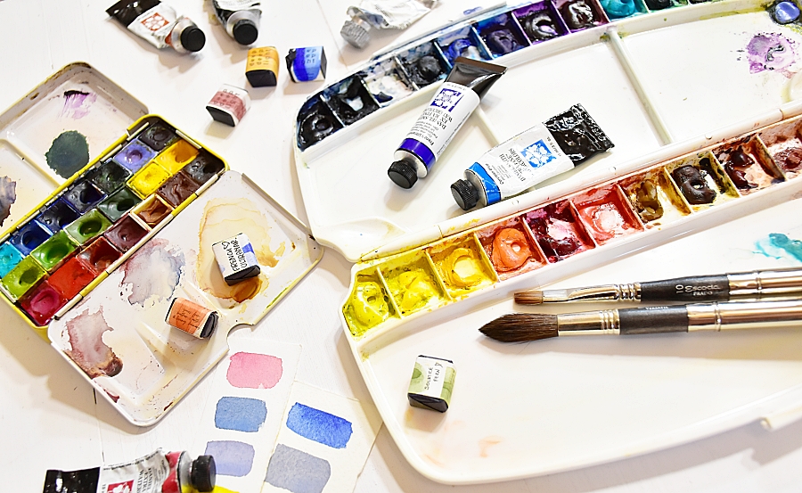
For studio work I prefer tubes dried into palette wells. Squeeze a dollop into each well, let it dry overnight, spritz with water before you paint, and you're ready to go. Big juicy puddles of colour, no fuss. Tubes are also more economical than pan paints.
Pans are very convenient if you'd like to change out colours often, because you can just pop them out and replace with a new pigment whenever you want.
How I lay out my palettes
Because reaching for colours becomes automatic over time, and that helps speed up colour decisions (watercolour painting is so time sensitive!), I keep the position of my colours consistent. I arrange them from cool through to warm - blues > greens > yellows > reds > earth tones.
Why almost all transparent colours?
The transparency of watercolour is what sets it apart from every other medium. I lean heavily on transparent pigments to let the light of the paper do the work — it's the surest way to avoid muddy mixes.
My two palettes
I work with two palettes.
- My main palette is a foldable Mijello Symphony with Daniel Smith and MaimeriBlu tubes dried into the wells — this is the one you'll see in all my online lessons.
- My travel palette is a small Meeden metal palette loaded with Deepdeeplight half pans, and I swap the pans out depending on where I'm going. More about my travel palette in this blog post.
What's on my studio palette?
~ These colours used more often than the others
Daniel Smith
Indigo ~
Ultramarine blue ~
Cobalt blue ~
Sap green ~
Green gold ~
Hansa yellow medium ~
Hansa yellow deep ~
Pyrrole orange ~
Quinacridone rose ~
Monte amiata natural sienna ~
Quinacridone sienna ~
Burnt umber ~
MaimeriBlu
Paynes grey ~
Prussian blue
Permanent violet ~
Turquoise cobalt
Lemon yellow
Pyrrole red
Dragon's blood
Sepia
Holbein
Lavender (W116)
Mineral violet
Pebeo
White gouache (I don't load this on my palette to avoid contanmination of my watercolours)
Want to see all my colour swatches and mixes?
Check out our app "Swatch Maniac"
It's free, works in your browser and there's nothing to install.
You can match my colour swatches and suggestions to any photo you upload. Great for planning your next painting.
Looking for more tips & advice? Join my mailing list...
Have a super colourful day!