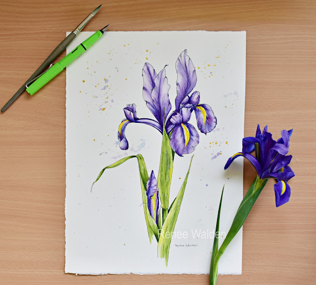
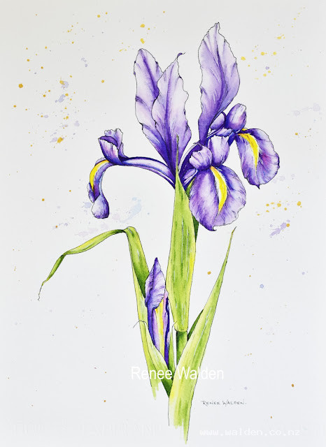
Spring has sprung in New Zealand and these beautiful Dutch Irises are putting on a wonderful show in my garden at the moment. Of course I needed to get my paints out before they fade as the weather gets warmer.
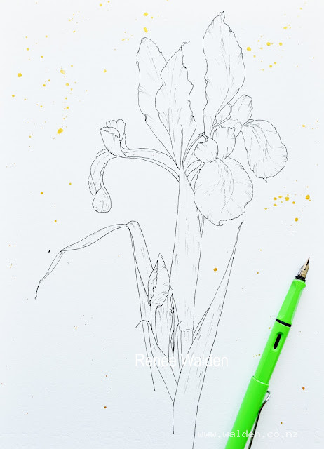
Ink Drawing..
After drawing the iris, the leaves and the bud in pencil I finished the drawing in waterproof ink. When the ink was dry I erased the pencil lines and then splashed some gold acrylic ink across the page, being careful to mask the flower with a piece of paper so that I didn't get any gold ink on it.
See my Tips & Techniques page (above) if want to know about the pens and inks I use.
Pen and ink drawing of Dutch Iris
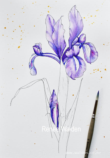
First Wash...
I paint each petal wet in wet. First I wet a single petal with clean water, then I drop in the colours carefully reserving the white areas to create highlights. I look carefully at each petal to notice where the the highlights and shadows are. I don't want any hard edges at this stage, so as the paint dries I soften with a clean, damp brush as necessary. I also use this damp brush to lift paint to create more highlights. Once one petal is complete, I move onto another petal that's not touching any damp petals, so that colours don't bleed from one petal to another.
The colours I used are MaimeriBlu Permanent Violet, Winsor & Newton Intense Blue and Daniel Smith Quinacridone Rose. The brush is an Escoda Perla No. 10.
First wash
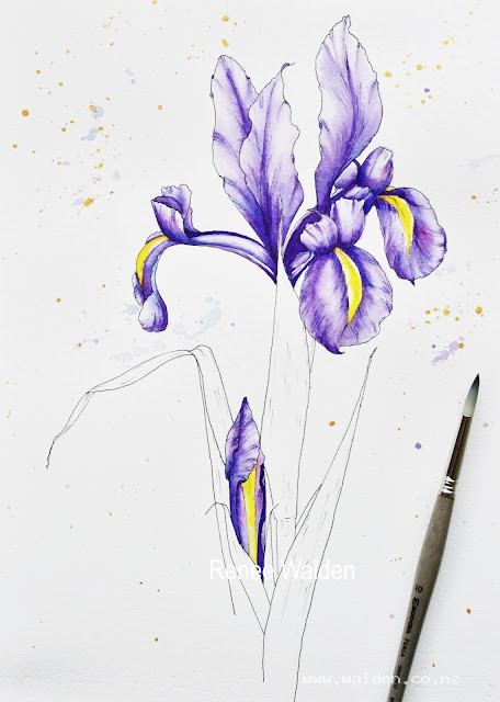
Finishing the flower & bud
Once the first wash is completely dry I follow the same procedure for a second, third, or even a forth wash. Wetting each petal with clean water again I strengthen the dark areas and soften any edges. Finally I concentrate on the very dark areas, adding details with a mix of paint with almost no water. I also add just a few veins to the petals with an almost dry brush. I'm still using the same No.10 brush.
The yellows I used are Daniel Smith Hansa Yellow Medium and Winsor & Newton Cadmium Yellow Light.
Dutch Iris flower and bud complete
Finishing the painting...
I'm sure you're getting the pattern here! I paint the leaves in exactly the same way as the petals. Wet in wet, layer after layer. The colours I used are Daniel Smith Sap Green and Hansa Yellow Medium. Still the same brush (isn't it amazing?! Highly recommend this brush.).
Finally I use a Uniball Signo white pen to add just a few little white highlights and I darken a few black lines where the shadows fall.
Sign and we're done.
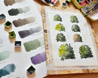
I'm off to Italy next week for my last retreat of 2026 and I'm getting all sorts of things ready. One of them is, of course, my palettes. One of the questions I get asked a lot is how I decide which c...
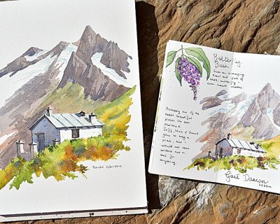
A couple of weeks ago, while hiking with friends in Val Ferret on the Italian side of the Mont Blanc massif, I made a decision that will surprise no one who knows me. An hour in, we stopped to shed ou...
My first watercolour retreat in Spain — Cabo de Gata, September 2027. Four years ago I moved to Spain. I've been painting here ever since — and quietly planning the day I could share it with you. ...