After last week's lesson where we painted the abstract goldfish using the negative painting technique, I thought it might be a good idea to follow up with a quick post showing other ways to use this technique.
Negative painting is not just for abstracts. It can be used for ...
creating highlights or shapes against a dark background
creating a lovely sense of depth
painting white objects, where you reserve the white paper
painting loose colourful washes or first layers with freedom, knowing you can come on top and cut in to create a shape.
So here are a few examples showing negative painting in practise...
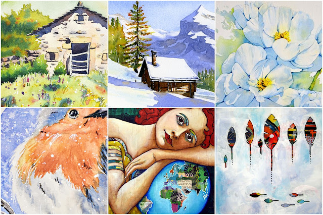
Little ermita : shaping the grasses by painting the dark bushes behind. This is a technique I'm sure you've seen in a number of my tutorials.
Snowy cabin : creating the white roof by painting the mountain behind. You can see how the dark mountain really brings the cabin forward.
White flowers : painting the background carefully around the flowers brings out their shape. This way you don't need to use masking fluid.
Little robin : painting the background around the outside of the bird to create the shape of the fluffy white feathers. Again, no masking fluid.
Mother earth goddess : negative painting is not only for watercolours. For this mixed media piece I first covered the canvas in collage and painted patterns. Then you can see on the world how I painted just the sea, to reveal the shapes of the continents.
Feathers : similar to the earth goddess and the goldfish we did last week. I first painted the canvas in an abstract way, then painted the background on top to reveal the feathers. Working this way, rather than painting the feathers on top of a background, creates a lot of depth and texture. Even in acrylics you can see the background coming through. Plus, like the goldfish we did, it a wonderfully free way to paint, starting loose and tightening up later.
I hope this gives you some ideas of how you can use negative painting. Next time when you're planning the steps for a painting, think about where this technique could be useful.
Happy painting!
PS
Are you surprised to see mixed media paintings from me? Haha! Maybe you are.
I've been painting for all my life and it hasn't always been just watercolours. I've always painted in watercolours, but it's only in the last 5 years that it's been only watercolours. In previous years I'd paint watercolours only outside and when traveling, then large mixed media pieces in the studio. Five years ago I wondered what would happen if I painted only watercolours and larger studio watercolour pieces too. Of course, you can guess what happened - my watercolour skills improved hugely and so did my joy in the medium. Will I go back to mixed media pieces in the future? Probably. I do sometimes miss painting big and bold. But right now I'm still not finished with this watercolour journey :-)
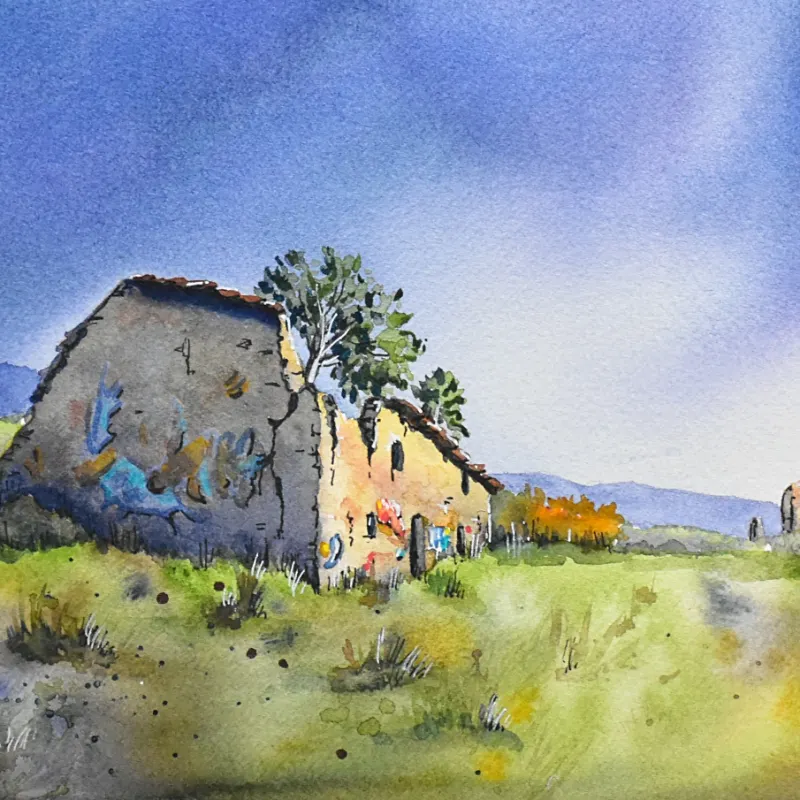
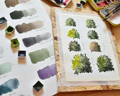
I'm off to Italy next week for my last retreat of 2026 and I'm getting all sorts of things ready. One of them is, of course, my palettes. One of the questions I get asked a lot is how I decide which c...
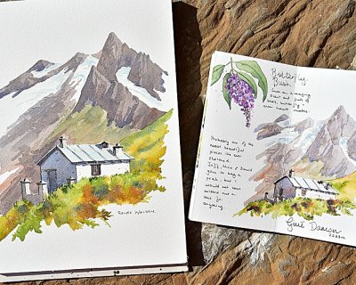
A couple of weeks ago, while hiking with friends in Val Ferret on the Italian side of the Mont Blanc massif, I made a decision that will surprise no one who knows me. An hour in, we stopped to shed ou...
My first watercolour retreat in Spain — Cabo de Gata, September 2027. Four years ago I moved to Spain. I've been painting here ever since — and quietly planning the day I could share it with you. ...