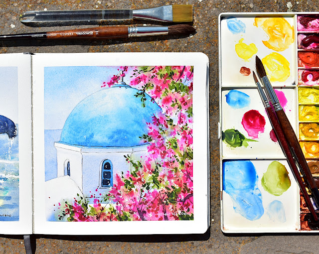
When I first saw the reference photo for this lesson, my immediate thought wasn’t architecture or accuracy — it was simply how much fun it would be to paint lots and lots (and lots) of flowers.
The chapel itself is beautifully simple: a clean, sharp blue dome and a few calm windows. But what really caught my eye was how perfectly that clarity could be framed by an overgrown tumble of vibrant pink bougainvillea. The contrast felt irresistible.
So instead of painting the whole building or sticking closely to the photographer’s original composition, we zoom right in. In this lesson, the chapel becomes almost a supporting character — a cool, solid anchor — while the flowers take centre stage, tumbling loosely across the page and framing the scene from the right and bottom.
Using a reference photo as a starting point, not a rule
This painting is a great example of something I encourage often: adjusting a reference photo to suit the feeling you want to paint, rather than copying it faithfully.
When you’re scrolling through photos — whether they’re your own or someone else’s — and one suddenly makes you pause, that’s your cue. Stop right there and ask yourself:
What is it about this scene that appeals to me?
Is it the colour contrast? The looseness? The calm shapes against something energetic? Once you know the answer, that is what you paint.
I often suggest writing that thought down before you begin. It gives you something to return to while you’re painting — a quiet checkpoint to make sure you haven’t drifted away from the original spark that excited you in the first place.
One photo, many paintings
Working this way also means that a single reference photo can be painted again and again, each time telling a completely different story. One version might focus on structure and geometry, another on light and shadow, and another — like this one — on joyful, expressive colour and movement.
In this lesson, we lean into looseness. The bougainvillea is painted freely, with layers of splatters and different brush marks, while the chapel remains crisp and calm by comparison. That push and pull is what makes the scene come alive.
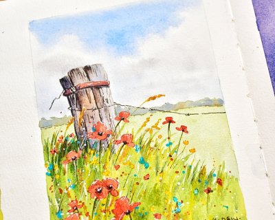
There's something irresistibly paintable about a weathered fence post half-swallowed by summer wildflowers. It's the contrast that does it — rough, sun-bleached wood against the soft, fleeting delic...
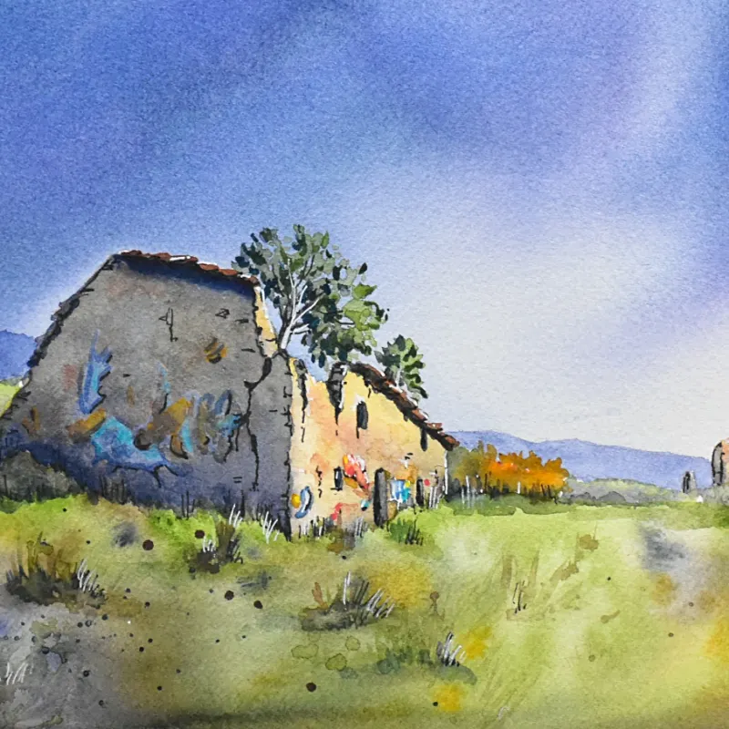
Five times at Périgord Retreats, and the magic is still there.. Every single time I hop on the train in southern France and get whisked through French countryside and villages to Gourdon Station — ...
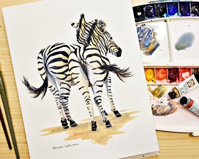
Ater spending time in South Africa recently, surrounded by the kind of wildlife you only see there, I came home with many sketches of zebras, giraffes, warthogs, baboons and more and a strong urge to ...