how to paint primroses without getting lost in the detail
2 April 2026
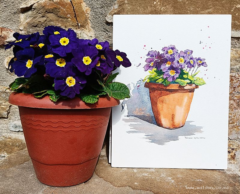
Violet primroses in watercolour
Aren't primroses just made to be painted? That deep violet with the yellow centres, and if you look closely, so many beautiful colour variations within each petal. They're the first really intense colour of spring while the rest of the world is still quite bare — a proper sight for sore eyes.
This lesson started the way the best ones do: spontaneously. I was sitting on my terrace one morning with a cup of tea, admiring the pot of primroses outside my door (I have pink ones too, but these violet ones stopped me in my tracks). I moved the pot around until the sun cast a beautiful shadow across it, took a photo, and went straight inside to record. It felt wonderfully immediate — a very satisfying afternoon.
What we cover in this lesson
The goal is to paint the flowers and leaves loosely — quickly, with lots of colour variation — without getting too tied up in botanical detail. Primroses have a lot going on, and it's easy to overwork them.
The technique I use here is to let the shadows do the separating. Rather than painting every petal edge individually, we paint broadly and use shadow details to distinguish one petal or leaf from the next. It's a much more fluid approach, and it keeps the painting alive.
Then there's the cast shadow — the one falling across the surface beneath the pot. This is the detail that takes a simple floral composition and makes it really interesting. Shadows anchor a subject, create light, and add that sense of a specific moment in time. We spend time on this, and it's worth it.
Who this lesson is for
If you find yourself getting fiddly with flowers — overpainting, losing freshness, struggling to know when to stop — this is a good one to work through. It's also a great exercise in observing and simplifying colour at the same time.
The full lesson is available to Patreon members. Come paint some primroses with me!
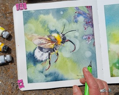
A super, super cute fluffy bumblebee. What's not to love?! The focus here is on the bee itself, with all the other elements in the scene soft and blurry. We have fun with painting the bright colours a...
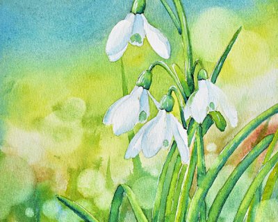
A very iconic symbol of the first signs of spring - snowdrops! They're so delicate and pure and super lovely to paint. In this lesson we also play with creating a bokeh effect - those circle highlight...
Potters pink is very pretty, dusty pink with an old world feel. It granulates beautifully and is very lightfast. While pretty on its own, it’s a super versatile colour to use in all sorts of ways. J...