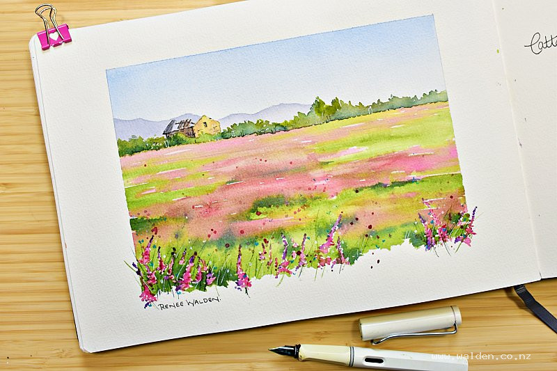
There's a particular stretch of road I've been driving lately that has been making my heart sing. The farmers around here have been planting their fields with sainfoin — a flowering crop used as an alternative to lucerne — and the result is kilometre after kilometre of the most glorious soft pink, rippling in the breeze like something out of a dream.
Pink is my favourite colour. I make no apologies for this. And when the landscape itself decides to go pink, well, I don't stand a chance.
With spring properly here and flowers everywhere you look, I grabbed my big camera on the way into town one morning and pulled over to photograph one of these fields. I knew immediately that I wanted to paint it — but I also knew I wanted to do something a little different with the composition.
Beyond the edges
Most of the time we work within a neatly taped border. It's tidy, it's controlled, and it works beautifully. But for this painting I left the bottom edge free, and let some of the foreground flowers escape out past the boundary of the paper. It gives the whole thing a looseness — a sense that the field just keeps going, that you're standing right there in the middle of it.
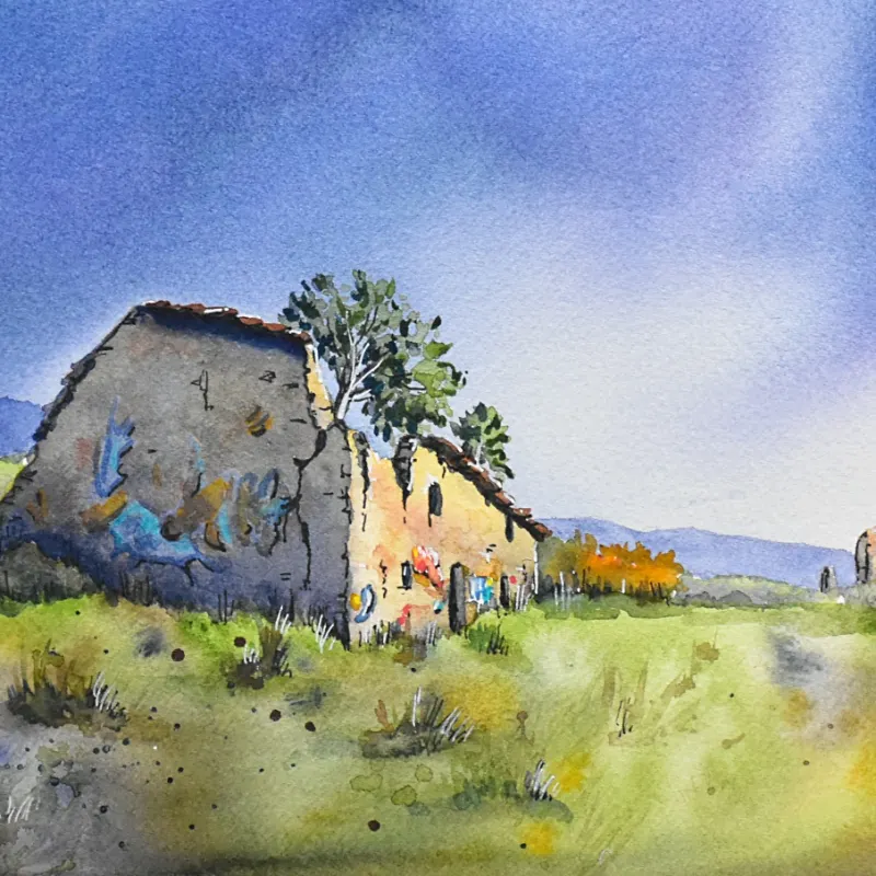
Behind the flowers, an old ruined barn anchors the scene. There's something quietly melancholy about a crumbling barn in the middle of a joyful pink field, and I loved that tension.
Painting depth into a meadow
The thing that excited me most technically about this subject was the challenge of creating real depth across the meadow — not just suggesting it, but making you feel the distance from your feet all the way to the treeline.
The way I approached it was through colour temperature, scale, and contrast. At the back, the pink streaks and green grasses are pale, flat, and soft-edged. As you move forward, the colours intensify, the shapes become more three-dimensional, and the contrast between light and dark increases. By the time you reach the foreground flowers, you've got rich quinacridone rose, deep indigo-greens, and strong shadows. Your eye reads all of that and understands: distance.
It's one of those techniques that sounds simple but is enormously satisfying when it works.
A note on working from reference
I deviated quite a bit from my reference photograph for this one — adding a background hill that wasn't there, simplifying the bushes, moving the light source so the barn reads as three-dimensional rather than silhouetted. I say this because I think it's worth remembering: the person who sees your finished painting has never seen your reference photo. Your painting needs to stand on its own, make its own sense, tell its own story. The reference is a starting point, not a contract.
Come paint it with me
The full step-by-step lesson is now available to my Patrons, walking you through the whole painting from the initial pencil drawing right through to the final pen details and those little cobalt turquoise hearts in the foreground (you'll have to come and see what I mean by that).
We cover wet-on-wet meadow technique, how to build layers of depth across a landscape, a simple but beautiful sky wash, and how to handle those loose foreground flowers so they feel free rather than overworked.
If you're not yet a Patron, this is a lovely one to join for — it's full of colour and spring energy and I think you'll enjoy it.
Already a member? The lesson is waiting for you. Happy painting. 🌸
There's something particular about returning to a place you loved when you were young. The Valley of the Red Gods, tucked into the Western Cape of South Africa, is one of those places for me — and f...
Aren't primroses just made to be painted? That deep violet with the yellow centres, and if you look closely, so many beautiful colour variations within each petal. They're the first really intense col...
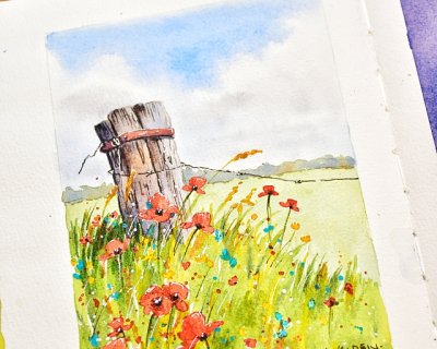
There's something irresistibly paintable about a weathered fence post half-swallowed by summer wildflowers. It's the contrast that does it — rough, sun-bleached wood against the soft, fleeting delic...