A behind-the-scenes look at palette prep before a painting retreat
I'm off to Italy next week for my last retreat of 2026 and I'm getting all sorts of things ready. One of them is, of course, my palettes.
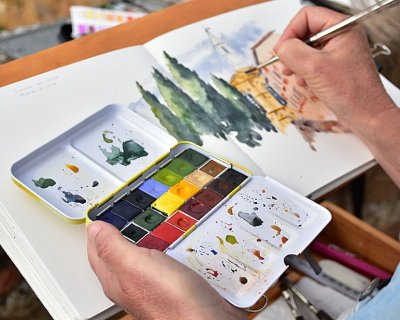
One of the questions I get asked a lot is how I decide which colours to pack for a painting trip. First off, I pack 2 palettes - my normal studio palette filled dried tube paints, and a smaller palette filled with half pans. I use both palettes for painting outside, but for some reason I think of the smaller palette as my 'travel palette'.
For the travel palette, it's not just a matter of grabbing favourites — every location, every season, calls for something specific. So while my studio palette has stayed pretty much the same for the last 25 years, my travel palette changes with each trip. It's so much fun!
So in this post I'm showing a bit behind the scenes of me choosing some greens to go into my palette.
What I'm looking for: greens for late summer in Italy
The landscape will still be lush but starting to shift in colour. There will still be plenty of green — deep, saturated, slightly tired late-summer greens — with perhaps the first hints of autumn warmth creeping in. So I'm looking for greens that will suit the place and the season.
For this trip, I'm building a small green section in my travel palette with four pigments:
A light tone — for sun-struck foliage and highlights
Two mid tones — for the body of shrubs and trees
A dark tone — for depth and shadow, ideally with some granulation
The granulation in the darks is important to me. It gives life and texture to shadow areas that can otherwise feel flat and heavy.
Step One: Swatch Everything
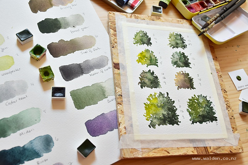
I started by swatching every green half pan I own — big swatches so I can really see the tonal range and any granulation as the paint dries.
What's with that violet colour in the swatches? Well, it was a surprise actually. On of the sample dot cards I had, the dot looked green. On paper, it swatched out violet. That's exactly why swatching is important - I wouldn't want this surprise while demoing in front my students!
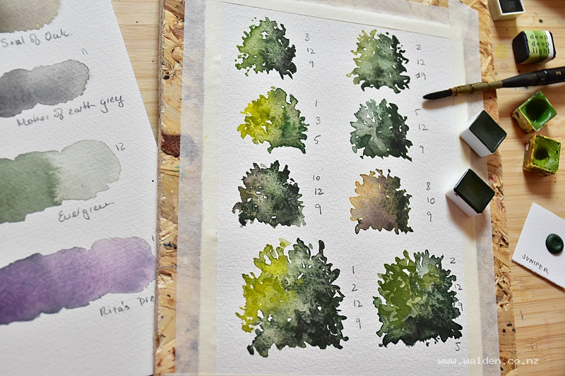
Painting bushes in various different watercolour greens
Step Two: Paint test bushes
Swatches tell me about individual pigments, but they don't tell me how colours work together. So the next step is painting small test bushes, trying out different combinations. This is honestly one of my favourite parts of palette prep — it's meditative and happy, and the results are often unexpectedly beautiful. Many smiley moments here :-)
I'm looking for harmony between the tones, not just technical merit. Do they read as a cohesive set? Can I layer the light over the dark convincingly? Is there enough contrast? Which combo suits the season and place?
Step Three: Make the final selection
Once I've painted enough test combinations, the right four greens usually become obvious. I pop the chosen half pans into my travel palette, with the near-misses and double ups going into a separate spare tin.
And here's something I always remind myself at this stage: these four greens are a starting point, not a limitation. I can still change these greens with other pigments in my palette, so I don't just have 4 greens packed, I have an almost infinite number.
Why premixed greens
I can mix greens from scratch if I want to pack light and go with a limited palette. But having a curated set of premixed greens ready to go is a real advantage when painting on location — it means speed, consistency, and more time looking at the landscape rather than mixing. Plus, you've got to admit, there are some really beautiful mixes here.
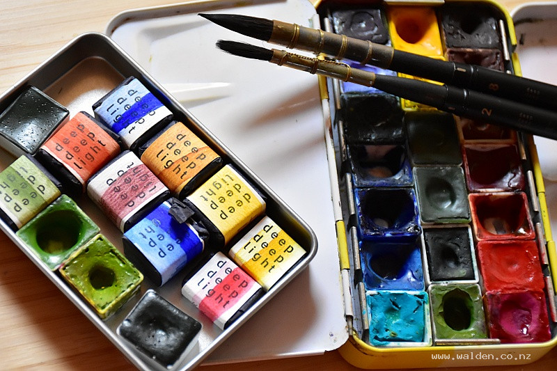
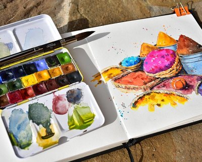
My watercolour travel palette
About the half pans & palette
All of these half pans are handmade by the wonderful team at DeepDeepLight Watercolors, and the pigment quality is exceptional. If you haven't come across them before, they're well worth exploring.
The little metal palette is from Meeden.
One last thought: I keep every sheet from these prep sessions, even the colours I don't choose for this trip. Late summer Italy greens won't be right for a spring retreat in Morocco or an autumn trip through France. Having a library of tested combinations means I'm not starting from scratch next time — I'm just pulling out the right sheet.
If you'd like to see how these greens look in practice, I'll be sharing work from Italy on Instagram throughout the retreat.
Happy painting!
PS : I do have a discount code for DeepDeepLight watercolours, brushes & sketchbooks. Use RENEELIGHT at checkout.
Usually I mix my colours.... Most of the time, I mix my own colours. It’s a wonderfully meditative part of the painting process and one I genuinely enjoy. Mixing gives me control, but also a sense o...
After months of painting with honey-based watercolours in pans from Deep Deep Light - in my studio and on location - I’ve got some thoughts about what makes these paints unique. Some of these discov...
A couple of weeks ago, while hiking with friends in Val Ferret on the Italian side of the Mont Blanc massif, I made a decision that will surprise no one who knows me. An hour in, we stopped to shed ou...