Water & Reflections
Every water scene is different — learn to observe before you paint
Six things to observe before you paint
The instinct is to paint water blue. But water is reflective and transparent — the blue you see is a reflection of the sky. Water under trees or bridges may have no blue at all. Before picking up a brush, look carefully at these six things:
- Colour — what colours are actually present? A single scene may have blues, near-whites, warm golds, and deep darks. Look first, mix second
- Ripple shape — in the foreground, ripples are three-dimensional; at the horizon, they compress to thin horizontal marks. Adjust your brushwork accordingly
- Ripple direction — however angled ripples are near you, by the horizon they appear horizontal. Don't carry a diagonal angle all the way to the back
- Hard and soft edges — water is rarely all one or the other. Paying attention to edge quality is what makes water convincing
- Tone — water can be the lightest or darkest area of a scene. Don't assume; look at the actual tonal range
- Restraint — too many ripple marks tips a painting from dynamic to static. Stop before you think you need to
Still water and reflections
Still or near-still water produces mirror reflections. The reflection sits directly below what it reflects, is slightly darker than the original, and is always painted with horizontal strokes — regardless of the angle of the subject above.
Underwash first
Wet the water area and apply the base wash, keeping it lighter in the distance and varying the colour. While the paint is still damp (the sheen is just starting to go), add ripple marks — full and expressive in the foreground, progressively flatter and more horizontal toward the back. Use a larger brush for the foreground and switch to smaller, flatter strokes as you move toward the horizon.
Painting the reflections
Mix all colours before starting. Paint the reflection with the same colours as the subject above, but slightly muted and with horizontal strokes only. Start with three-dimensional shapes in the foreground, shifting to flatter zigzag marks as you recede. Drop the highlight colour in while the mid-tones are still wet so they merge softly. Keep some edges hard and blur others — check your reference for what to soften and what to keep crisp.
Blurry vs sharp reflections
Blurry reflections are painted wet-into-wet — the wetter the paper, the softer and more spread the reflection. Sharp reflections are painted wet-on-dry and have crisp edges. Decide which applies to your scene before wetting the paper, because the choice determines your whole approach.
Lifting highlights
Once the water wash is dry, a clean damp flat brush dragged in horizontal strokes lifts gentle streaks of colour, suggesting shimmer and movement. Work gently — it's easy to overdo. A few careful streaks are more effective than many.
Sky and water as a continuous wash
In calm sunrise or sunset scenes, sky and water can be painted in a single full-page wash — the sky above and its reflection below forming a continuous glowing band. This is one of the most luminous effects in watercolour and is only possible by painting both at the same time.
How to do it
- Wet the entire page — sky and water — with clean water
- Mix all sky colours before touching the paper
- Apply sky colours in the sky area, then turn the painting upside down and mirror the same sequence in the water area
- The horizon colours (where sky meets water) should match — a warm streak of yellow or gold in both
- Once dry, add ripple marks in the water area only, using horizontal strokes with a slightly drier brush
The key principle: mix warm colours (yellow, then pink) before any blues, so there's no contamination. Let the water on the paper carry the paint — don't push it.
Painting waves
Waves have two distinct characters depending on scale — and each requires a different approach.
Big crashing waves
- Reserve the white of the paper for foam, spray, and bright crests — plan these before applying any paint
- Paint strokes that follow the direction of water movement: sweeping upward on the sides of the wave, becoming horizontal in the foreground
- Vary the colour deliberately — deep dark blues out to sea, shifting to turquoise where the water is thin and light passes through
- Shadows create form — without shadow beneath the curling white water, waves read as flat. The darker the shadow, the whiter the foam reads above it
- Organic shapes — resist symmetry. A wave is random and unpredictable; the drawing should reflect that
Shore ripples
- Start at the horizon with the darkest water; work forward, transitioning through cobalt teal to pale sandy tones near the shore
- Reserve generous white areas for the foam at the leading edge of each ripple
- Use negative painting to define the forward edge of each wave — work the dark colour around the foam shapes rather than over them
- Shadows beneath each ripple give them form; this step is most often omitted by beginners and makes the biggest difference
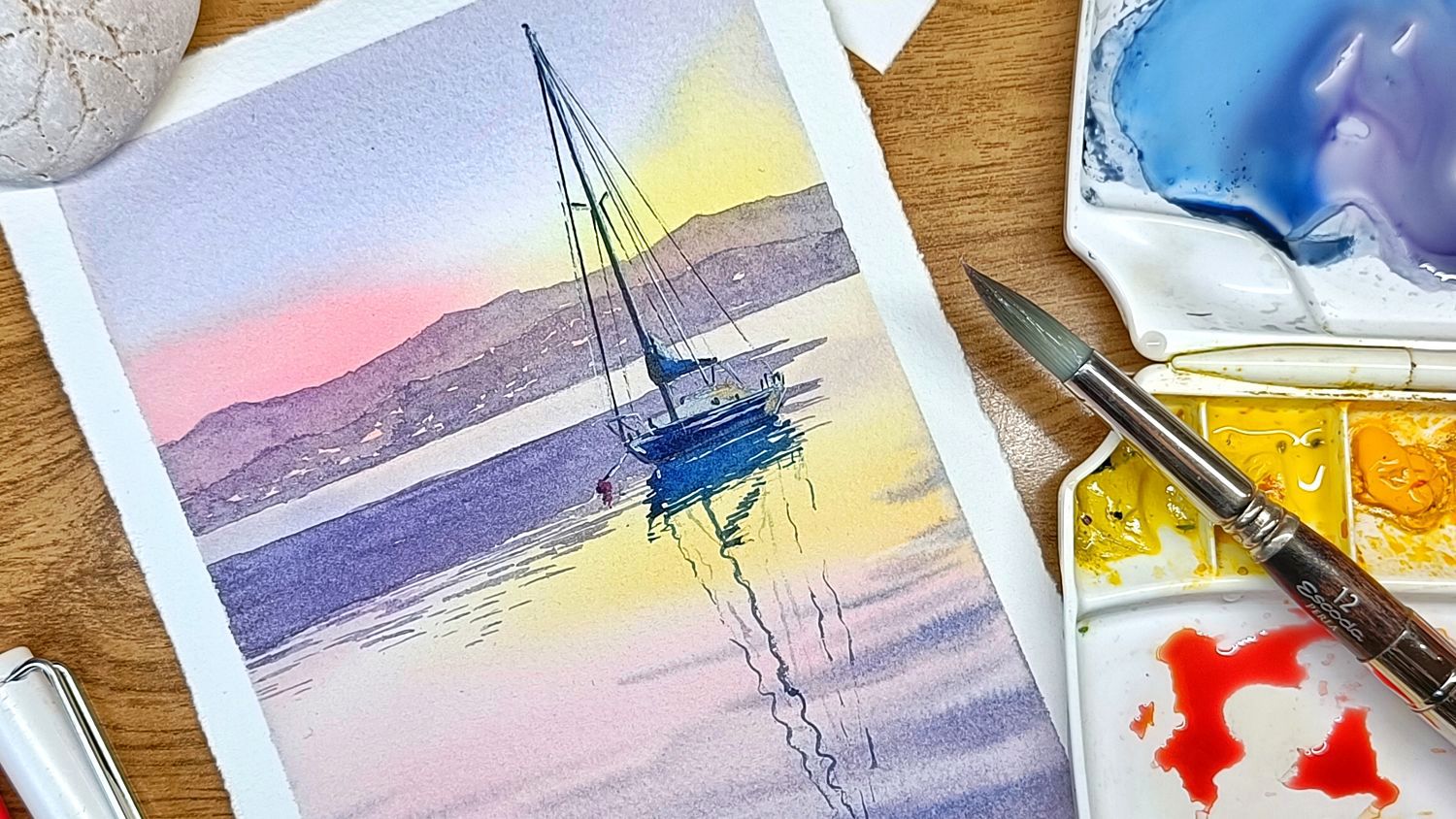
Boats, hulls, and rigging reflections
A boat or hull placed convincingly on water requires the reflection and the hull to be connected — painted in a single continuous pass rather than separately. Paint running from the bottom of the hull straight into the water below is what places the boat on the surface.
Mast and rigging reflections
A mast reflection starts relatively straight just below the hull, then becomes progressively wobblier as it extends into the rippled foreground. Fine rigging reflections follow the same principle — very faint and wobbly where they hit the ripples. Use a rigger or dagger brush, starting from the hull and working downward.
Wax candle resist for water sparkle
Before any painting, a white candle dragged across the water area leaves invisible wax marks. When paint flows over them, the wax resists and the marks reveal themselves as sparkling highlights. This is permanent — test on scrap first. Apply along the main band of light and along the lit sides of any boats in the foreground.
Ink colour for boats
In a cool-palette scene (blues, grey-purples), use black ink for rigging and pen work. Brown ink would add unwanted warmth and clash with the cool palette. Reserve brown ink for warm, sunny scenes where it blends with the watercolour tones.
Perspective in water scenes
The same aerial perspective rules that apply to landscapes apply to water — distant water is lighter, cooler, and less detailed than foreground water. A few additional specifics:
- Lily pads, ripples, and any objects on water flatten dramatically as they recede. Foreground elements appear nearly full-size; the same element at the horizon compresses to a near-horizontal sliver. Drawing background lily pads as round as foreground ones makes water look vertical
- Keep the horizon line truly horizontal — a wobbly horizon is the most distracting error in a seascape. Use a ruler for the pencil mark
- Distant waves are very small, flat, and horizontal — tiny gaps of white rather than pronounced forms. One of the most common mistakes is making distant waves the same scale as foreground ones
- The shoreline horizon should be off-centre — roughly a third of the way up the page. A centred horizon gives equal weight to sky and water and reads as static