Skies
The stage everything else is set against — worth getting right first
Before you paint: the sky rules
- Mix all sky colours before wetting the paper — once wet, there's no time to mix
- Mix more than you think you need. Running out of colour mid-sky is one of the most common causes of a failed wash
- Wet the paper generously — twice. The first pass expands the paper fibres; the second creates the working layer of water on the surface that the paint floats into
- Use the largest brush that comfortably fits the area — fewer strokes means a fresher, more luminous result
- Let skies dry naturally wherever possible — colours continue to move and separate as they dry, and stopping them with a hairdryer too early freezes them mid-movement
- Decide if the sky is the focal point, or merely the mood setter for the whole painting. A sky that is too dark or too detailed will compete with the foreground for attention. Often the sky sets the key; the foreground holds the story
The graded wash sky
The most fundamental sky technique: a single colour, darker at the top and fading naturally to almost nothing at the horizon. Done well, it reads as pure clear-weather sky with no brushwork visible at all.
Technique
- Mix a large, fully loaded pool of blue — much more than seems necessary
- Wet the sky area twice, checking from the side for dry patches and a consistent sheen
- Load the brush right to the ferrule — fill it with paint
- Sweep a single stroke all the way across the top of the sky without stopping
- Without reloading, sweep immediately below, picking up the bead of wet paint from the first stroke
- Continue downward without reloading — the paint naturally runs out and the sky grades lighter toward the horizon
- If the graduation is not dark enough, do a second pass from the top while still wet
The halo problem
The most common issue with graded skies is a white halo around buildings or trees where the wet sky colour didn't quite reach the edge. Prevention: use a smaller, almost-dry brush to tease the blue carefully into the nooks and gaps along any silhouette while the sky is still wet. Much easier to prevent than to fix.
Cirrus and fine-weather clouds
Cirrus clouds are the high, wispy streaks of ice crystal cloud that characterise cold, clear days. They are softer and more directional than cumulus — more like brushed silk than cotton wool.
Technique
- Wet the sky and apply the main blue in sweeping diagonal strokes, leaving loose, irregular lighter areas for cloud
- As you near the horizon, your marks become smaller, more horizontal and fainter
- Mix a very pale grey-purple (for example, cobalt blue with a touch of permanent violet and burnt umber) for the cirrus shadows
- Apply a few soft streaks into the lighter areas — use a flat brush held at a low angle for the most natural, directional marks
- Immediately clean the brush, dry it almost completely on a paper towel, and drag the tip through the unpainted wet areas to lift and feather the cloud into wispy streaks
- Work quickly — if the paint is already drying, the feathering marks will have hard edges instead of soft ones
Composition tip
Cirrus streaks can be used compositionally — angling them toward the focal point of the painting subtly guides the viewer's eye even before they've noticed it. This is worth doing deliberately, especially in wide landscape scenes.
Cumulus clouds
The most common mistake with cumulus clouds is making them too symmetrical, or painting the white parts instead of the dark sky around them. Clouds are not white blobs — they are the spaces between the blue.
Tissue-lifting technique
- Screw tissue into an interesting, irregular shape before wetting the paper — not a tight ball
- Wet the whole sky with clean water
- Paint the blue sky around your intended cloud shapes, leaving lighter, looser areas for cloud
- Clouds shapes at the top are round and irregular, towards the horizon they become smaller and flatter
- While still very wet, dab the scrunched tissue on the cloud tops to lift colour — creating soft, fluffy edges
- Only dab some areas — a mix of lifted soft edges and unpainted hard edges reads as more natural than all-soft
- Note: tissue-dabbed areas are dry and the paint won't flow into them. Use this deliberately — don't go back into lifted areas
- Add a light grey mix to the bottom of the clouds to create shadows. These can be blue-grey or a warm grey with a little of an earth tone added into the grey mix
Cloud shadows
A very pale purple-grey (for example ultramarine violet with a little burnt umber) along the underside and right-hand side of cumulus clouds — the shadow side, away from the sun. Apply wet and soften immediately. Much lighter than you expect; the temptation is always to go too dark, which makes clouds look like grey blobs rather than sunlit masses.
How clouds change with distance
Clouds directly overhead appear as rounder, blobby shapes with more visible structure — use a round brush and organic marks. Clouds near the horizon appear as soft, flat horizontal streaks, because you're seeing them edge-on from the side. Use a flat brush or purely horizontal strokes for the horizon area. Mixing these two cloud types in one sky immediately reads as convincing aerial perspective in the sky itself.
Stormy skies
The drama of a stormy sky comes from contrast — dark saturated clouds against areas of light breaking through, and the luminous quality of sunlit objects set below a dark sky.
Palette
Mix a three-colour grey, for example from cobalt blue, quinacridone sienna, and permanent violet. If you use a mix of colours, these separate on the wet paper as they dry and create far more life and texture than a flat Payne's grey. Have the individual colours ready in separate pools as well, so you can drop them in independently for additional variation.
Technique
- Wet the entire sky area very generously — twice. This is not the place to be stingy with water
- Drop colours in gently into the layer of water on top of the page — don't scrub them into the paper. Let the water carry the paint
- Tilt the board so colour flows downward or diagonally, suggesting the direction of rain and cloud movement
- Leave large areas of unpainted white paper — these create the dramatic light breaking through. The white is doing as much work as the dark
- Use an almost-dry small brush to tease colour up to building or tree edges — prevent white halos
- Let dry naturally until colour stops moving, then hairdryer. Forced early drying with a hairdryer freezes marks mid-movement and produces a stiff, unconvincing result
The dark-sky / light-subject contrast
Going very dark immediately around a white subject — a lighthouse, a sunlit building, a pale cliff — is what makes it pop. The sky immediately adjacent to the focal point is often the darkest area of the whole sky. This is deliberate and worth pushing further than feels comfortable.
Sunset skies
In a sunset sky, clouds are lit from underneath rather than on top, because the light source is at the horizon. This completely reverses the usual rule of lit cloud tops and dark undersides.
The colour structure
- Cloud underbellies: warm peachy-orange — these catch the light from below the horizon
- Cloud tops and shadow masses: rich, deep purplish-grey (ultramarine, permanent violet, and a touch of quinacridone sienna) — the darkest, heaviest mark in the sky
- Blue sky gaps: cobalt blue or cerulean, lighter near the horizon than overhead
- Sun glow: warm yellow or Hansa yellow medium near the horizon — leave clear white areas rather than painting right up to the edge; let the glow emerge from the paper itself
Critical rule for sunset colours
Do not pre-mix the sunset colours together on the palette — orange and blue produce brown. Instead, lay each colour separately into the wet paper and let them mix on the surface. The wet paper carries the paint to where it needs to go without scrubbing. Clean the brush completely before switching from a warm colour to blue; even a trace of orange on the brush will dull the blue.
Reflecting the sunset in water
The colours in a sunset sky appear again in the water below — the same palette, applied with horizontal strokes only, slightly more muted. The brightest reflection is a streak of warm yellow leading from the horizon toward the viewer, directly below the sun's position. This reflection is one of the most effective ways to create a sense of distance and mood in a seascape.
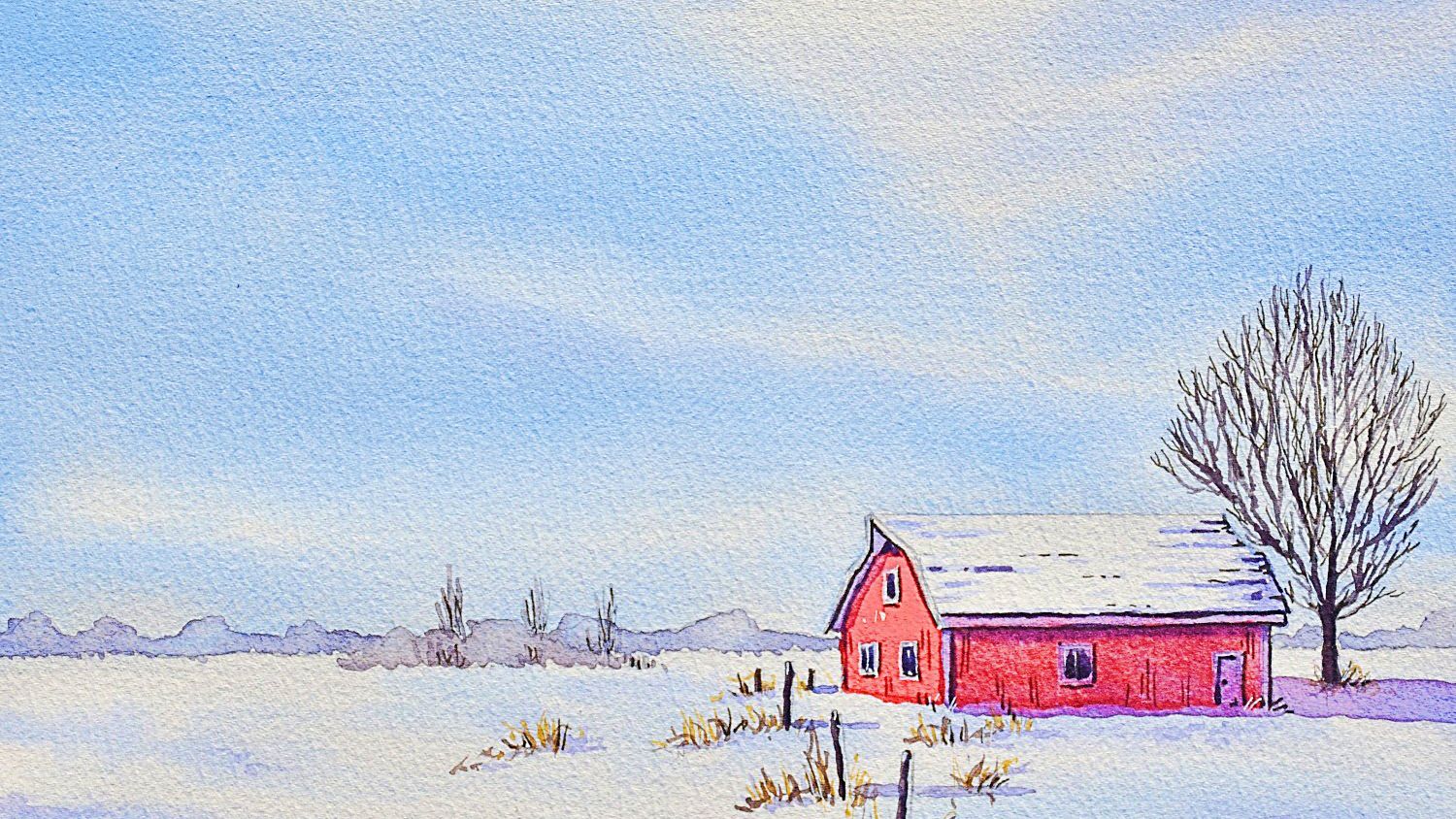
Winter and snow skies
A winter sky is not simply a pale version of a summer sky. The quality of the light is different — lower, cooler, with a characteristic muted luminosity that is distinct from summer blue. Getting this right sets the mood for the entire painting.
Colours and character
- Cobalt blue or cerulean blue are the right base for winter skies — they are softer and less intense than ultramarine, which reads as too saturated and warm for cold weather
- A touch of permanent violet or a very diluted grey-purple (cobalt blue and burnt umber) suggests the overcast or semi-overcast quality of winter light
- Near the horizon, the sky often warms very slightly in winter — a barely perceptible warmth of natural sienna or a diluted yellow, where the pale winter sun sits low
- For completely overcast snow days, the sky can be almost the same pale grey as the snow itself — the distinction between sky and snow-covered ground is subtle, and the painting relies on value contrast from the trees and structures
Snow texture in sky washes
A useful trick for suggesting falling snow or snow-loaded background trees: partially dry the sky wash with a hairdryer until the paper is damp but not soaking, then splatter clean water across the surface. The water drops into the damp paint and create bloom marks — soft, organic circles that read as snowflakes, snowfall, or the blurry edge of snow-covered branches dissolving into the sky. Only works if the paint is at exactly the right stage of dampness; test on a scrap first.
Night skies
A convincing night sky must be very dark — darker than most students dare to go. Stars only read as stars against a genuinely deep, saturated dark. A mid-toned grey sky with white dots looks flat and unconvincing.
Palette and approach
- Mix the dark from three colours rather than one — indigo, Prussian blue, and permanent violet is a rich combination that separates on the paper and creates visual depth in the dark. A single pigment dark looks flat
- Apply the sky heavily loaded, darkest at the very top where the sky is directly overhead, lightening very slightly at the horizon
- While still wet, lift cloud shapes with a clean damp brush or scrunched tissue — the clouds in a night sky are darker than the moon-lit areas but still lighter than the deepest sky
- Let the sky dry naturally until almost dry, then hairdryer thoroughly before adding stars or the moon
Stars and the moon
White gouache splattered from a toothbrush creates the random distribution of stars convincingly. Concentrate splatter in the darkest sky areas — stars show up only where the sky is deepest. Keep splattering away from the moon, which should remain as a distinct lifted or reserved shape. The moon should feel embedded in cloud rather than sitting in front of it — passing cloud colour gently over the lower edge of the moon, while keeping the top rim bright, creates this effect.