Buildings & Architecture
Old walls, rusty roofs, worn wood — texture, light, and the story buildings tell
The core principle: overall colour first
The most common mistake when painting stonework, brickwork, or any textured wall is trying to paint every individual element. Stand back and squint at the reference — what colour do you see when you ignore the detail? That's your first wash. Individual stones, bricks, or planks are added into or over this wash, not instead of it.
The goal throughout is to give the viewer just enough information to understand the surface — then let them complete the picture. Suggest, don't document.
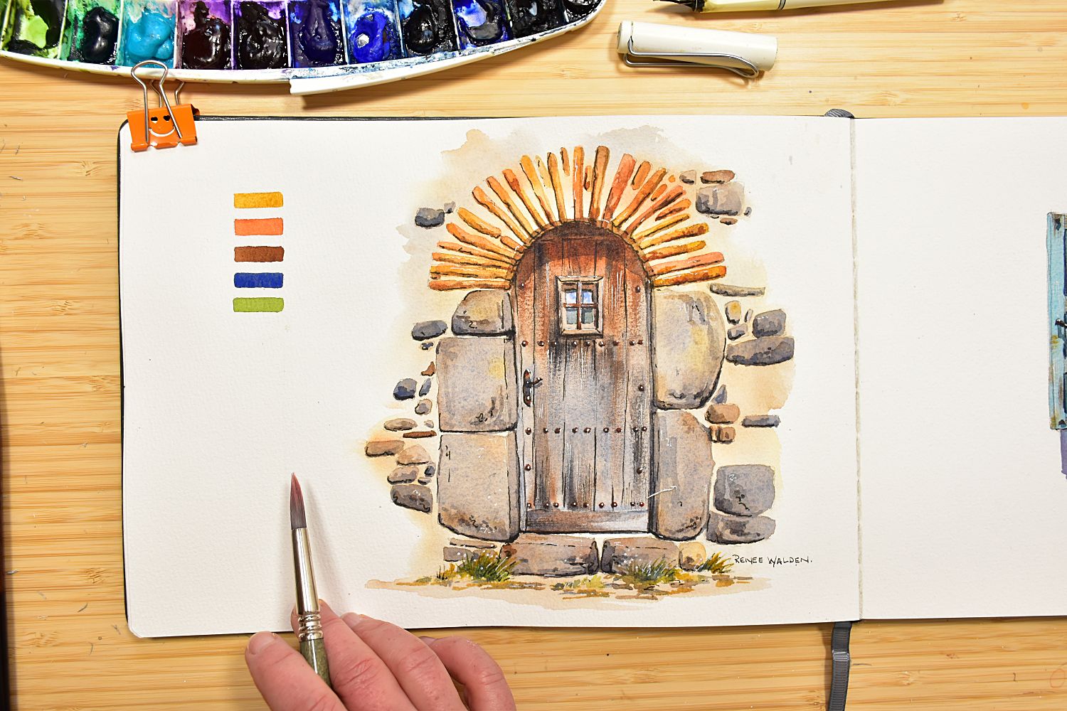
Stonework
Tightly packed stone (dry-stone walls, old village buildings)
The overall colour is the stone itself. Mix natural sienna well-diluted as a base wash and paint the whole area. While still wet, drop in individual stone marks in varying browns and grays — vary the sizes, shapes, and colours. No rows, no regular spacing, no polka dots. Once dry, come back with a smaller brush and thicker paint to define a handful of stones more clearly. Stop before you feel finished.
Mortared stonework (more space between stones)
When mortar is prominent, it's the mortar that dominates — so the overall colour is the mortar colour, not the stone. Mix ultramarine and quinacridone sienna into a warm, complex grey. Working wet lets the two colours separate on the page, creating natural texture that already reads as mortar. Drop individual stone shapes in while wet, further apart than in dry-stone work.
Stone under the arch
Protected stonework — under arches, inside doorways, sheltered from rain — often retains a warm golden limestone colour. Use natural sienna or quinacridone gold here, a visible contrast against the weathered grey of exposed stone. There is often reflected light from water below an arch, warming the tone further.
Old wood and corrugated iron
The single most important habit for both materials: paint in the direction the material runs. Vertical weatherboards get vertical strokes. Corrugation ridges get strokes that follow the corrugations. This directional consistency, even without detail, immediately reads as the right texture.
Old weathered wood
Weathered wood sits in the grey-brown range. Work with three related colours: a warm grey from ultramarine and burnt umber, straight burnt umber for warmer areas, and burnt sienna for a slightly redder warmth. Paint wet and loose with a large brush, varying between the three as you go — let adjacent planks blur slightly into each other. While still damp (not wet, not dry), add a few grain lines and knots with a smaller brush and thicker mix. They soften slightly into the damp paint, giving the right quality of real wood grain.
Gaps and shadows between planks go on last, once dry — a small brush with thick dark grey-brown fills the joints and indicates where one plank casts a shadow on the one below. This is what gives planks depth.
Corrugated iron
Ultramarine and burnt sienna in varying proportions — old and rusty leans toward the sienna, newer and shinier leans toward the blue. Paint the whole surface in one pass, following the direction of the corrugations, and leave occasional fine white gaps between strokes — these catch the light on the ridges and give the surface its metallic quality without additional effort. Where one sheet overlaps the next, a fine dark mark along the overlap line immediately makes the roof read as individual sheets rather than one continuous surface.
Brickwork and perspective
Brickwork has a critical addition that stonework doesn't: perspective. Brick courses are only truly horizontal at eye level. Above eye level, courses slope downward as they recede; below eye level, they slope upward. Before painting, establish the eye level line and indicate the direction of courses with light pencil marks — thinking done in pencil doesn't need to be done mid-painting.
- Mix burnt sienna and paint the entire brick surface as a flat wash
- While still wet, suggest some of the courses with a smaller brush — following the perspective established in pencil
- Once dry, define individual bricks in a few key areas — particularly where courses change direction (around arches, at corners) and at the focal point
- Shadows last — a transparent glaze of ultramarine and quinacridone sienna over the shadow side immediately makes a flat wall read as three-dimensional
Where bricks arch around windows or doorways, indicate those curved directions in pencil before painting — arching brick courses are one of the most satisfying architectural details and worth the extra planning.
Shadows on buildings
A flat wall becomes a building the moment a transparent shadow glaze is applied. Shadows are ver important in architectural painting — they describe form, separate surfaces, and create the three-dimensionality that makes a scene feel real.
Architectural shadow principles
- Apply shadow as a single glaze over completely dry underpainting — transparency allows the texture and colour underneath to show through
- Mix the shadow from the same palette as the scene: ultramarine and quinacridone sienna make a lovely warm, granulating grey that belongs to the light
- The shadow inside windows and doorways is the darkest mark in the painting — lean into it
- Dappled tree shadow on a wall: paint marks but immediately soften some edges with a clean dry brush. A mix of hard and soft edges suggests a tree moving in a light breeze
- Under eaves: apply the shadow, then soften its lower edge with a clean dry brush — a slightly soft edge reads as a shadow cast by a roof rather than a painted line
- Where shadows fall on different surfaces (from stone to plaster, or from building to ground), vary the colour — the shadow picks up reflected colour from each surface it crosses
Building colour and wet surfaces
Urban and architectural scenes often involve wet stone, cobblestones, or alleyways — and wet surfaces require a specific approach.
Painting wet stone and alleyways
- Wet the surface area with clean water
- Drop in cobalt blue in horizontal strokes as a sky reflection — horizontal marks only, since the surface is flat
- Bring in a darker grey-brown mix and let it merge with the blue
- Lift some areas with a clean almost-dry brush to create shiny, reflective patches
Shadows on complementary-coloured surfaces
When shadows fall on coloured laundry, painted walls, or tiled roofs, use the complementary colour as the basis for the shadow mix — shadow on yellow gets purple, shadow on red gets green, shadow on blue gets orange. This gives shadows luminosity rather than deadening the colours underneath. While the shadow wash is still wet, drop in reflected colours from neighbouring surfaces — a white wall beside a blue shutter will pick up a touch of orange-blue into its shadows.