Shadows
The element that most often lets down an otherwise good watercolour painting
Why shadows matter
Shadows create the illusion of three dimensions and anchor objects to the surfaces they sit on. Without well-painted shadows, a technically accomplished painting can still feel flat.
Because shadows are often large, dark areas, the eye goes straight to them — getting them right matters disproportionately.
The golden rules
- A single ready-made grey can be boring — mix a grey from two or more pigments and vary the ratios as you go
- Use a large enough brush and work fast in a single wet pass, so your shadow wash is clean, luminous and has minimal brush marks
- Go darker than feels comfortable — timid shadows can make the whole painting weak
- Keep light direction consistent across the entire painting
Checking your tonal values
After the shadow stage, photograph the painting and convert to black and white. Do the same with the reference photo. Comparing them in greyscale strips away the colour confusion and shows clearly where values are balanced and where more depth is needed.
- The lightest lights (sunlit snow, white walls catching direct sun) should be in the palest value range or not painted at all
- The darkest darks (interior shadows, deep window recesses) in the darkest range
- If the contrast isn't there in greyscale, the shadow washes need to go darker — not more colourful, darker
- The foreground should be tonally richer than the background; if they read the same, aerial perspective is lost
Complementary colour shadows
Ideally each shadow should be mixed using the complementary colour of the surface it falls on — this gives shadows luminosity and makes them feel part of the light.
The principle
- Shadow on yellow → add purple
- Shadow on blue → add orange
- Shadow on red/pink → add green
- Shadow on white/neutral → cool blue-grey, plus reflected colours from nearby objects
Reliable shadow pair
When mixing complementary colour shadows feels fussy, intimidating or time consuming, then I've found a reliable shaow pair - Ultramarine + quinacridone sienna. These granulate together and create beautiful texture. Lean more blue in cool areas, more brown where warm reflected colour enters.
Shadows across multiple surfaces
A shadow that crosses from one surface to another must change character as it goes — the colour, edge quality, and tone all shift.
Common surface transitions
- Stone wall to snow: warmer on the stone, cooler and bluer on snow
- Shutters to white wall: keep the shutter colour in the shutter shadow, switch to cool grey for the wall
- Building to ground: connect them — a floating shadow that doesn't touch the base looks awkward
Hard vs soft edges
Hard edges on flat surfaces in direct sunlight; soft edges on rounded objects, moving foliage, or overcast days. Balance your painting, so you have a good mix of edges.
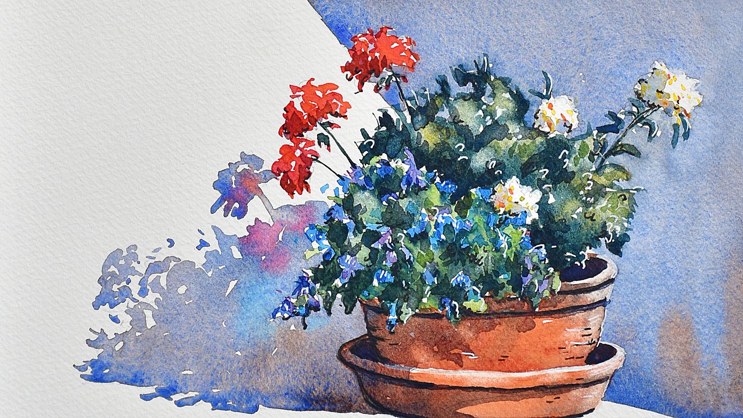
Reflected light in shadows
Where an object sits close to a pale or warm surface, light and colour bounce back into the shadow. For example, a terracotta pot casts a warm orange glow into the nearby shadow. Snow shadows are full of reflected colour from surrounding objects.
How to paint it
- Apply the main shadow wash with a large, well-loaded brush
- While still wet, drop in the reflected colour — warm brown near terracotta, quinacridone sienna near warm stone, violet near purple flowers
- Leave a slightly lighter area along the base of round objects — reflected light from the floor
- Don't overdo it — reflected light is subtle, not garish
Snow shadows
Snow shadows are the most misunderstood shadows in watercolour. The instinct is to use a flat blue-grey — but snow is highly reflective and shadows on snow are full of colour from surrounding objects.
The technique
- Before applying shadow, you can lightly flick clean water into random patches of the snow area — when the shadow wash flows over these, some edges soften while dry areas stay crisp, creating the natural mix of hard and soft that real snow has
- Use two shadow mixes: for example straight ultramarine (clean blue), and ultramarine with a touch of permanent violet (cooler purple) — alternate between them across the shadow area
- While still wet, drop in warm colours near buildings or pathways — this is reflected light from nearby surfaces and stops shadows looking flat
- Follow the form — where shadow crosses a snowbank, it must change direction to follow the slope. A shadow that ignores the underlying form looks pasted on
What colours?
Snow shadows are never usually warm grey. The shadow colour is almost always cobalt blue or ultramarine, sometimes with a touch of violet — cold and sky-lit. Any warmth that enters a snow shadow is reflected light, not the shadow colour itself.
Common mistakes to avoid
- Inconsistent light direction — check every shadow before painting it
- Ignoring the shape of the shadow — it must follow the form of the surface it falls on
- Painting shadows before underlayers are dry — they will bleed and lose integrity
- Using too small a brush — causes reloads, hard lines, and cauliflower blooms
- All hard edges — makes the scene look stiff and cut-out