Colour Mixing
You don't need twenty tubes — you need to understand a few reliable principles
Mixing natural greens
The most common question I get: how to mix greens that don't look artificial. The short answer — vary them. A single flat green reads as wrong. Multiple greens, varied in warmth and saturation, read as real.
Four ways to make green
- Straight from the tube — sap green or green gold are handy in non-focal areas
- Mixed on the palette — blue + yellow (for example, ultramarine + hansa yellow medium or cobalt blue + quinacridone gold)
- Charged on the page — lay blue, drop yellow into the wet wash for maximum variation
- Glazing — wash of yellow, dry completely, glaze blue on top
Dulling greens that look too vivid
- Sap green + burnt sienna → earthy, warm green
- Any green + permanent violet → complex, deep natural tone
- Any green + its complement (red or an earthy red) → muted, naturalistic
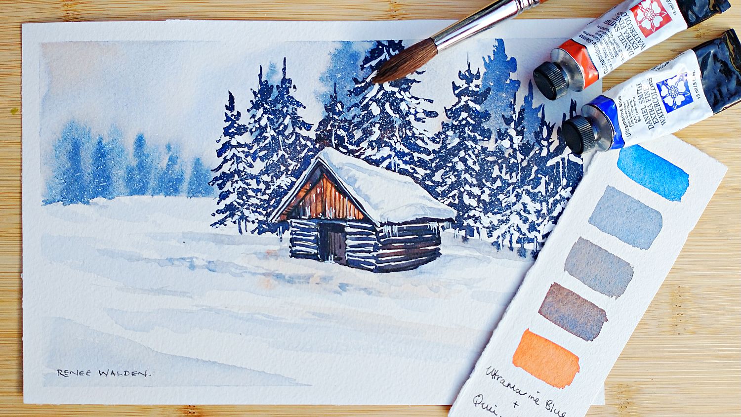
My favourite shadow pair
Ultramarine blue + quinacridone sienna — this combination is such a versatile, reliable shadow mix. Ultramarine blue granualates and quinacridone sienna sits on to of the paper, creating natural texture and separation as they dry.
You can shift the ratio of blue to brown depending on what you need: more blue for cool, sky-lit shadow areas; more sienna where warm reflected colour enters. Used thick with little water, this mix approaches near-black for the darkest accents.
Warm vs cool temperature
Every scene has a temperature — the light source defines it. A sunny day is warm; overcast or stormy days are cool. Shadows are typically the opposite temperature to the light.
Sunny day painting
- Sunlit surfaces: warm yellows, natural sienna, quinacridone gold
- Shadows: lean cool — more blue in the ultramarine/sienna mix
- Snow in sun: shadows are distinctly blue-violet, sunlit areas cream-white
Overcast / stormy painting
- Everything shifts cooler — cobalt blue, permanent violet, cool greys
- Shadows are subtler — less contrast, softer edges
- Reserve warm colour for the focal point to draw the eye
Background always cooler than foreground
Aerial perspective means distant objects are cooler, less saturated, and lighter than foreground objects. This is the single most reliable tool for creating depth.
Granulation
Granulation happens when heavy pigment particles settle into the paper's dimples while finer particles float, creating visual texture as the paint dries. Working very wet enhances it.
Colours that granulate well
- Ultramarine blue, French ultramarine, sepia — a classic heavy granulator
- Cobalt blue — softer, rounder granulation
- Mixing ultramarine with a fine pigment (quinacridone sienna, pyrrole red) produces beautiful separation — the heavy ultramarine sinks while the fine pigment floats
How to maximise granuation
The wetter you work, the more the granualation appears when the paint dries. Working and drying your painting flat also enhances the effect. Splattering with clean water into an almost dry wash can be very effective.
When to use it
Background mountains, stormy skies, stone and rock textures, misty forests, trees and shrubs — anywhere that natural texture enhances the subject. Avoid it in clean, luminous flower petals or sunny skies where you want smooth transparency.